Color is one of the most important aspects to consider in photography. Of course, you need to be able to capture colors accurately with your iPhone, but there’s so much more to color than that! The colors in your photo affect the overall mood of the image and greatly influence the viewer’s emotions. In this tutorial, you’ll learn how to use color more effectively to help you create expressive and dynamic iPhone photos that really capture the viewer’s imagination.
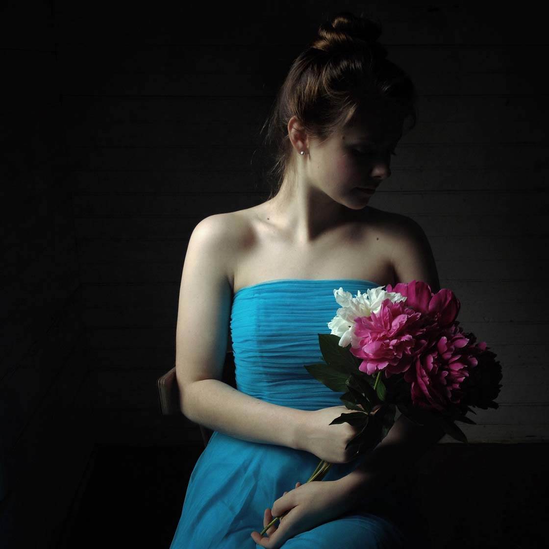
Basic Color Theory
Using color more effectively requires a basic understanding of color theory. Color wheels are great at helping you visualize these basic concepts which are so important in photography.
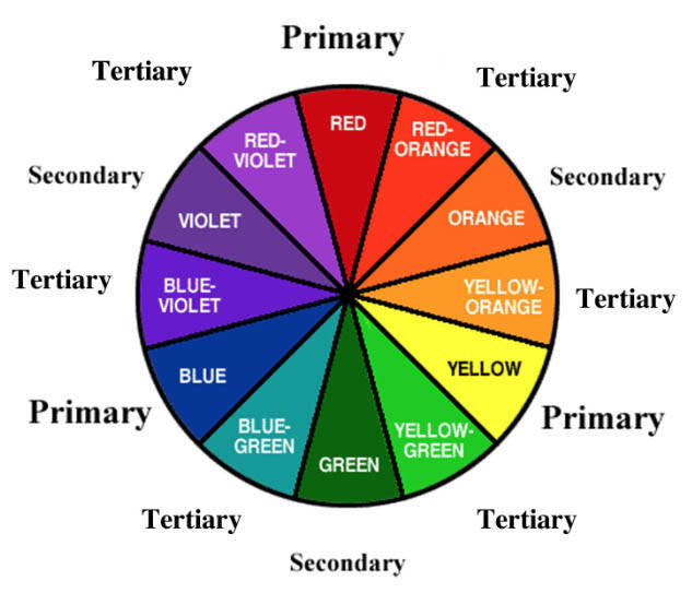
Primary colors (blue, red and yellow) are the three colors that cannot be formed by any mixture of other colors. Secondary colors (green, orange and purple) are the colors formed by mixing two primary colors. Tertiary colors are colors made by mixing a primary and secondary color, hence the names yellow-orange, red-orange, blue-green, yellow-green, etc.
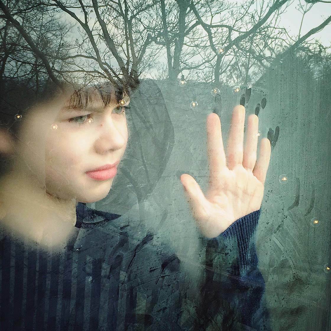
The term “analogous colors” refers to similar colors on the color wheel. This means using colors that are next to or near each other on the color wheel, such as oranges and yellows, or greens and blues.

The term “complementary colors” refers to colors that are opposite each other on the color wheel, such as orange and blue, or red and green. The contrast of complementary colors tends to create a stronger visual impact than using analogous colors that are similar to each other.
There are a couple of other color terms that you should be familiar with when studying color. “Hue” simply means the color of a color, e.g. red, green, blue. And “saturation” refers to the intensity of the color. A saturated color is one that appears very vibrant, and a desaturated color is one that appears more muted.
So let’s now take a look at eleven ways of using different kinds of color and color combinations to create different visual impacts and emotions in your imagery.
1. Use Color To Evoke Different Emotions
Most people see colors and react to them in the same way because our minds have learned that different colors mean certain things.
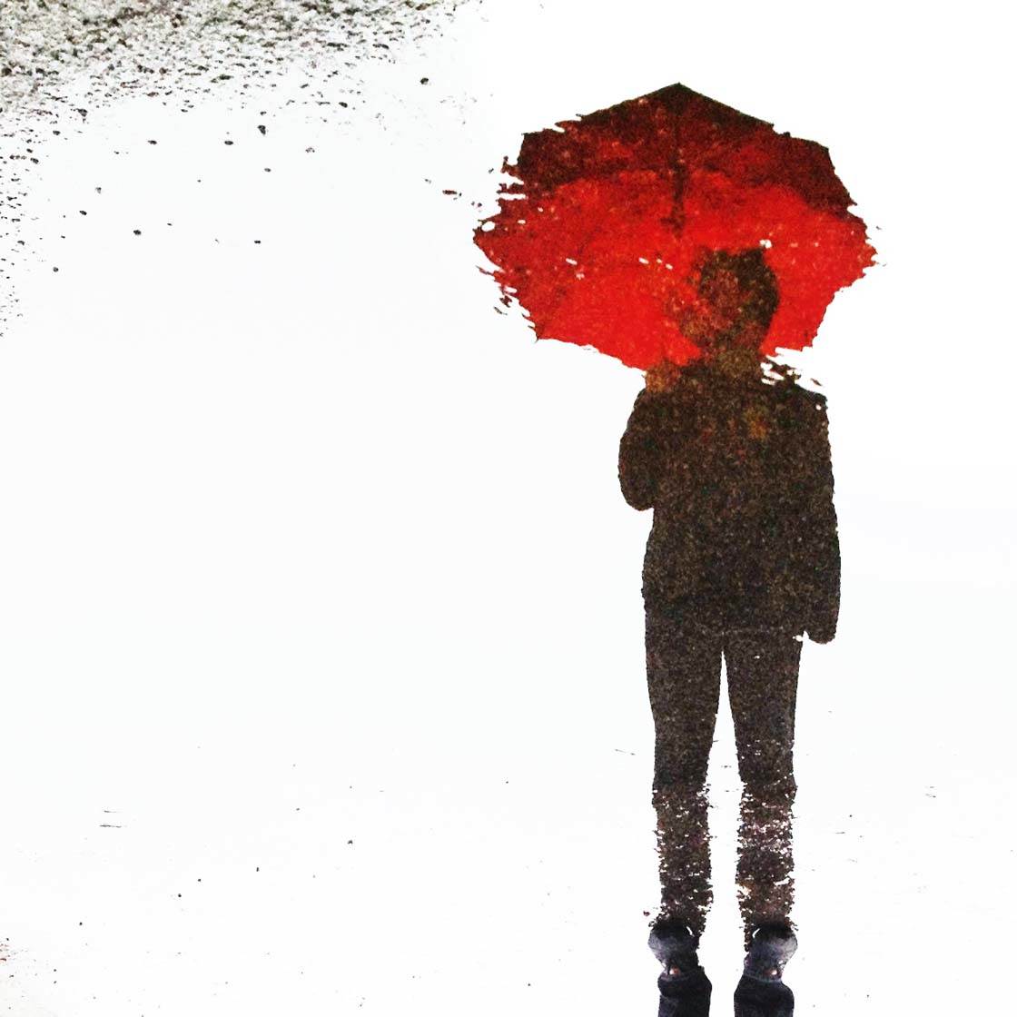
For instance, red may make us think of danger, strength, power or love since it’s the color of blood, hearts, fire, etc. Red has the widest spectrum of emotions and is considered to be the most emotional color.

Blue and green are colors that are found in our natural surroundings and are most often associated with calmness, freshness and hopefulness. They’re very relaxing and tranquil colors.
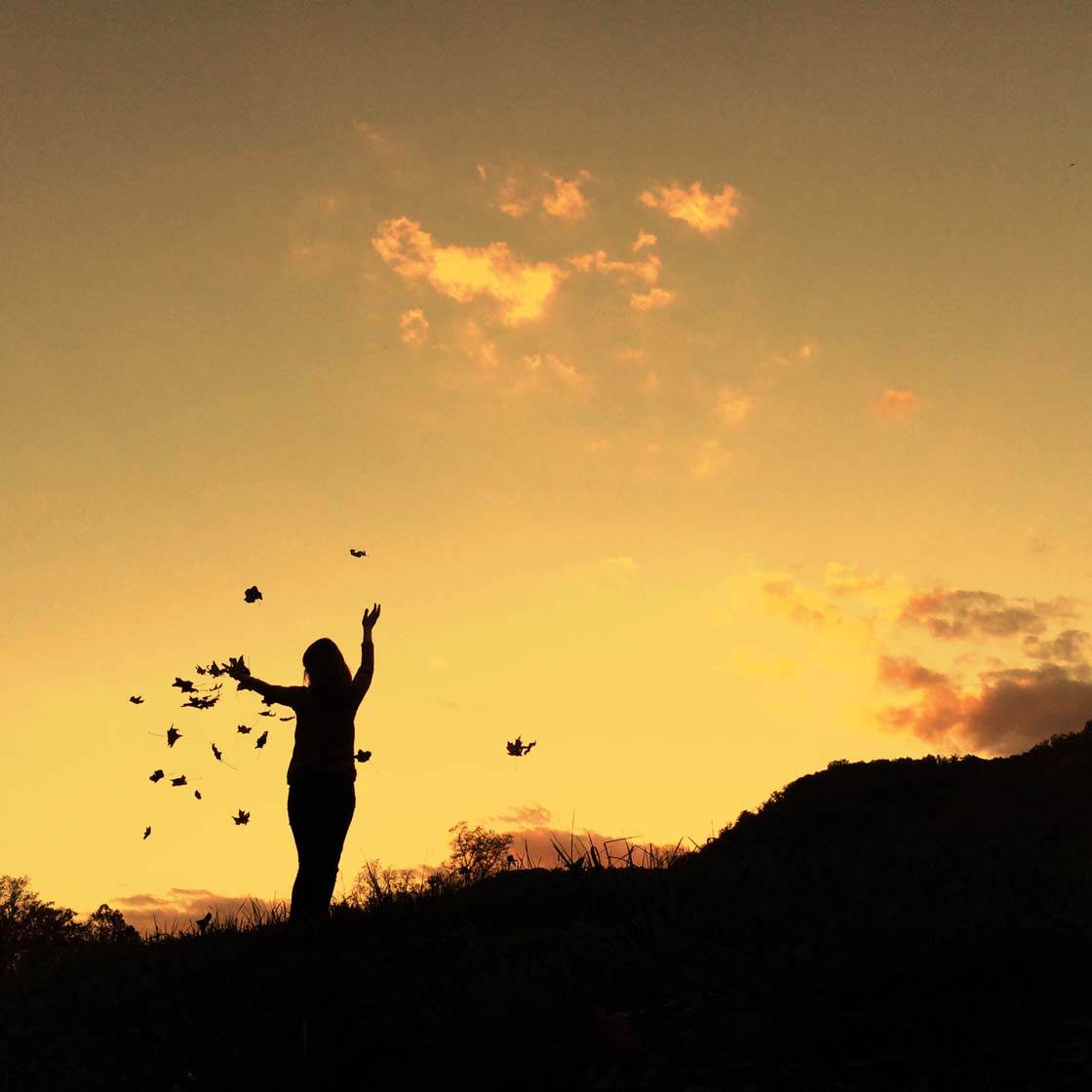
Energetic and cheerful moods are often suggested using the colors yellow and orange. Purple is the color of power, luxury and nobility. White suggests light and purity, while black signifies elegance, mystery and fear.

There are many emotions and moods that are signified by different colors, and as a photographer you must make choices as to how they can best be used to visually convey the story or emotion in your photos.
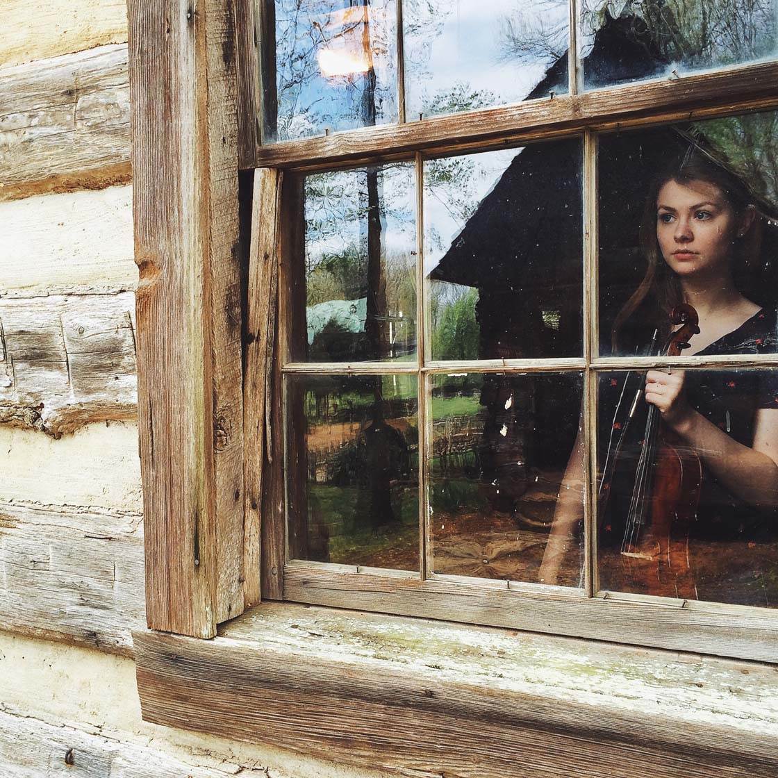
2. Use Contrasting Colors To Create Excitement
Contrasting colors, or complementary colors as they’re otherwise known, are the colors that appear opposite each other on the color wheel, such as blue and orange, or red and green.

Using contrasting colors together can create a very bold and eye catching image. The clash of the strong colors tends to create a dynamic image with a feeling of excitement.

If you’re shooting outdoors under a bright blue sky, try looking for orange or yellow flowers that will contrast against this blue. Shooting from a very low angle ensures you get the blue sky in the background.
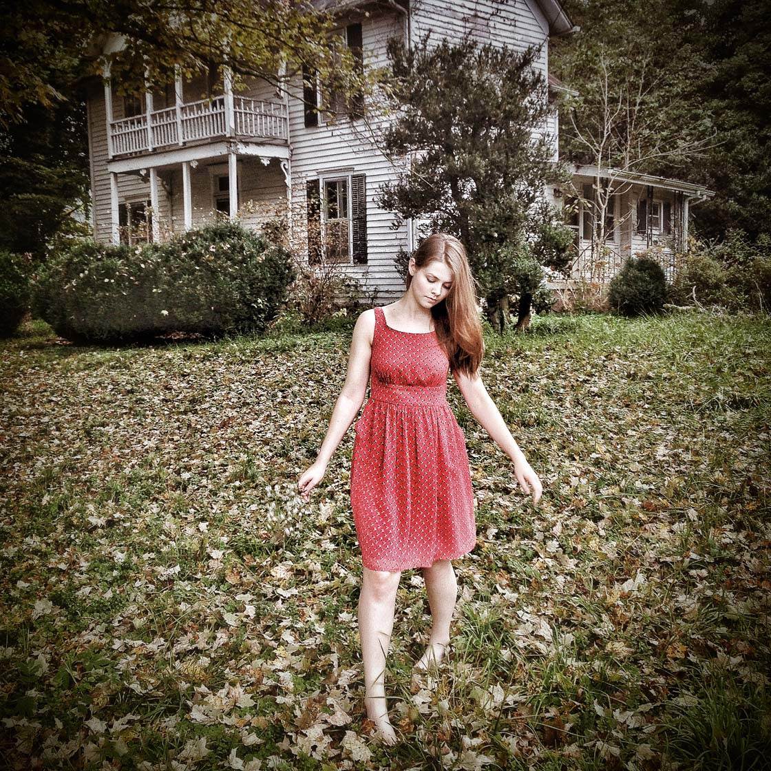
Another great technique for shooting contrasting colors is to photograph a person wearing red clothing against a green background such as a field of grass. The red creates a wonderful pop of color against the green.
3. Capture Similar Colors To Create Harmony
Similar colors, or analogous colors as we also call them, are the colors that appear next to each other on the color wheel, such as blue, blue-green and green.
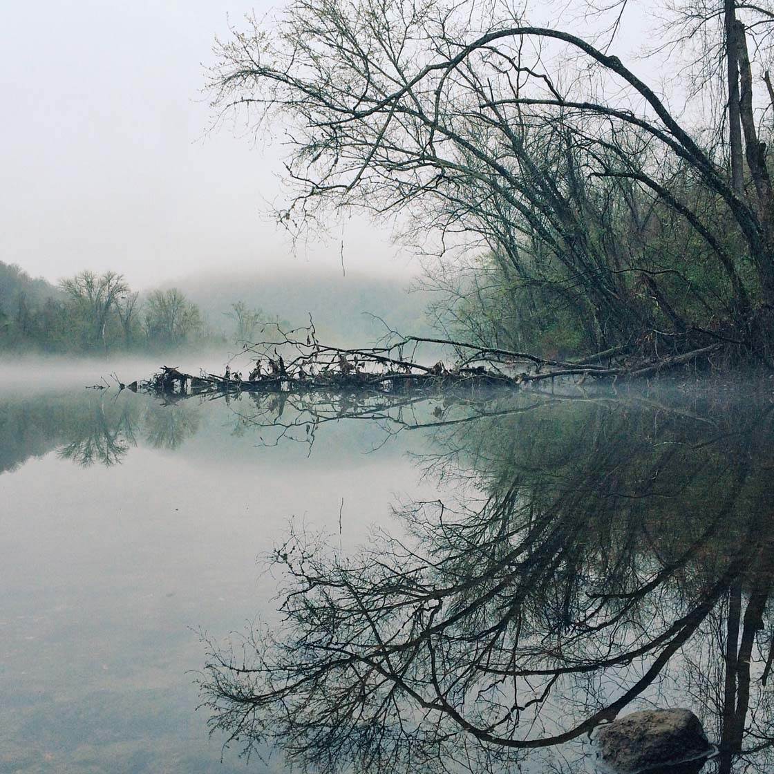
Using analogous colors in your scene gives the photo a more harmonious and visually cohesive quality. The similar color hues gradually blend into one another, which is very easy on the eye compared to the clash of contrasting colors.
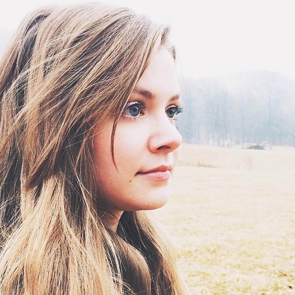
Photos with similar colors create a less dramatic feel than using contrasting colors, evoking a much calmer mood in your image. The similar colors of the hair, skin tone and background in the picture above create a lovely serene portrait photo.
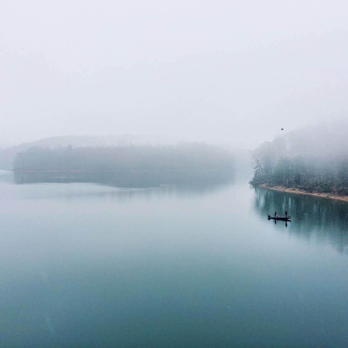
You can even use the same color with different tones (e.g. light blue, mid-blue and dark blue) to create a beautiful monochromatic image.
4. Use Vivid Colors For Maximum Impact
Using bold vivid colors in a photo results in an image with a very strong visual impact. Choose one or two bright colors as the focal point so that the eye is drawn immediately to your subject.
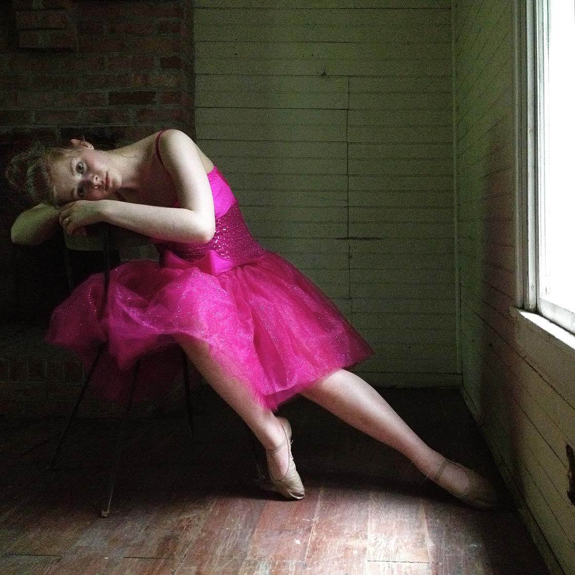
When using vivid colors, try to make sure the photo isn’t filled with so many colors that it becomes too cluttered and bewildering.
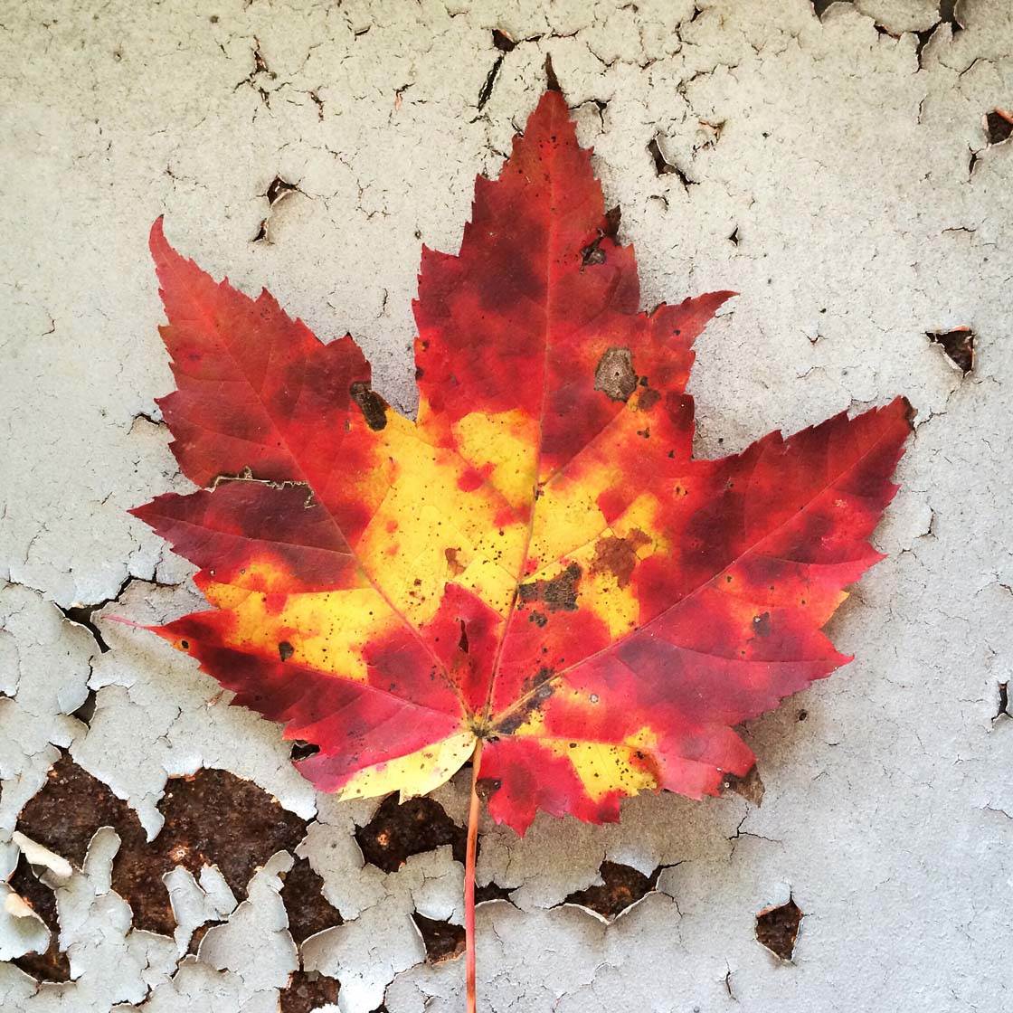
A neutral background, without any other colors competing for attention, will give more priority to the vivid color of your subject.
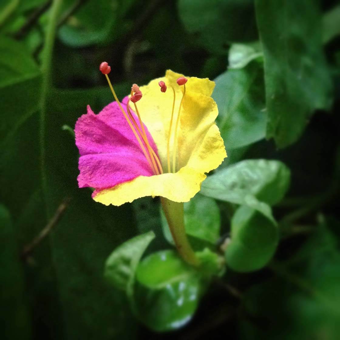
Alternatively you could use another vivid but contrasting color for the background, such as the green leaves in this photo.
5. Photograph Muted Colors To Create Calmness
Muted colors are less saturated and much more subtle that vivid colors. Muted colors evoke a sense of dreaminess or moodiness in your photos.
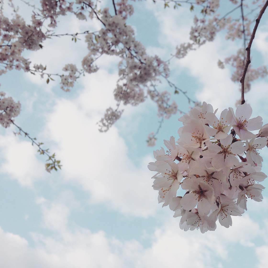
The soft pale pink color of these blossoms look beautiful against the muted blue sky in the background. It creates a harmonious composition with a dreamy feel.
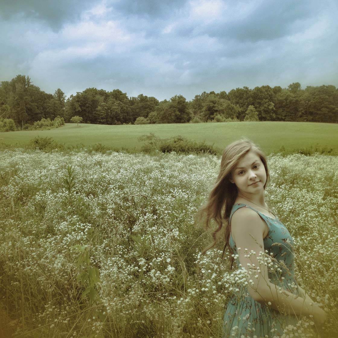
If you want your photo to have a vintage or retro feel, you can desaturate the colors slightly in post-processing using an app such as Snapseed.
6. Fill The Frame With A Color
Filling all or most of the frame with a single color is an excellent way of creating a strong visual impact, whether you’re using vivid or muted colors.
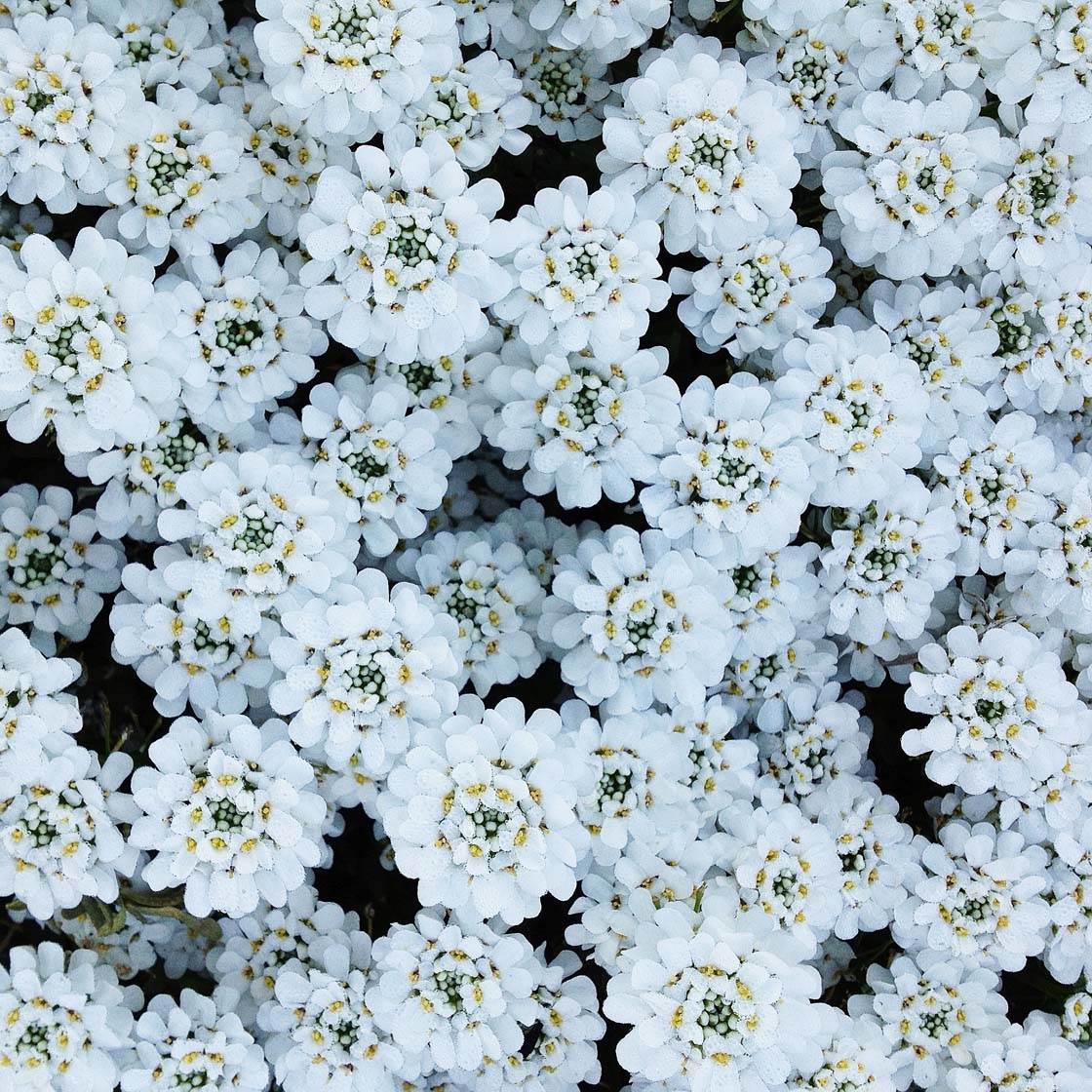
Filling every last inch of the frame with the color of your subject is such a great way of presenting your scene and placing emphasis on the color. An easy way to do this is to get up close to your subject so that none of the background is visible.
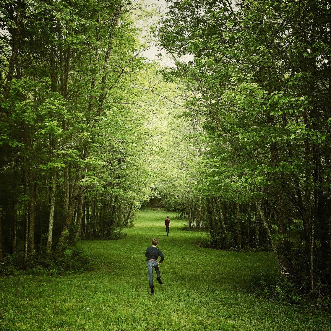
Alternatively, you might have a scene that is mostly a single color that you can shoot from a distance, such as this woodland picture that fills the frame with a lush green color.
7. Use A Splash Of Color
Another powerful use of color in photography is to add a pop of color to an otherwise neutral scene. Colorful props are a great way of achieving this effect.
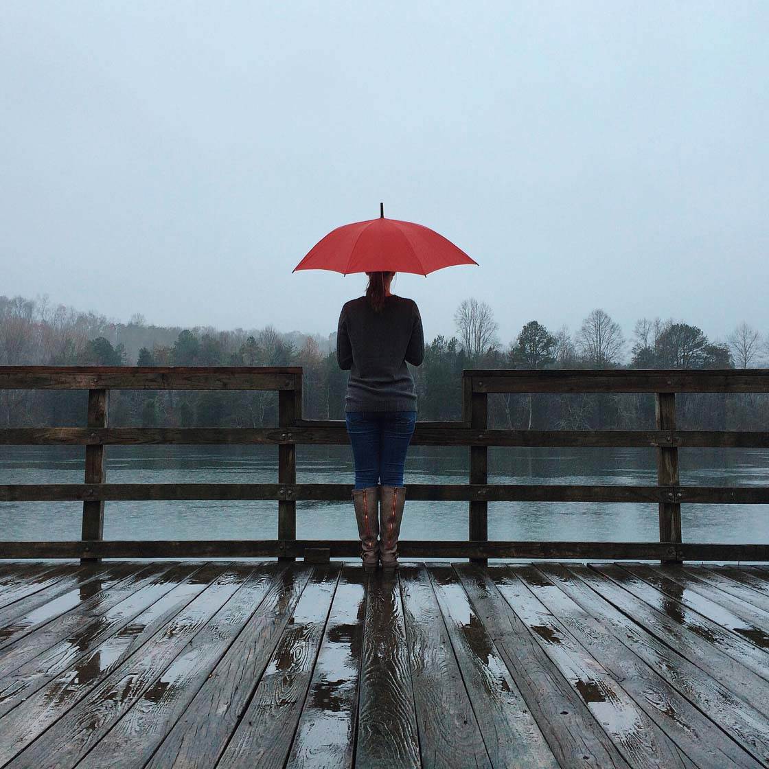
The red umbrella in this photo provides a much needed splash of vivid color on this dull overcast day. It creates a strong focal point and the vibrant pop of color helps get the photo noticed, even from a distance.
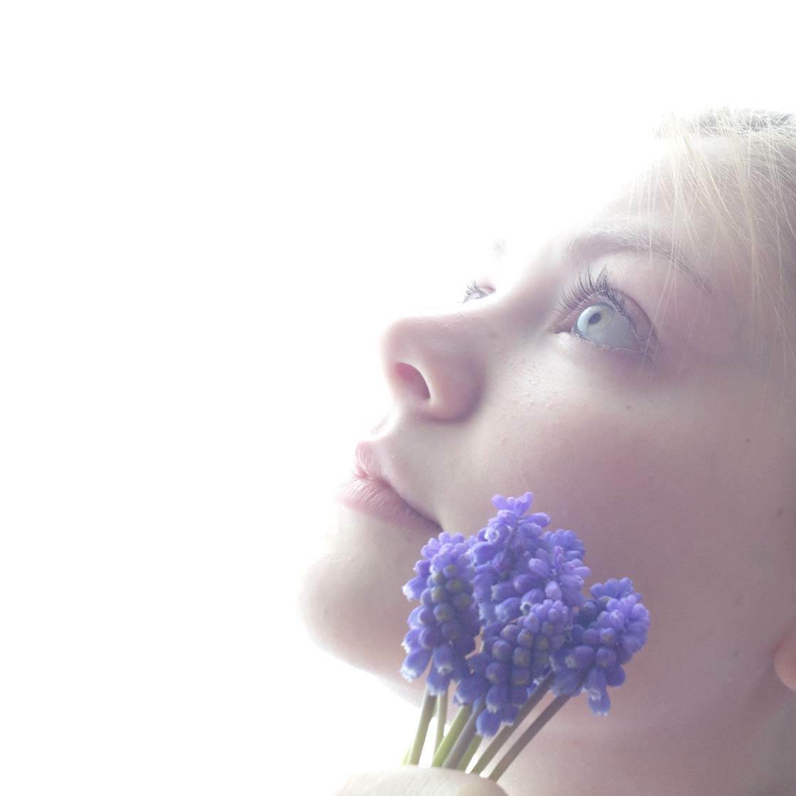
Colorful flowers are an ideal way of adding a splash of color to a photo. They work especially well in portrait photography, adding to the beauty of your subject.
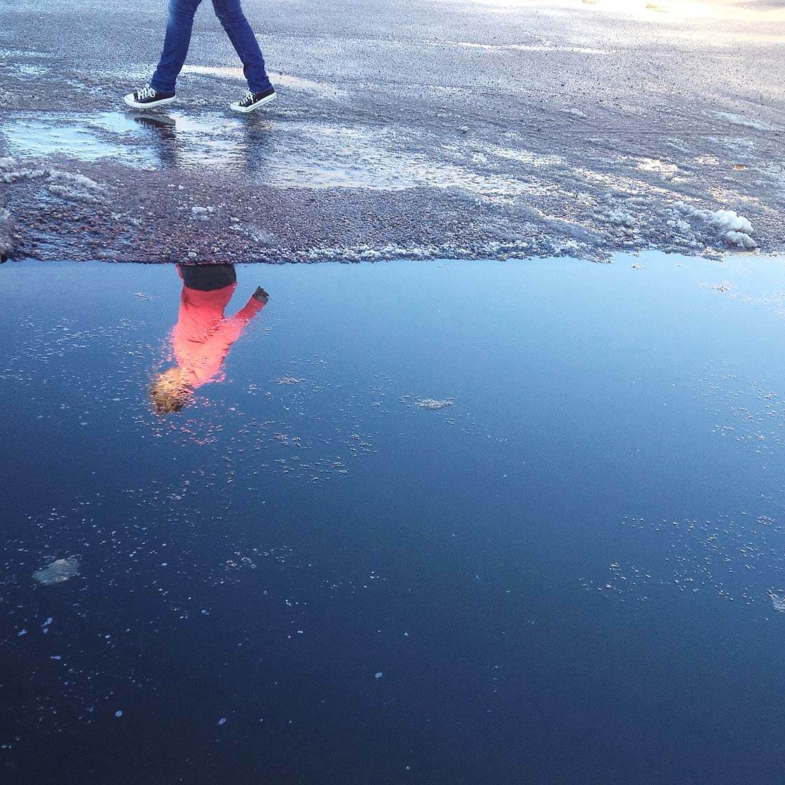
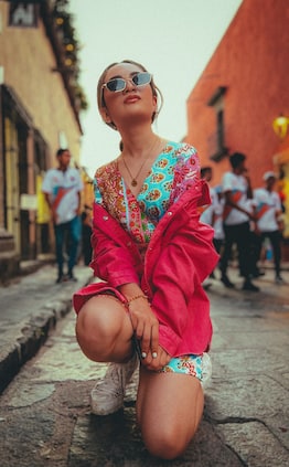
If you’re photographing a person within a landscape or urban scene, you could ask them to wear vibrant colored clothing so that they stand out better against the background.
8. Ensure Your Scene Is Well Lit
Color in photography isn’t just about what color your subject is. The type of light that you’re shooting in can dramatically affect the colors in a scene. Having the right kind of light is essential in photography, not just for exposure, but also for color.
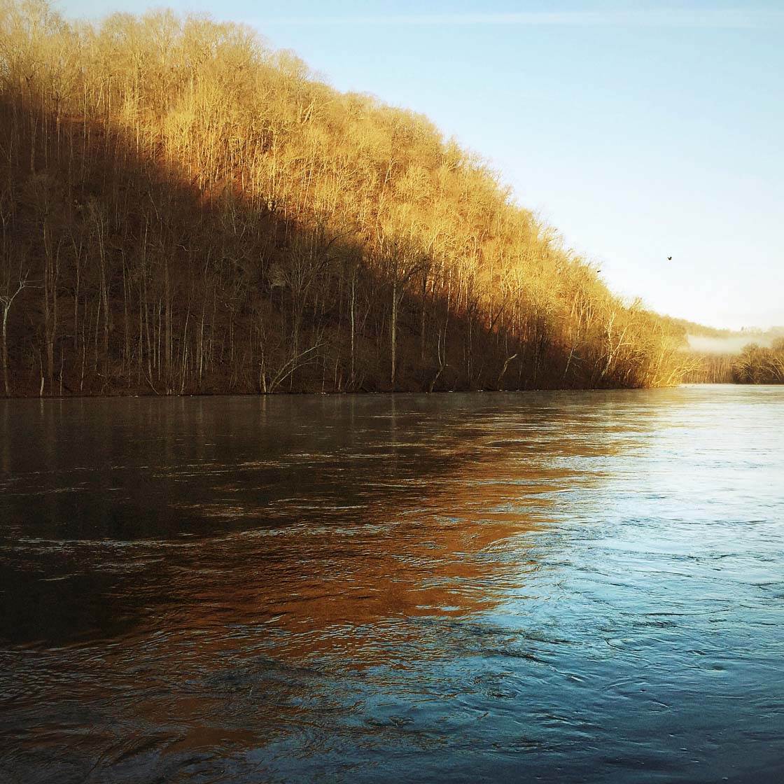
In the photo above you can see how the colors in the parts of the scene that are in shadow look completely different to those areas in direct sunlight.
Making sure the light is right is important to ensure your colors appear correct. Your camera doesn’t always see what your eyes see, and when the light isn’t quite right the nuances of colors may not be visible in the image.
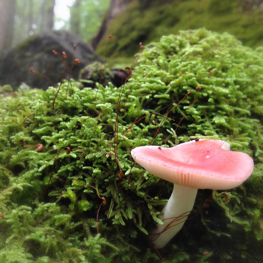
If you don’t have enough light, the image will be under-exposed and the colors will appear too dark or possibly even black. This can be a particular problem when shooting indoors, in shade, and obviously when you shoot at night.
If there’s too much light in the scene, the image will be over-exposed and the colors will appear too bright, or maybe even pure white. In harsh sunlight this can be a problem, and you may get dark shadows which will affect the colors too.
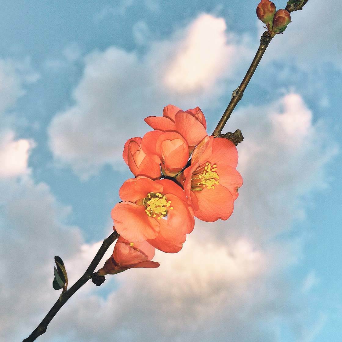
Assuming that the lighting in the scene is adequate, it’s important to ensure you correctly expose the image so that the colors are rendered as accurately as possible.
After tapping to set focus on your subject, use the manual exposure control in the camera app to adjust the exposure if necessary, so that the color of your subject looks accurate. To adjust exposure, simply swipe up or down on the screen.
9. Capture Warm Or Cool Colors
Since light is one of the key elements in photography, it’s important to discuss how different types of light can affect the colors in your photos.
Different light sources emit different “color temperatures.” What this means is that the color of a particular type of light can be anywhere on the scale from “warm” orange to “cool” blue.

Notice the difference in the overall color of the photos above and below, and how this affects the mood that each image conveys.
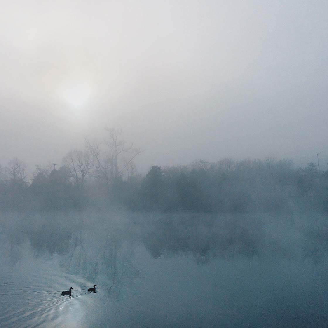
Warmer colors tend to be more stimulating and connote the feeling of warmth and excitement, while cooler colors suggest a feeling of coldness and tranquility, and sometimes even sadness.
Learning how the light affects the color in your photos is a matter of practice and experimentation. Color will be rendered differently in your photos depending on the amount of light and the kind of light that is present.
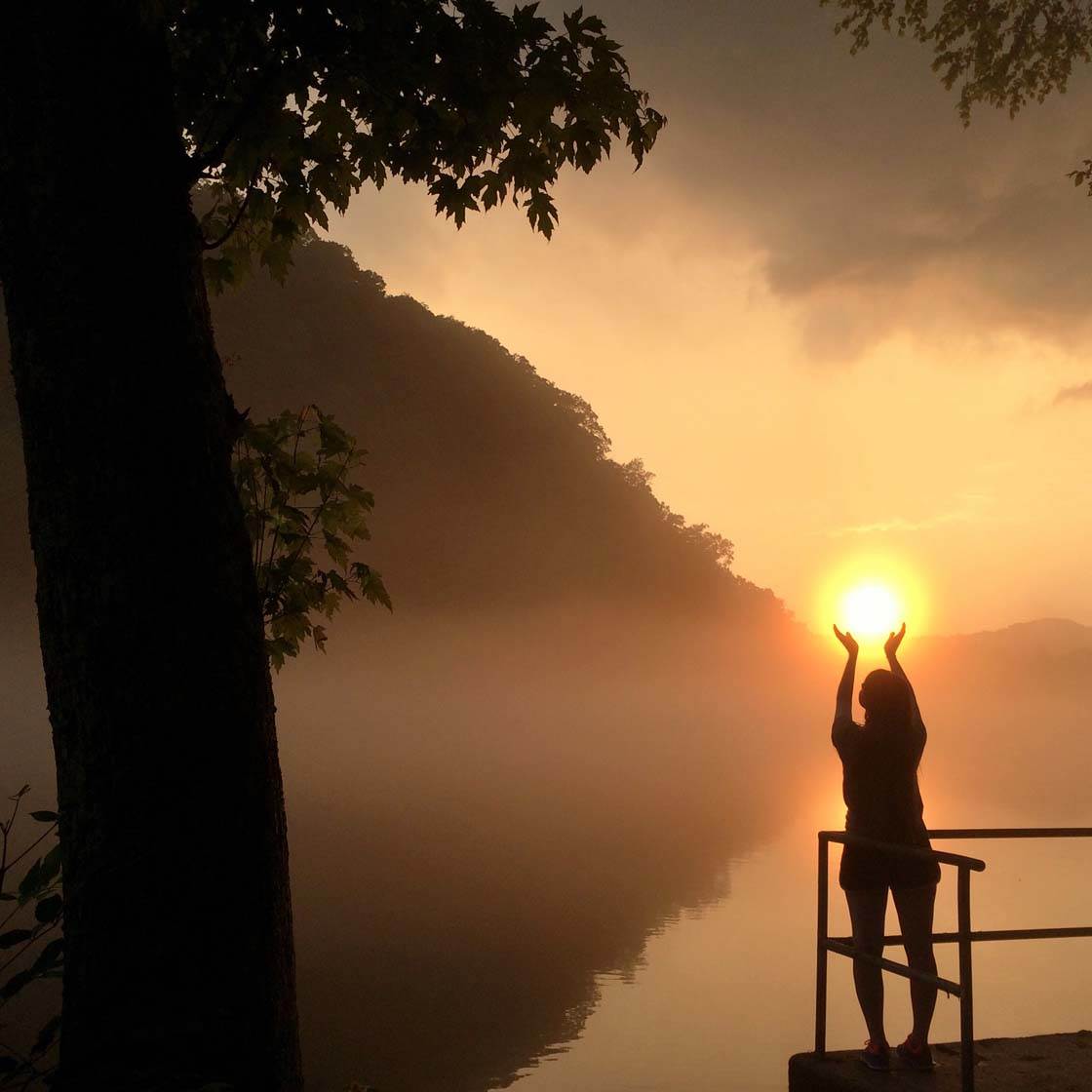
When taking pictures outside during golden hour (the hour after sunrise and the hour before sunset), the color of the light is warm and will cast a golden glow over your scene as shown in the photo above.
Now contrast this to the photo below that was taken during blue hour (the hour before sunrise or after sunset). As the sun sinks lower in the sky, the warm light of golden hour turns violet and then to blue, creating a completely different mood in your photo.
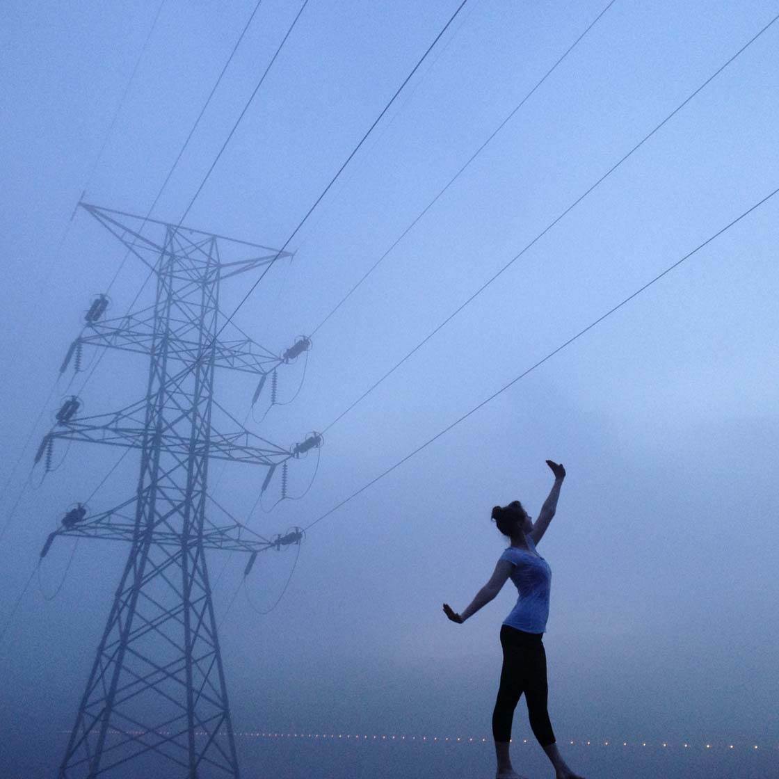
As well as the different colors emitted by natural light, bear in mind that any kind of artificial light will usually create unusual color casts in your photos. Incandescent light bulbs and candlelight cast a yellow or orange glow on your scene, whereas fluorescent lights look white to our eyes but may create a greenish tint in the photo.
10. Alter Colors In Post-Processing
While it’s important to try and capture the correct color of your subject, sometimes it may be necessary for you to enhance, correct or alter the colors after you’ve taken the photo. It may be because the light changed the true colors of the subject or simply because you’re making an artistic choice to alter the image in some way.
You can change or enhance colors in your photos using most image editing apps. Even the native camera app has a few filters that you can use. I like to use Snapseed for most of my post-processing edits. The Snapseed photo editor offers a powerful set of color tools for working on your image.
One option for altering colors in post-processing is to adjust the color temperature towards either the orange or blue end of the scale. This allows you to warm up or cool down the colors in your photo, depending on the mood you want to create.

Above is the original photo that I decided to work on in Snapseed. I wanted the image to appear a cooler blue to create a more wintery and tranquil feel. Below is the end result after making my color adjustments.

I’ll briefly show you the step-by-step process that I used to make these color adjustments in the Snapseed app.

I began by opening the image in Snapseed, then tapping the plus icon (+) on the main screen. I then selected the Tune Image tool from the list of tools shown below.

You can now swipe up or down on the screen to access the list of settings that you can change. I selected the Warmth tool which is used to make the colors warmer (more orange) or cooler (more blue). Now just swipe left or right to adjust the color – I set the value to -60 which made the colors cooler.

I also adjusted the Brightness, Ambience and Contrast settings to +10 (simply swipe up or down on the screen to access these settings, then swipe left or right to adjust the value).
Another adjustment you could make is to the saturation of the colors in your image. For maximum impact and boldness, try over-saturating the colors in post-processing to make them more vibrant.
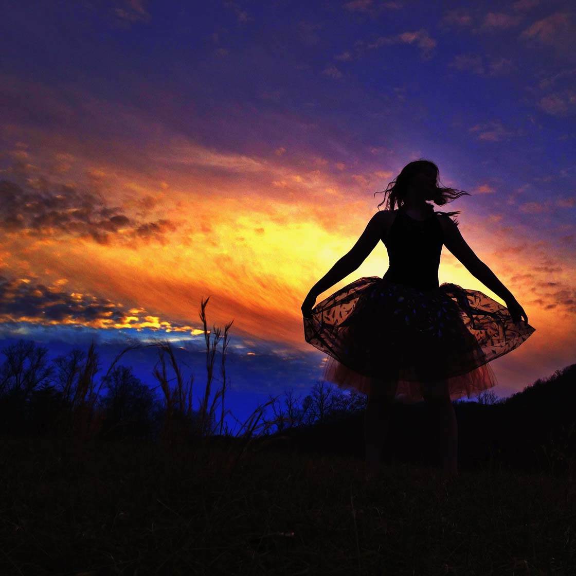
I increased the saturation in the photo above to make the colors of the sky really vivid. Even though the over-saturated color is not natural, it can be used for very dramatic results. Don’t go overboard though, otherwise your picture will look too cartoonish.
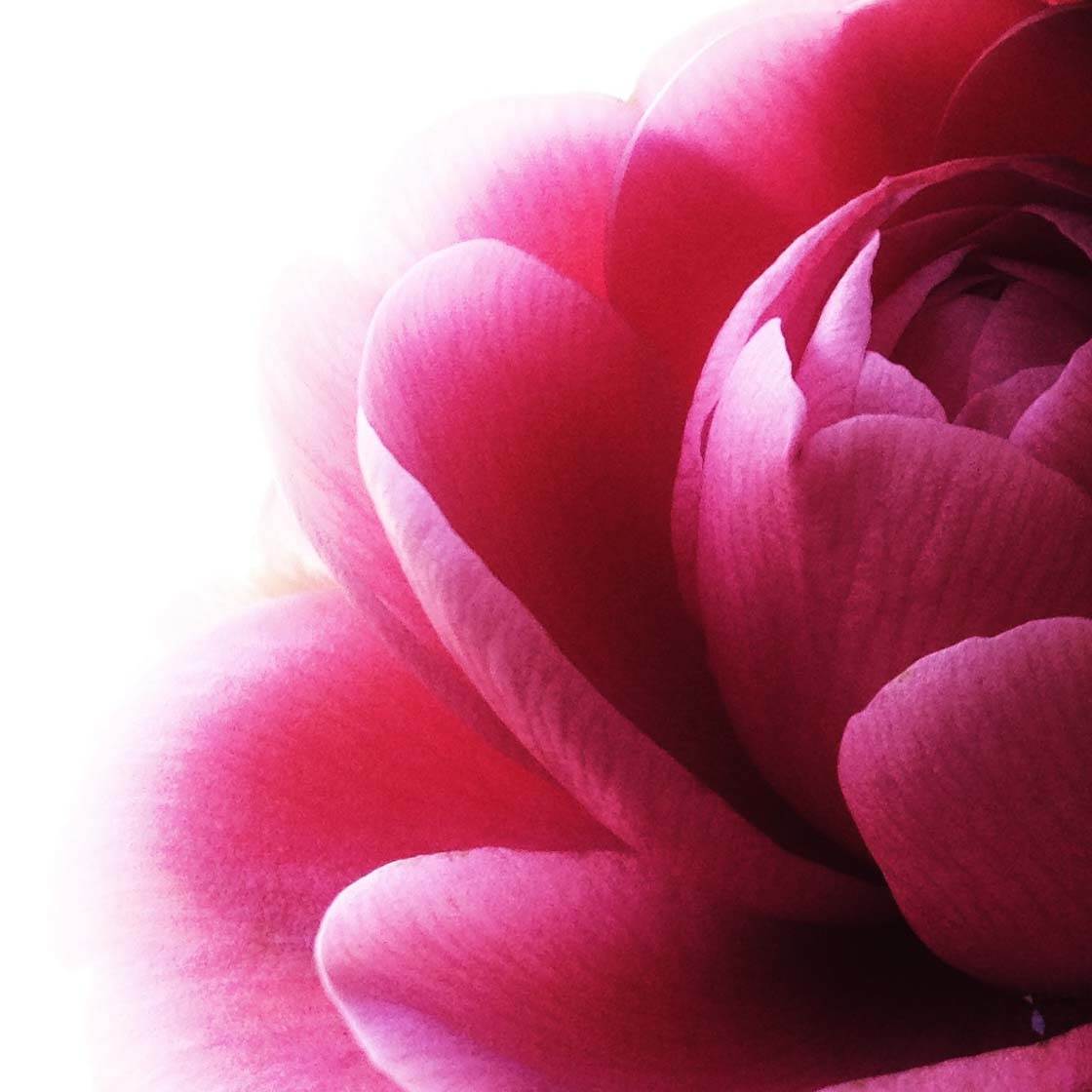
Increasing the color saturation of flowers can work very well. It makes the colors really pop, giving maximum impact to your photo. Increasing color saturation doesn’t usually work well on photos of people though, as their skin tones will become more orange.

Taking the saturation slider the other way will desaturate the colors in your photo, making them less vibrant. This creates a softer image, with a more dreamy or vintage feel to it. Of course, if you completely desaturate the colors, the image will have no color at all and will appear black and white.
11. Remove Color To Create Black & White Images
If you have an image that has distracting colors, blown out (over-exposed) whites, unsightly lens flare, or if the colors take away from the overall feel of the photo, you could convert it to a black and white photo in post-processing. You can easily do this in a photoshop app such as Snapseed.
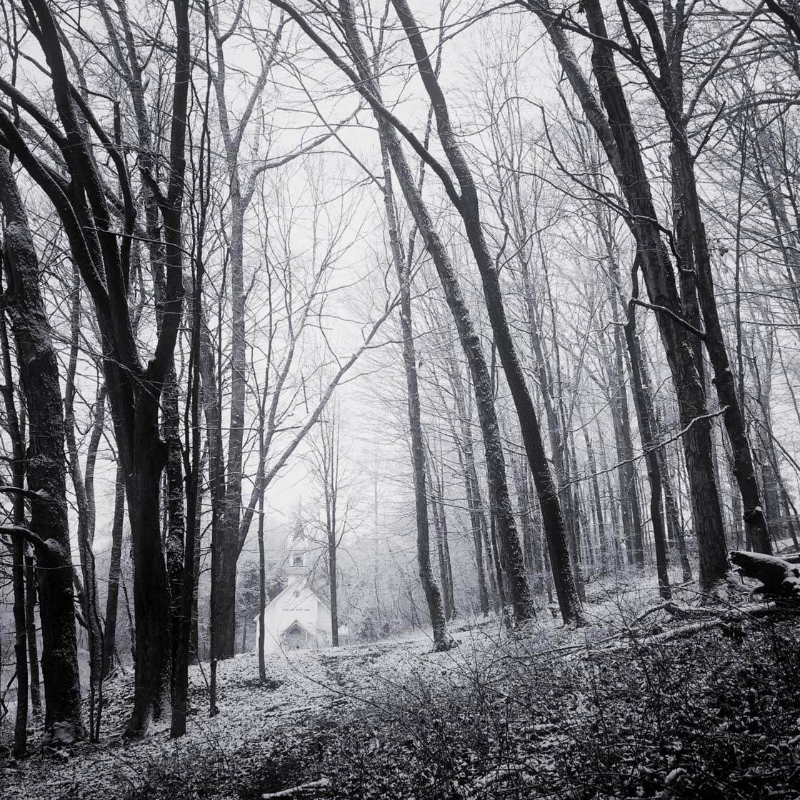
Make sure that there’s sufficient contrast in the image, with dark shadows and bright highlights. You don’t normally want a large portion of the photo to have just different shades of gray as it’s likely to look washed out and uninteresting. It’s the contrast between the dark and bright areas of a black and white picture that creates the visual interest.
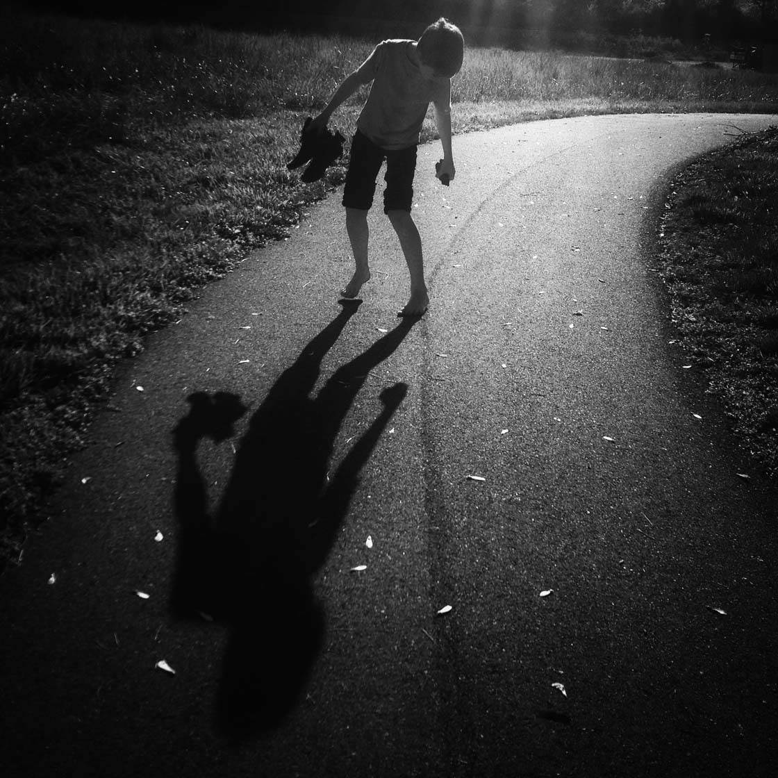
In the photo above, I decided to make the photo black and white because of an unsightly purple lens flare. I also wanted to emphasize the long shadow and the leaves which stood out better without any color.
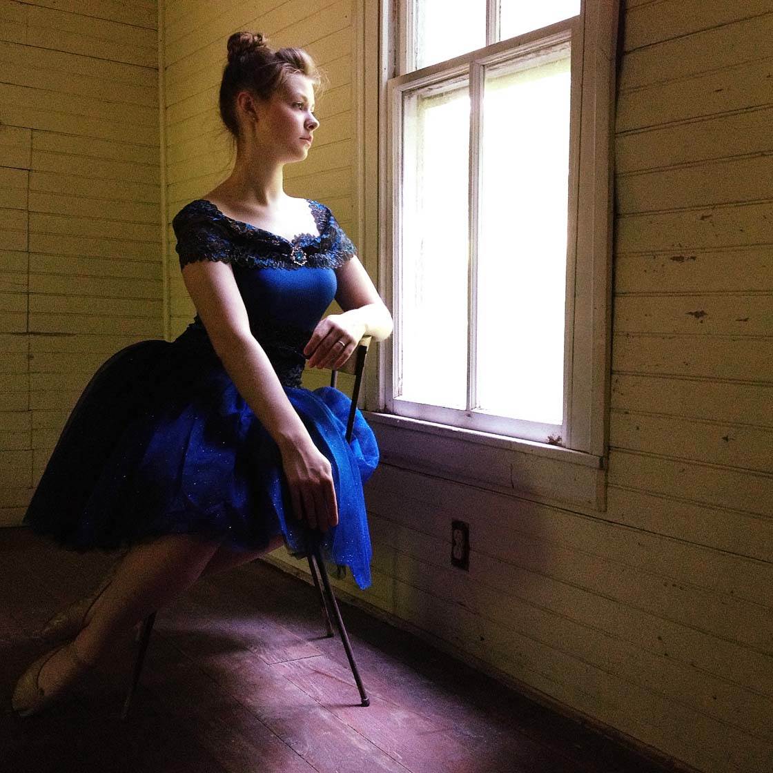
In this color photo, notice how the colors of the girl at the window did nothing to enhance the overall image. The room didn’t have great lighting and it caused the walls to reflect an unpleasant green and made the floor look purple.
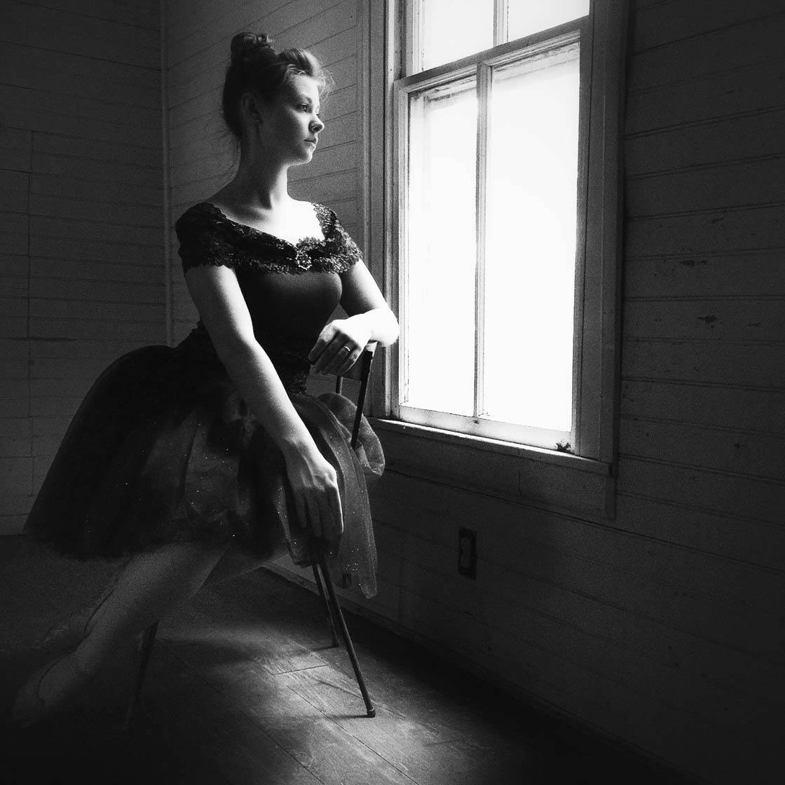
When I changed it to a black and white photo, it placed the focus on the girl and the beautiful window light. All of the problems caused by the distracting and unsightly colors are gone, creating an image that’s much more pleasing to the eye.
So if the colors don’t work out in your iPhone photos, don’t despair! Try converting it to black and white and you might be surprised at how much better it looks without any color at all.

Thanks for these great tips Karyn. Your wonderful images really demonstrate the importance of colors in our photography.
Thank you, Kate!
Wonderful tips. Thank you! I had Snapseed but didn’t know how to use it. Just had a play. Am signed up and ready to improve my photography and editing skills! So glad I stumbled across this site. 🙂
Hi Sarah. Really glad to hear that. There’s always something new to learn here 🙂
🙂 .. I’ll be back soon! Thank you.
Thankyou ,will put into practice your helpful tips
Thanks for sharing!
Very enlightening, I have a few shots in mind that I would like to edit, in different ways. Thank you.
Thanks for sharing and the time you spent writing this article!