Making the most of the colors in your scene is a great way to compose incredibly eye-catching iPhone photos. There are so many ways that you can use color to grab the viewer’s attention and draw the focus toward your main subject. With a few simple techniques you can use color to greatly increase the impact of your photos. In this tutorial you’ll discover how to create stunning iPhone photos by taking advantage of the colors in your scene and using them as a foundation for your compositions.
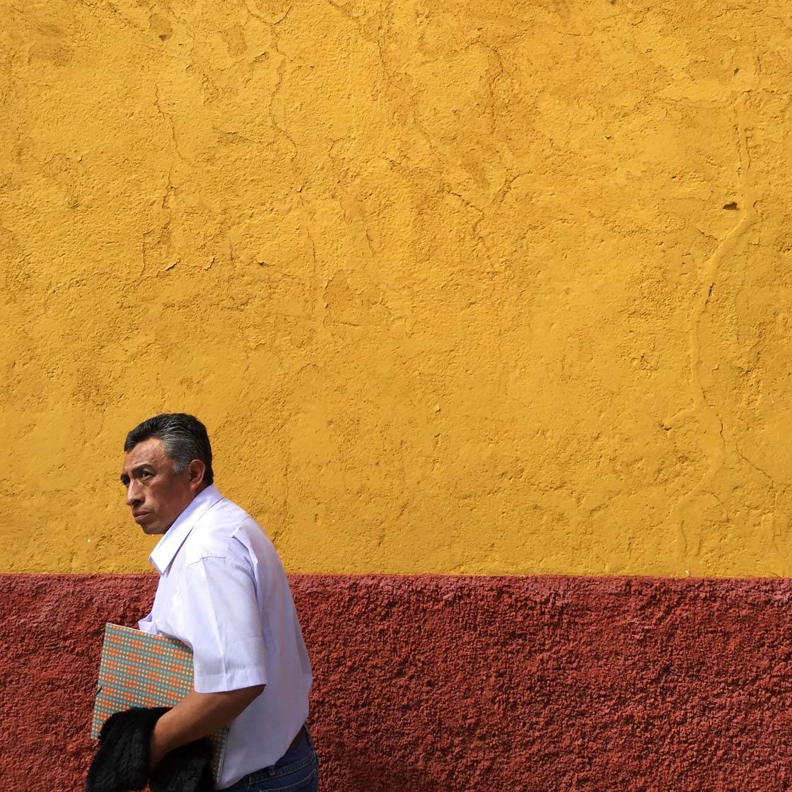
1. Find Accent Colors
An accent color is one that stands out against the other colors in the scene. Capturing an accent color in your photos will have a powerful impact because it creates a strong focal point that instantly catches the eye.
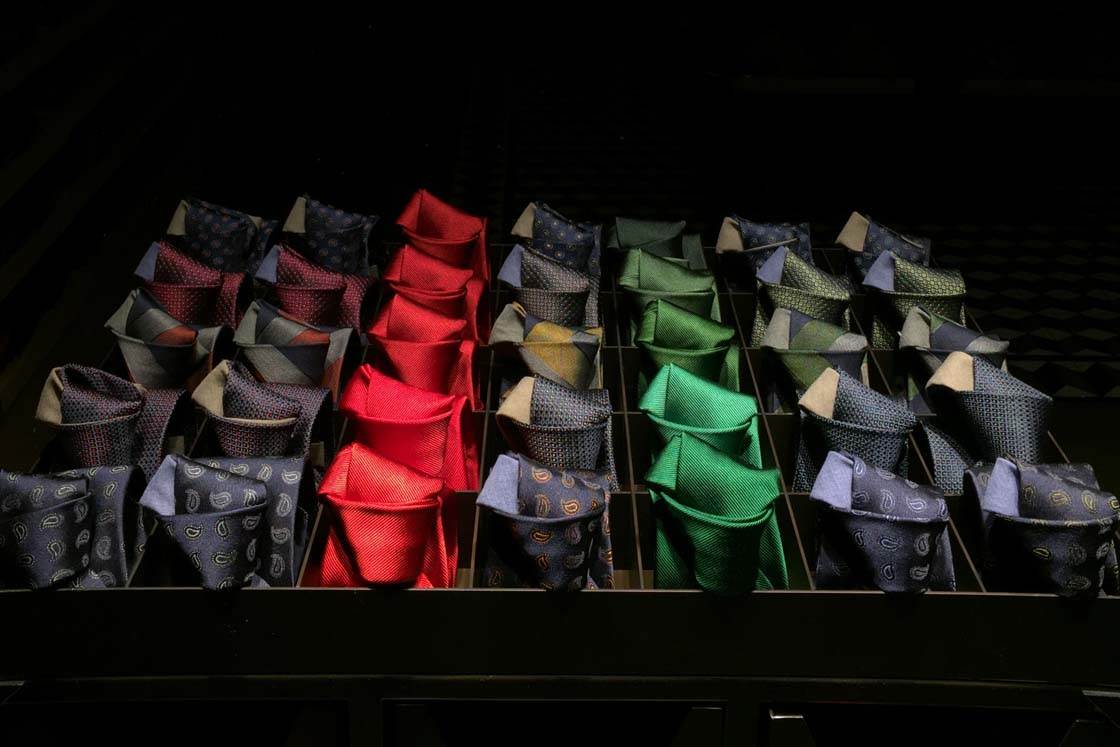
This men’s fashion shop in New York city clearly had a window stylist who knew what they were doing. The result of this window design is an accent color of red that visually reaches out to the viewer and pulls them in.
Accent colors are not limited to red of course, however red seems to be a favorite with designers as it’s a powerful and alluring color.
So whenever you’re taking photos, look out for neutral colored scenes that contain a single accent color that you could use in your composition.
2. Use Colorful Backgrounds
Whenever you find a colorful wall, building, or any other type of colored background, think about how you could use it as the backdrop for your photo.
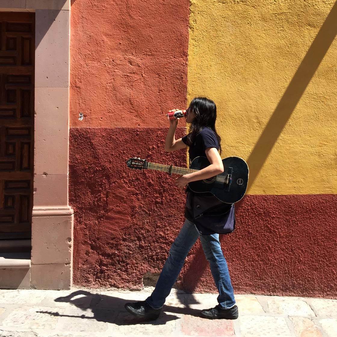
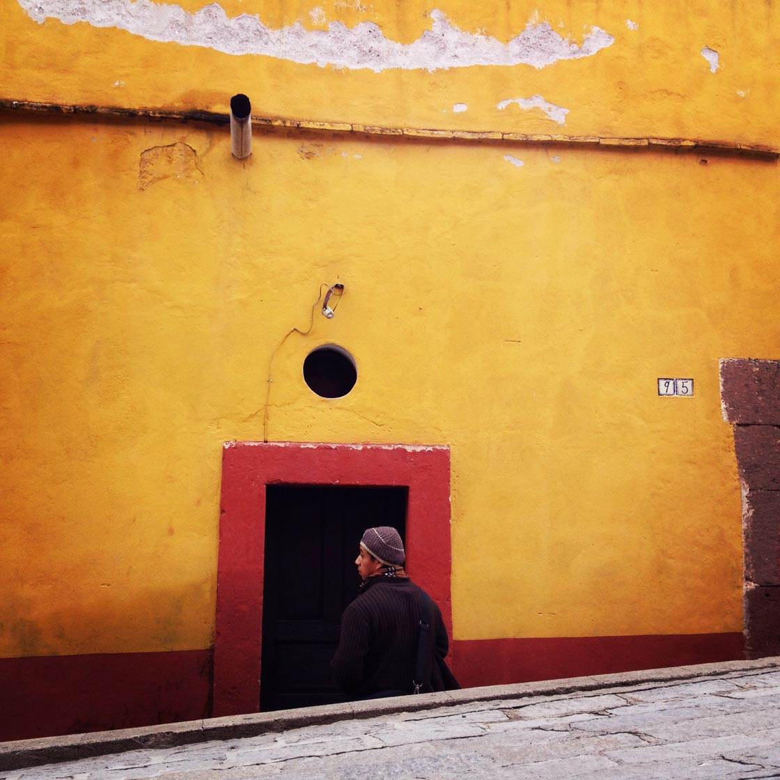
While the colorful wall might make a great photo on its own, it will really come alive if you include a human subject in the scene. A person tends to add “soul” element to your picture and helps you tell a more interesting story.
Once you’ve found a great background, compose your shot, then wait for someone interesting to walk into the frame – or have a friend walk in as a favor.
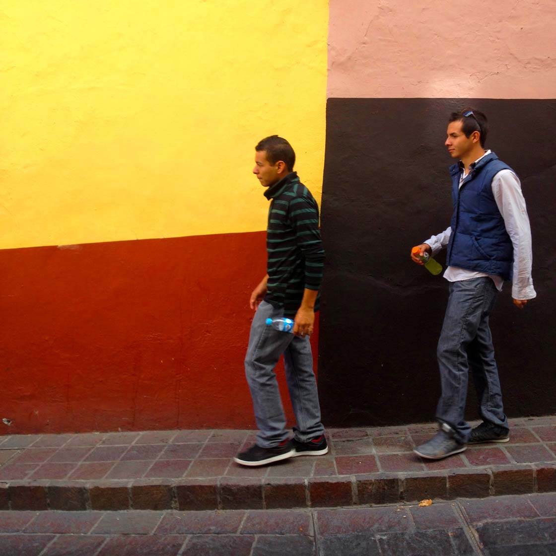
While this waiting technique in street photography works for a non-colorful background as well, I find that having a colored backdrop really makes the shot.
3. Use Color To Frame Your Subject
The “framing” composition technique is a great way of drawing attention to your main subject. Color can often be used to create a visual “frame” around the subject.
This narrow Mexican street is a prime example of a “framing device.” If you encounter such a scene, compose your shot so that the colored objects are creating a natural frame around the edge of the scene.
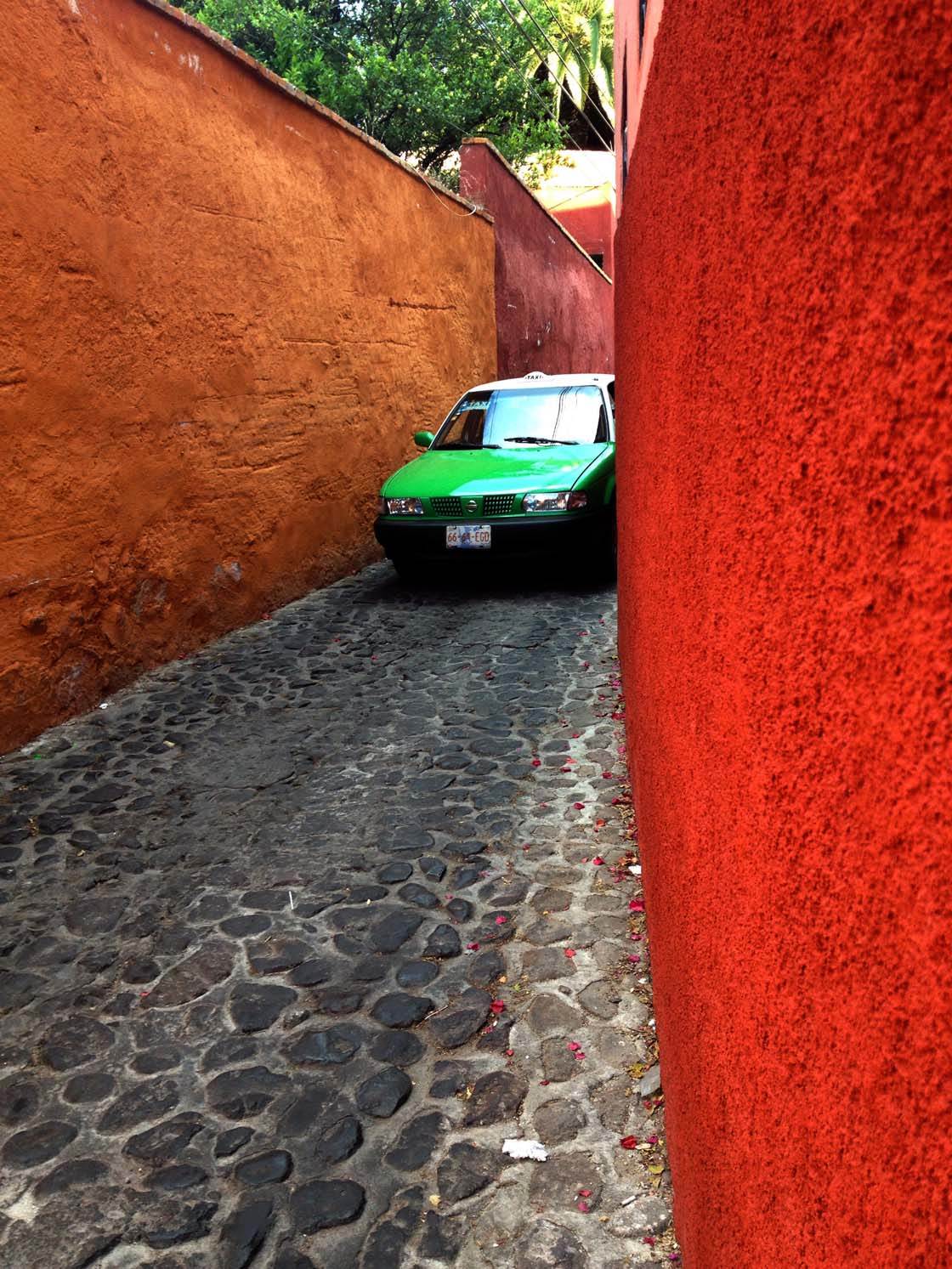
Then wait until a primary subject (a car, cyclist, runner, animal, etc.) comes into the scene before snapping a few shots. In the case of the photo above, a green taxi became the primary subject, framed by brilliant red and earth-toned walls.
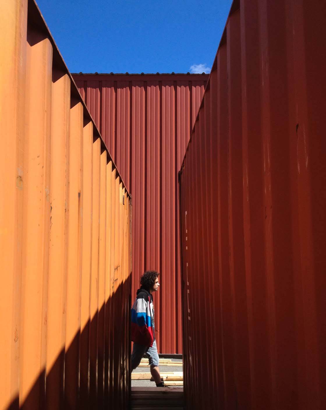
Whenever you see two columns or walls of color, wait for a colorful subject to enter into the “frame.” You could also look out for painted doorways and arches that will create a frame around your subject.
4. Use Color To Mimic Geometric Forms
Geometry has been a mainstay in art theory ever since Aristotle put language to visual design. And pro photographers often use color to “trace” geometric forms such as circles, curves, triangles and symmetrical scenes.
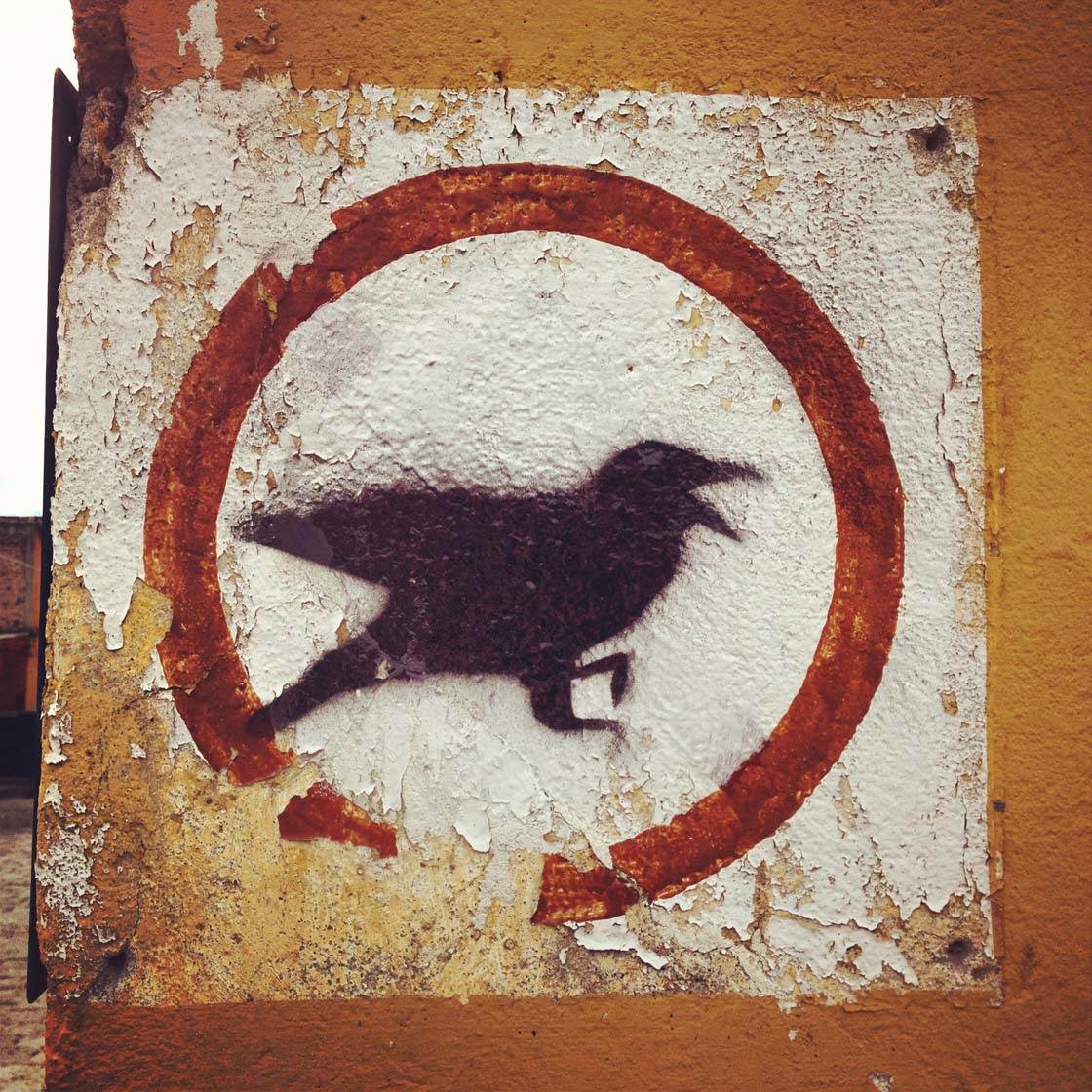
So why is geometry so effective when composing photos? Geometry is important because each shape provokes a different emotional response in the viewer.
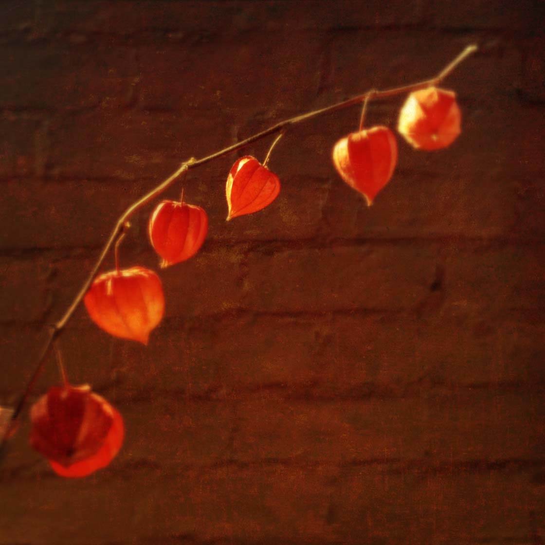
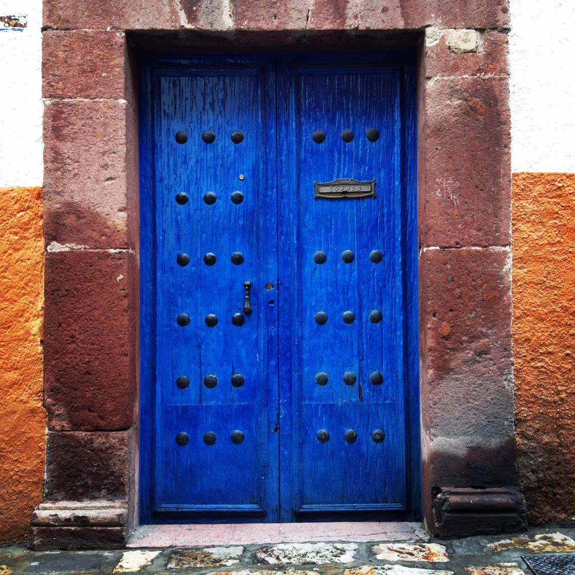
A circle is known to be all-inclusive. A triangle is sharp and “directive.” Curves are sensual and inviting. Symmetry is solid which gives the viewer a sense of permanence and an emotionally safe foundation.
Keep in mind that the geometric forms don’t need to be perfect – they only need to suggest the form. For example, in the photo below, the red flowers mix with the shape of the Spanish Colonial style villa to create a triangle.
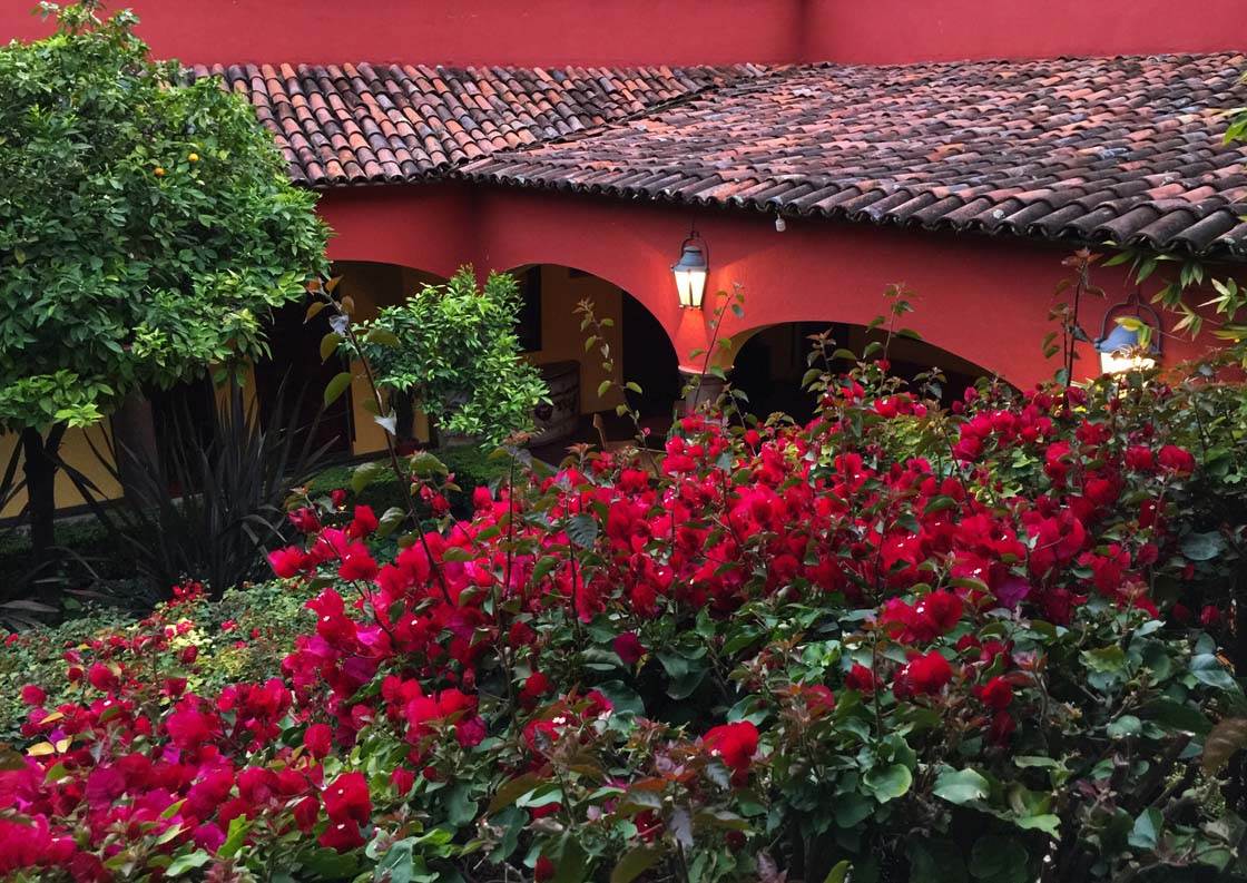
Yes you have to put some imagination in the mix, but we can “see” a triangle in that shot made by the roof-line, flowers, and a possible “just out of the left frame” line that closes the triangle.
5. Use Color As A Basis For Minimalist Photos
Minimalist compositions tend to have very few visual elements. The image gets stripped down to its bare essentials, such as color, shape and texture.
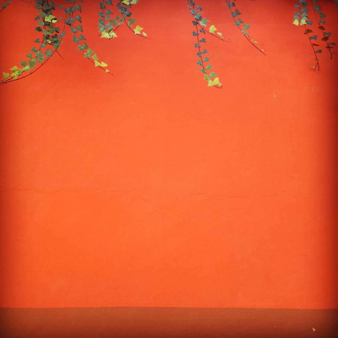
To create great minimalist photos, look for colorful walls that have plenty of empty space. If you include elements like leaves from a tree, make sure they occupy only a small percentage of the space.
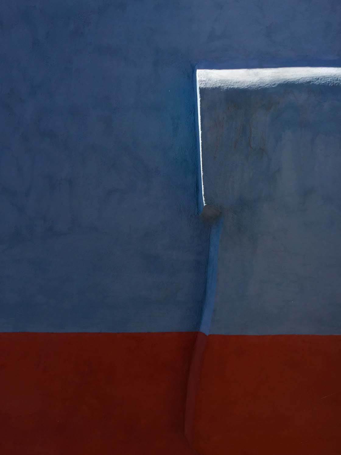
If you want to include variations in a wall that catch sunlight in a unique way, try and compose your shot so that there are no other subjects in the photo. The colors and the light will be the only elements that create your wonderful minimalist image.
6. Use Color To Demonstrate The Rule Of Thirds
The rule of thirds is a compositional tool that divides a picture space into three horizontal parts and three vertical parts.
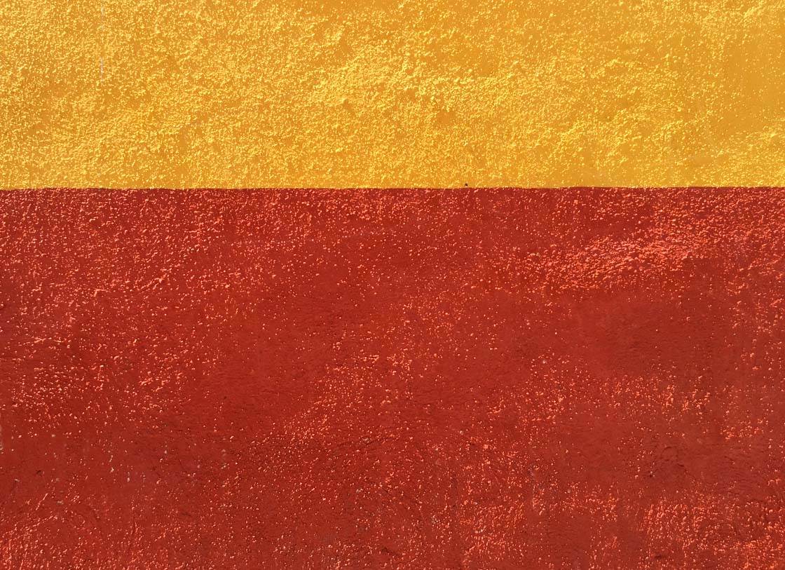
If you switch on the grid in the Camera app (Settings > Photos & Camera > Grid), you’ll have a visual guide that you can use to line up the elements in your photo according to the rule of thirds.
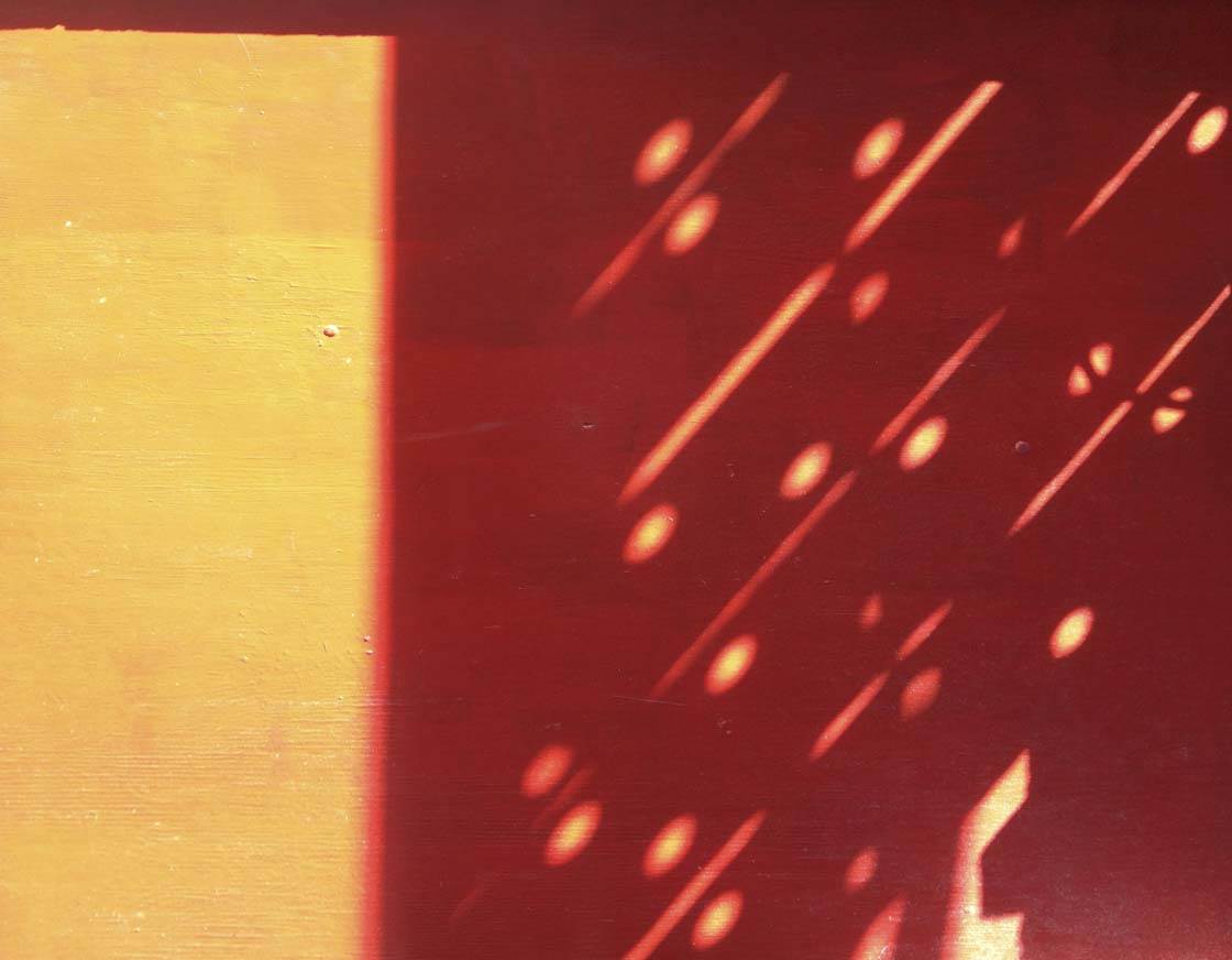
In these sample photos you can see that one color section occupies one third of the picture, while another block of color occupies two thirds of the space. This thirds concept works with both verticals and horizontals.
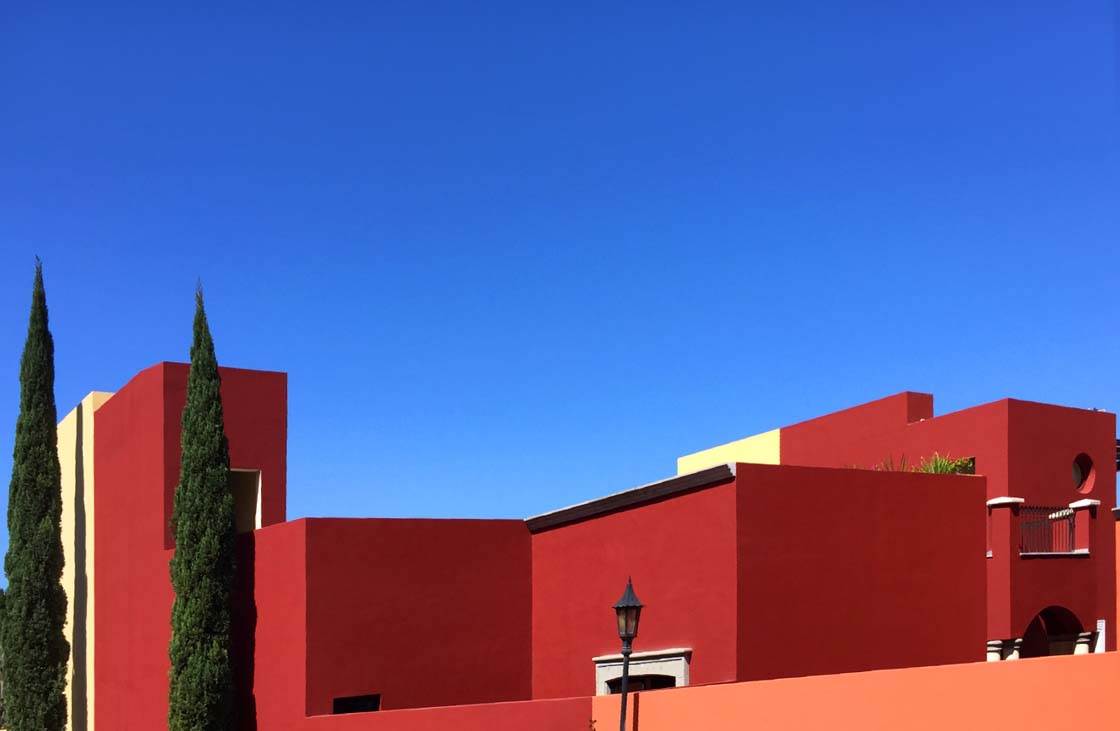
While the rule of thirds is not at all limited to color photos, actively looking out for blocks of color that you can photograph by lining up the colors according the rule of thirds grid is fun and rewarding.
7. Use The Blue-Yellow Combination
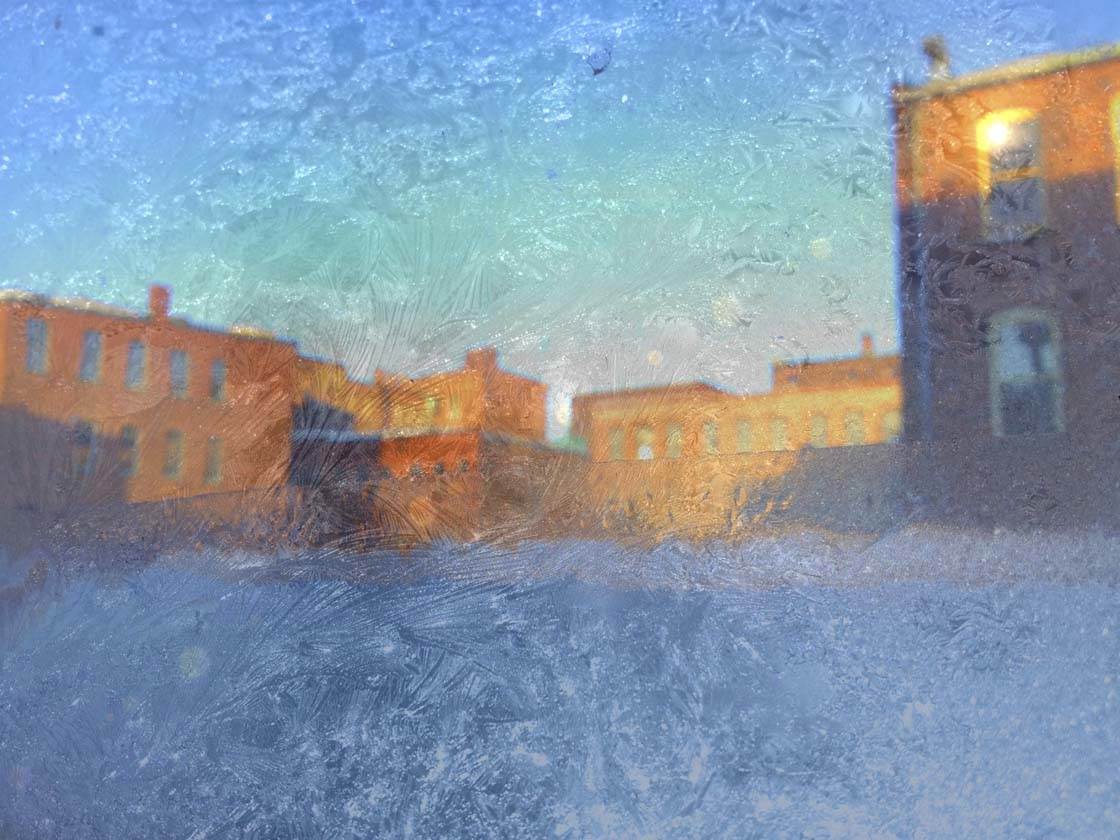
The two colors that work the best together in a single photograph are blue and yellow (or blue and any warm tone like orange).
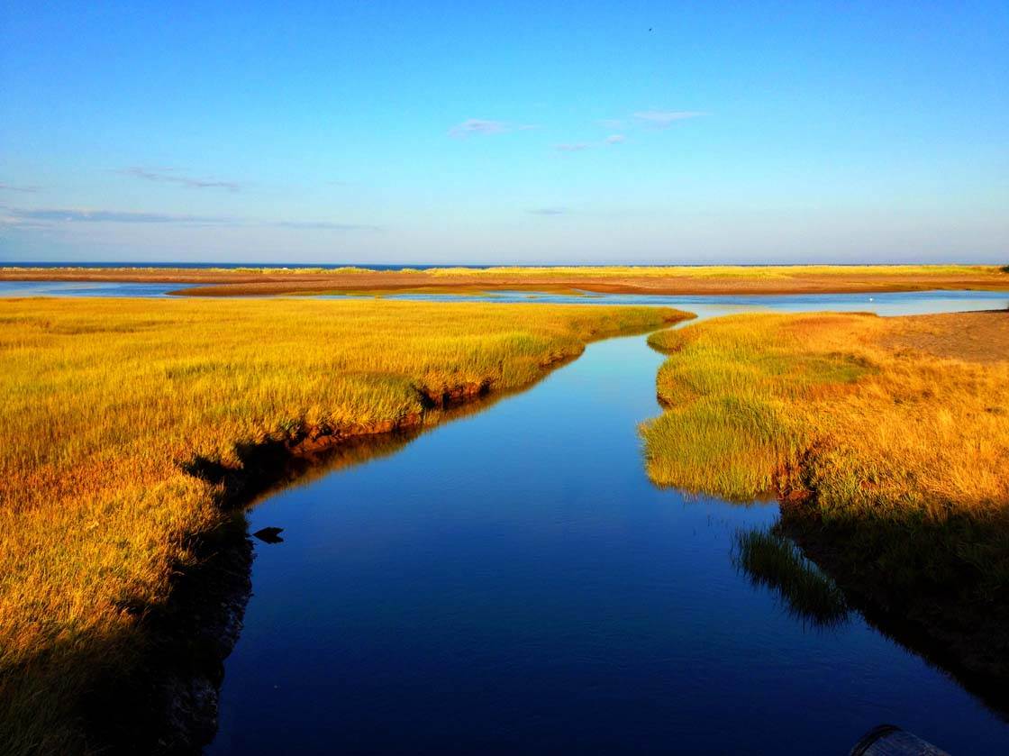
This dynamic duo can give the viewer a sense of both warm and cold in the same shot, and when used with water and land they can elicit a sense of peace and tranquility in the viewer.
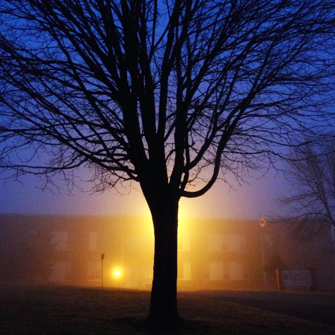
When out on a photo shoot, or just walking around town with your iPhone in your pocket, always be on the lookout for blue and yellow combinations that you can use in your photos.
8. Experiment With Backlighting Leaves
Photographing green leaves with normal frontal or aerial light is nice, but there are millions of such iPhone photos.
For a more unique approach, try laying on the ground with your iPhone pointing skyward while the direct sun hits the top side of the leaf or plant.
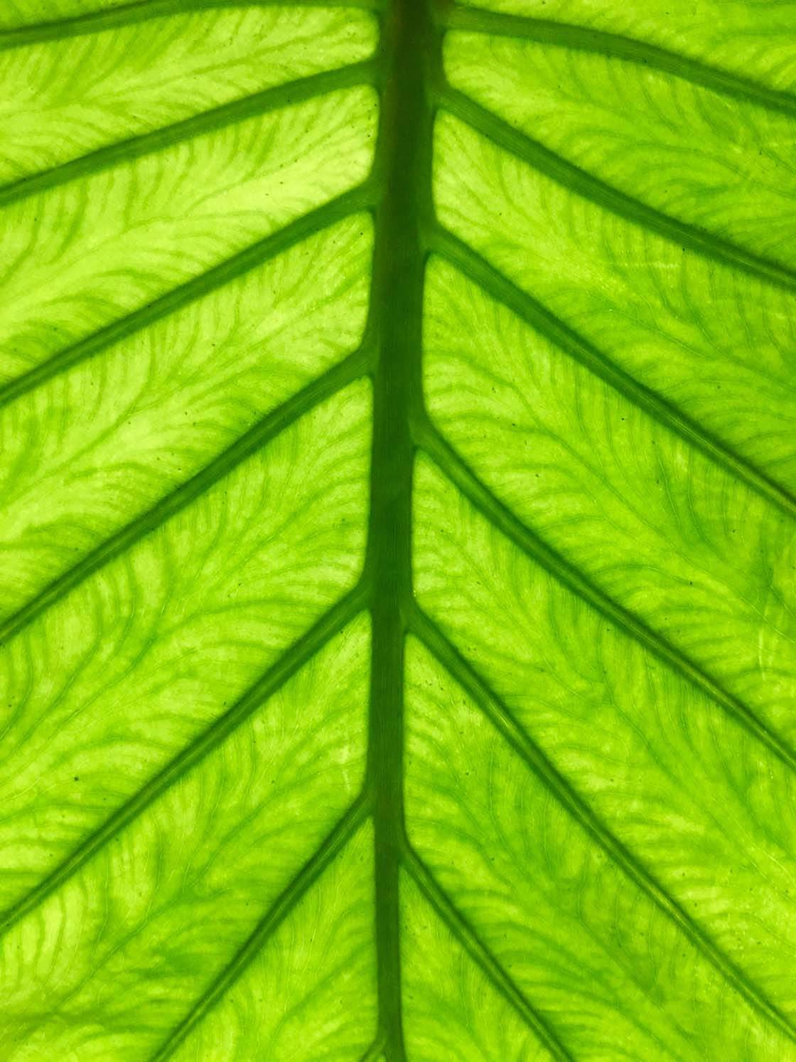
When photographing foliage with the sun as a backlight, you can often walk away with a lovely greenish glowing abstract image.
Keep in mind that your iPhone may automatically want to under-expose the photo. If this happens, simply increase the exposure manually by swiping up on the screen after you’ve tapped to set focus.
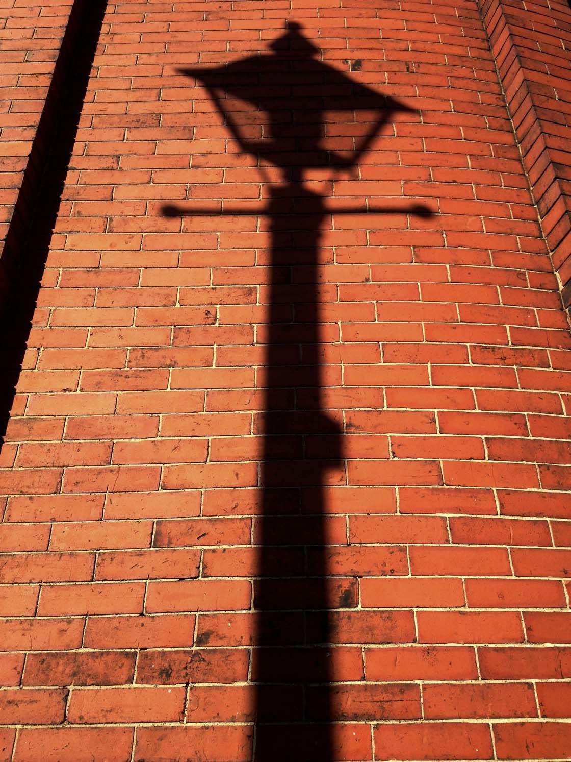
9. Watch For Shadows On Colorful Backgrounds
City photo walks are fun, especially when it’s approaching dusk as the low light casts great looking shadows on building walls.
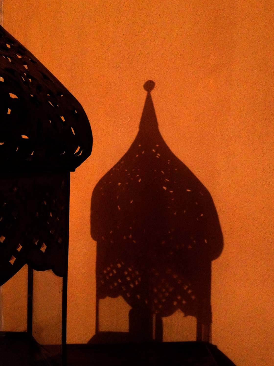
While shadow photos work really well in black and white, color shadow photos are stunning. The nice thing about shadow photos is that no two photos are the same because the sun is constantly shifting westward.
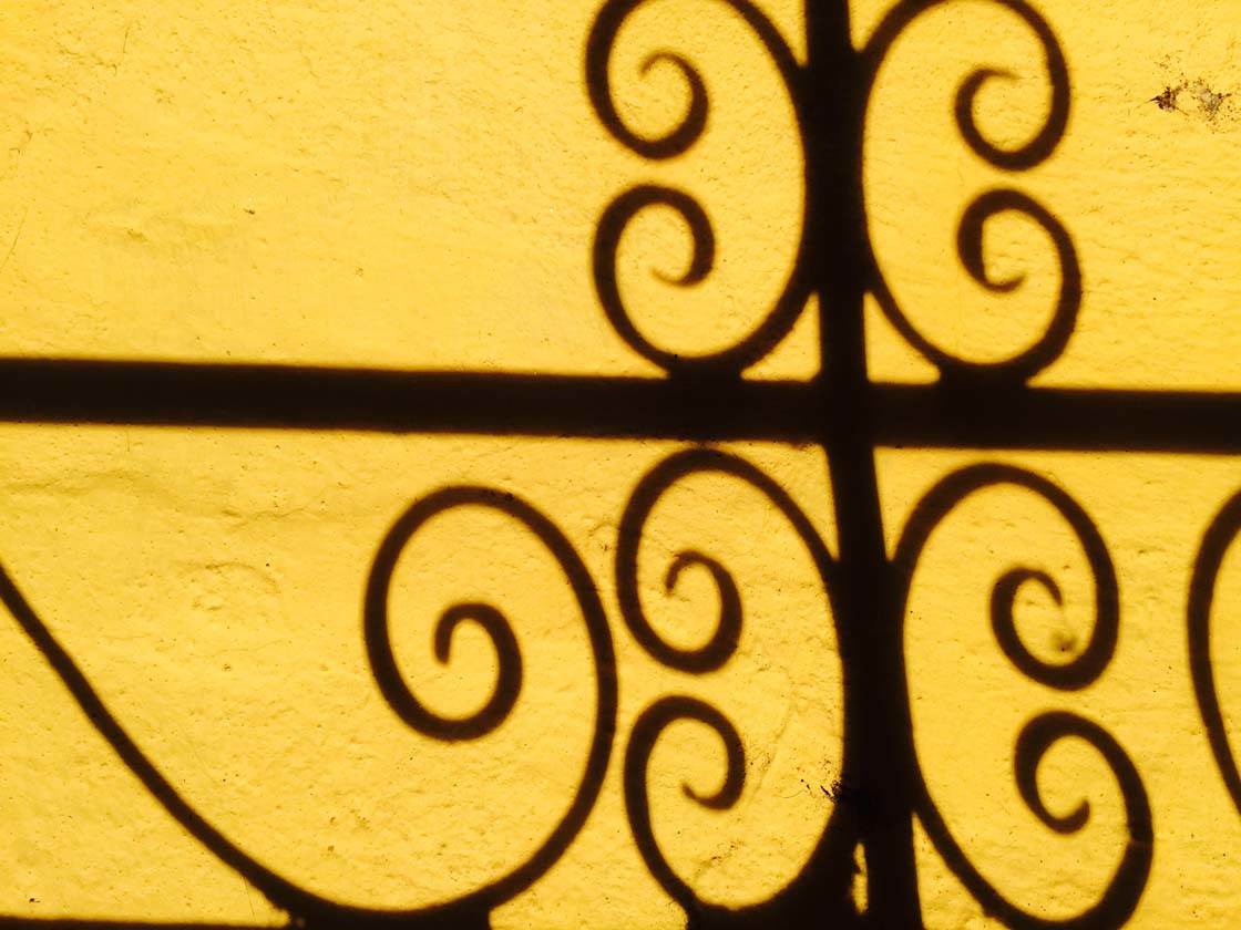
This uniqueness factor allows for an almost unlimited supply of diverse photo opportunities. Look for colorful walls in your city and have fun with the evening light!
10. Look Out For Colorful Cars
Cars are a great subject to photograph. While many vehicles are a less-than-exciting gray color, almost every day you’ll be able to spot some real gems that are painted brightly.
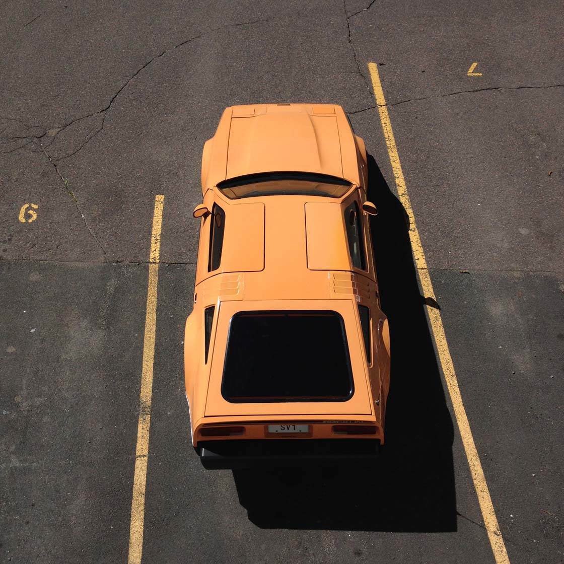
If you can match colors in the rest of the scene with the color of the car, your composition will be even more effective, creating a cohesive image that’s pleasing to the eye.
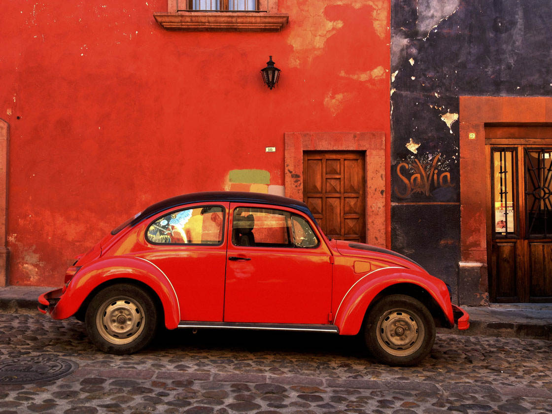
Have you ever heard of the word “anthropomorphism”? In the context of photographing cars, it means that you treat the car as a subject for portraiture in a similar way as you would a person.
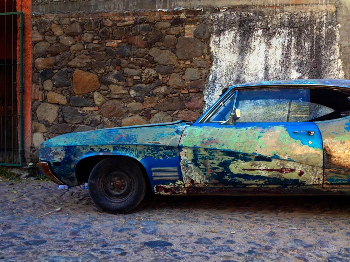
Essentially, you see the car as a “person” and compose them in the scene as you would a human. This is a fun challenge, and one that I love to set myself when I’m out shooting with my iPhone.
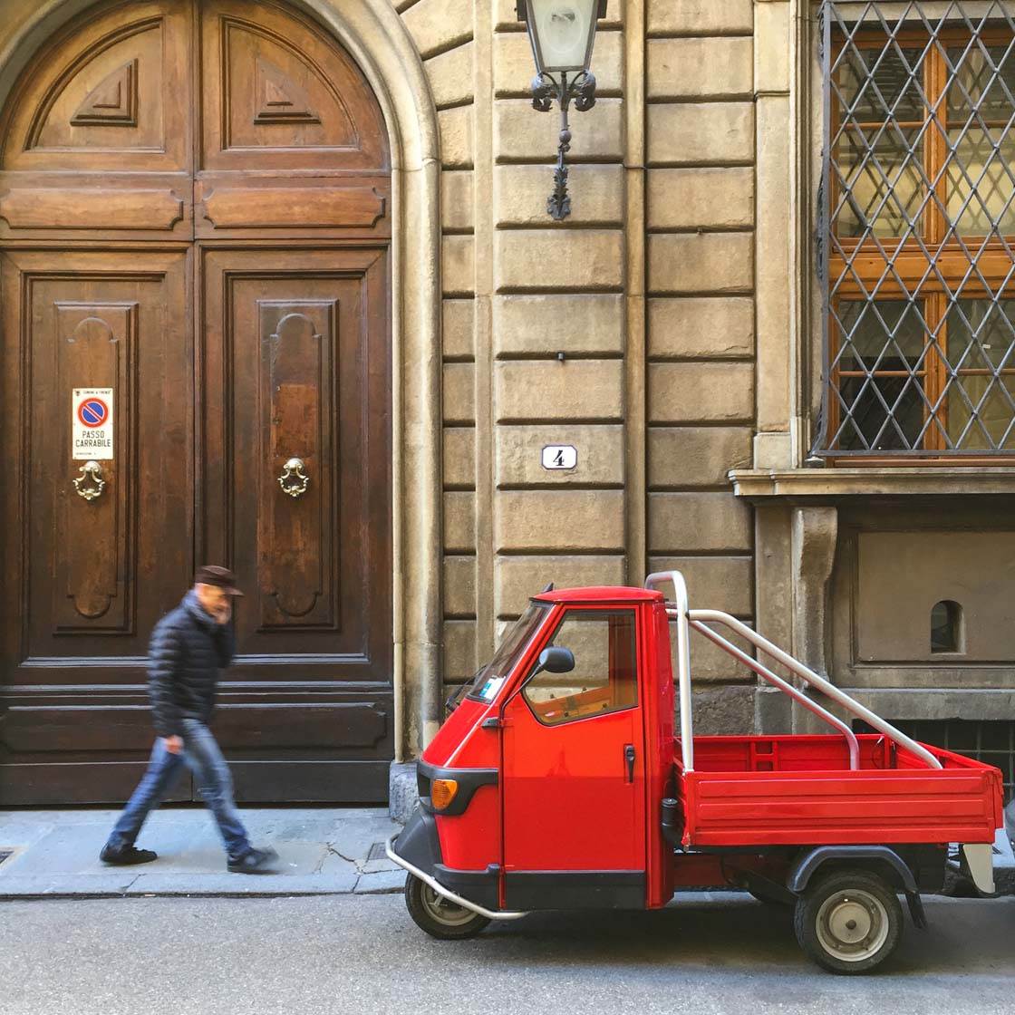
By doing this you’ll often find that the car takes on a life of its own after you’ve created their portrait.
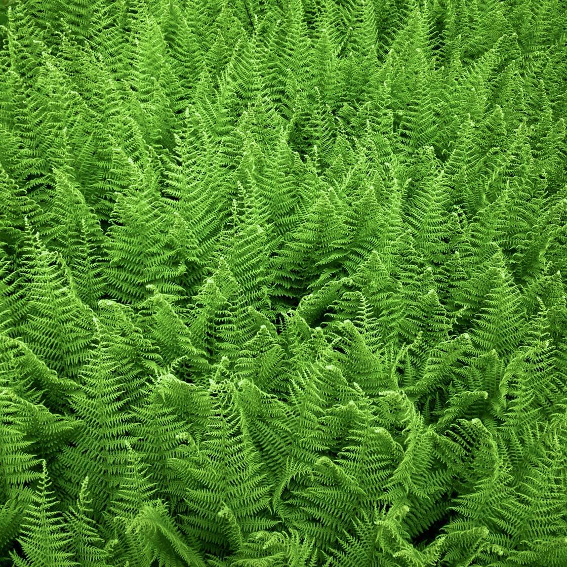
11. Adjust The Hue Or Tint Of Greenery
Have you noticed that adding warmth (yellow and orange) to a nature photo in post-processing usually makes the scene more inviting? Well that technique doesn’t always ring true when the entire scene is made up of green tones.
When you’re photographing a field of green, you may find that the image comes out with a bit too much warmth if you edit using this technique.
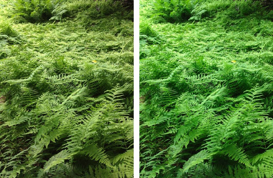
An easy fix is to use adjust the Tint or Hue slider to the green end of the spectrum, instead of the magenta side. This is a quick and easy way to make your green scene visually jump out at the viewer.
12. Adjust The Blue Tone To Add Emotion
Take a look at the photo of seashore stones on the left below. This is a normal photo that looks attractive. But when you take texture-style photos like this one, why not see if you can add some emotion by adding a cool blue tone?
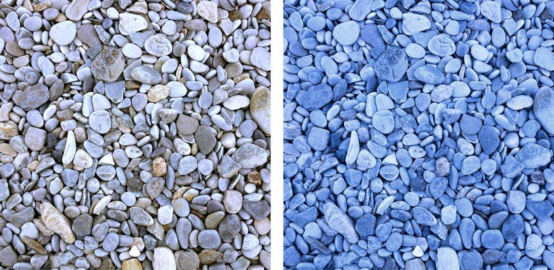
We’re very used to adding warmth to our images, but we rarely add blue. While blue is often associated with coldness, disassociation, and emotional distance, it can also elicit a positive response of refreshment and clarity.
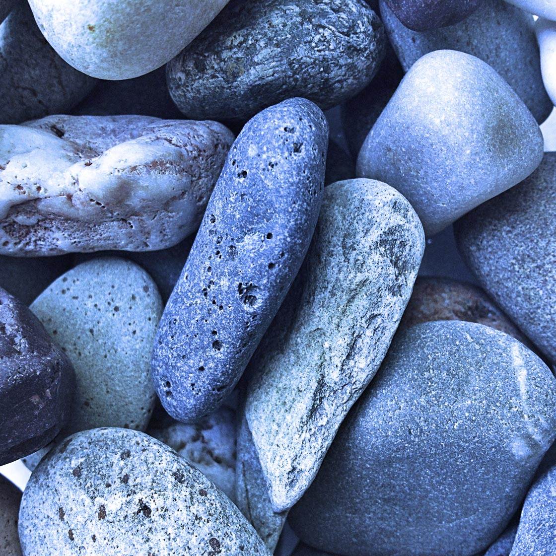
Adding blue to your photos is as simple as adjusting the Warmth slider (or similar blue-yellow slider option) to the left when you’re editing your photos. Or if you’re editing with the iOS Photos app, use the Cast slider.
Further Inspiration
I hope these techniques have given you plenty of ideas for how you can use color to create compositions with maximum visual appeal.
But if you need some more inspiration to get into the color mood, a simple option to get some ideas is to do a Google search for colorful photos.
My first introduction to radical use of color was from the “Father” of color photography, Pete Turner. He inspired me to really take advantage of color, and make use of it as a foundation for compositional principles.
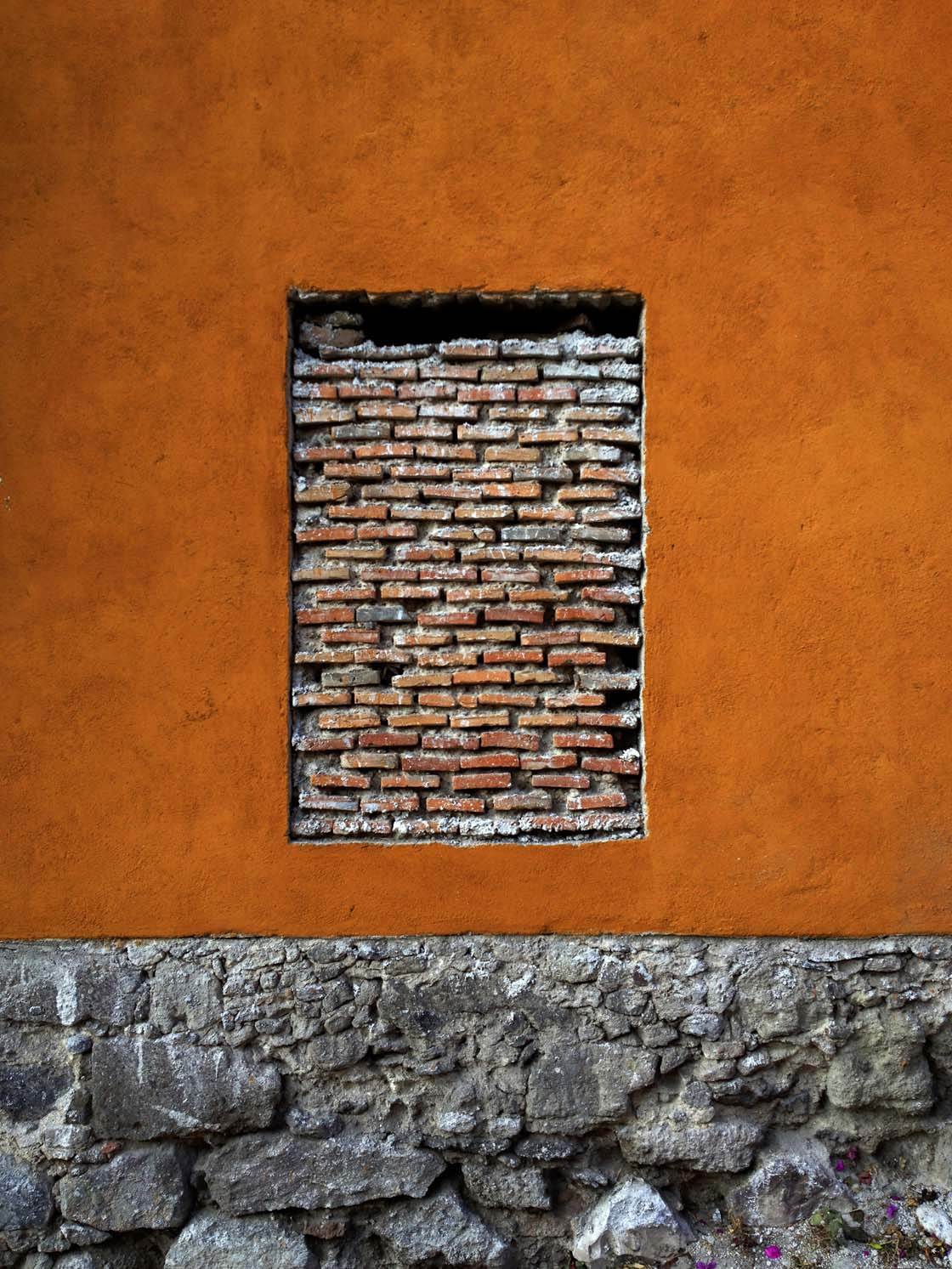
Since those early days with manual SLR cameras and slide film, until now with iPhones and many other camera types, I’m a devoted fan of color! I’d definitely recommend that you study color masters like Pete Turner and discover what made them tick.
You should also check out our article on how to use color more effectively in your iPhone photos which will provide you with a good foundation on color theory.
The world is full of color – now it’s up to you to capture it!

Thanks for sharing all these great ideas for enhancing our photos with colorful shots. I recently went on vacation to London, Amsterdam and the South of France after taking a course from Mark on how to improve your vacation photos. I found myself using the information Mark shared and the results were great! Thanks Mark for this great share.
Great to hear that Kim. Mark is a fantastic photographer teacher! 🙂
Strange how Blind we can be until someone ignites our passion an opens our eyes. I will see much more now, Many many thanks.