How can knowledge of color make you a better iPhone photographer? There are so many ways! In this article, award-winning artist and photographer, Pamela H. Viola, provides a fascinating introduction to the world of color and its importance in photography.
The Color Wheel
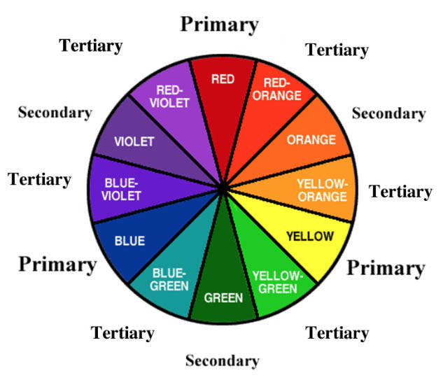
We learn as children that red, blue and yellow are primary colors, and that colors directly opposite them on a color wheel (green, orange and violet) are complementary colors.
Primary hues are considered pure, meaning they are not a combination of two or more separate colors. Complementary colors are a result of mixing two primary hues.
How does that relate to the photographs you make? Put simply, color begins with light, and photography is recording the light that reflects from a subject. Understanding color leads to making photographic choices that will improve your images and communicate your ideas more successfully.
We’ll now take a look at six important considerations when it comes to using color in your iPhone photography. Color in photography is usually discussed as hue, saturation and luminance (often called value in painting) so lets begin with those terms first.
1. Hue
When we say a color is orange, olive or pink we are referring to its hue. Hue is just another word for color.
2. Saturation
Saturation (also called chroma) refers to the intensity of the hue. How pure is the color? A saturated color is achieved by using one wavelength at a high intensity. If the intensity drops, the saturation is diminished. Colors blended with white (a tint), black (a shade) or another color will be less saturated.
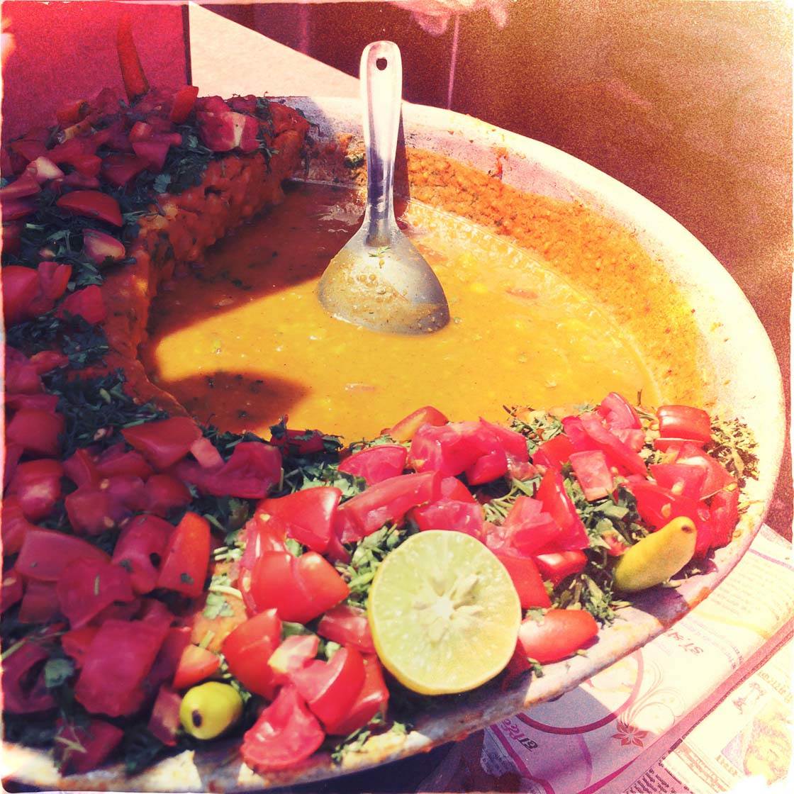
I often use different combinations of films and lenses in the Hipstamatic camera app when I photograph. These two food images were made with different Hipstamatic combos, and they have created two very different images of the same subject.
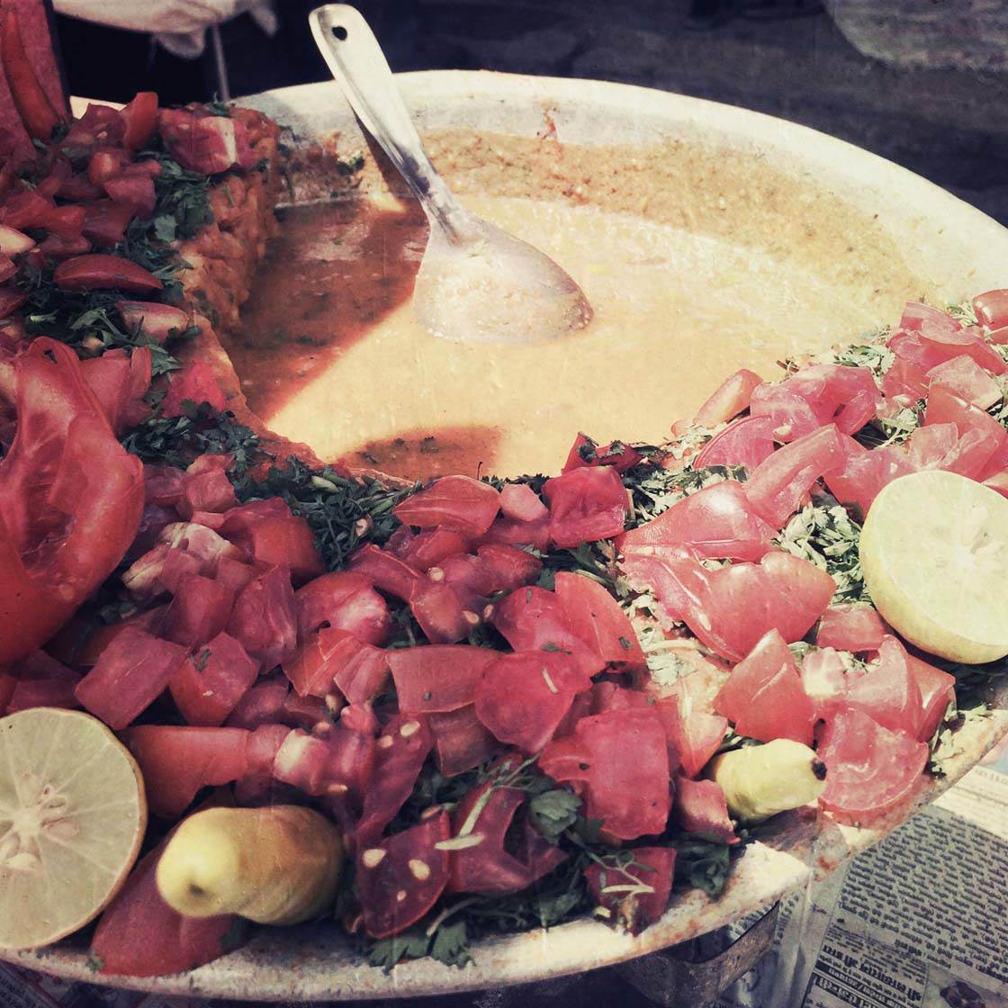
The second food photo is less saturated and doesn’t make the food look very appealing, does it? In general, photographs of food look better with rich saturation.
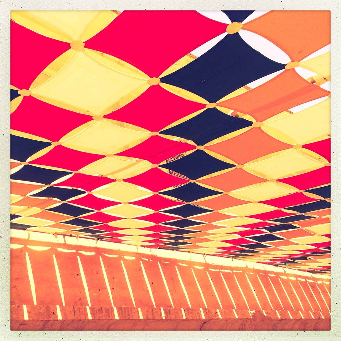
These two photographs (above and below) are also pairs of very similar compositions, but treated differently in terms of saturation.
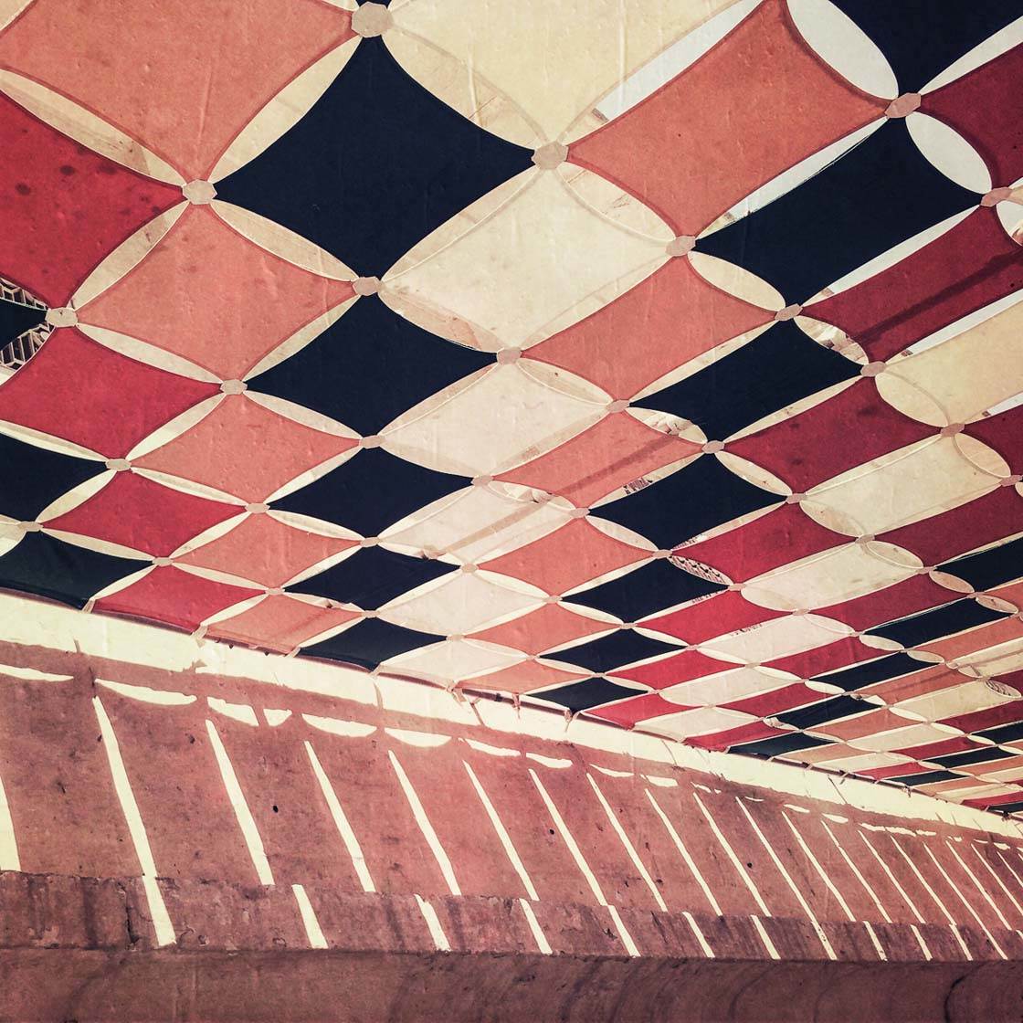
What drives the choice of color treatment is more a matter of personal taste, what mood the photographer wants to convey or even how the image relates to another in a series of images.
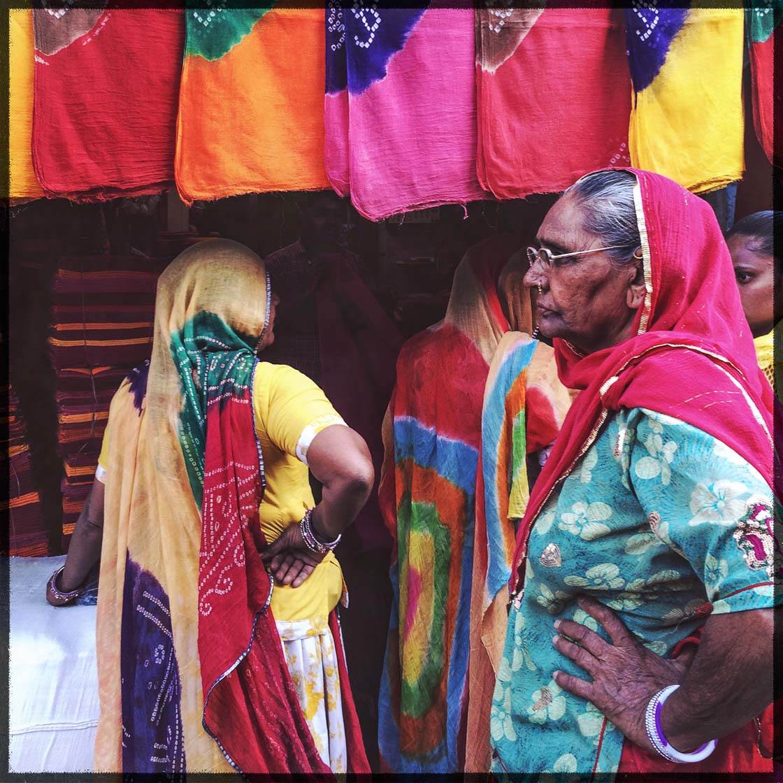
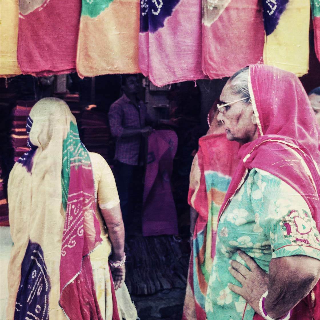
Above and below are two more examples illustrating how the choice of color saturation can impact the mood of a photograph.
3. Luminance
Luminance refers to how bright (light or dark) a hue is. In photography this is generally controlled by exposure. A blue object that is underexposed will be darker (less bright) than the same blue object if it is overexposed.
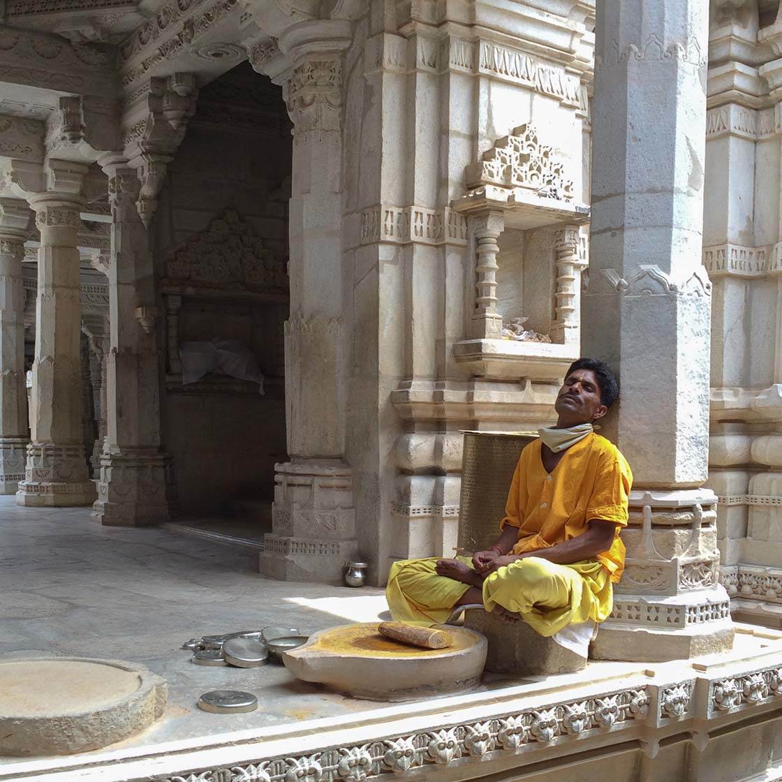
These two images have a very different feel. The one above has a brighter luminance than the one below.
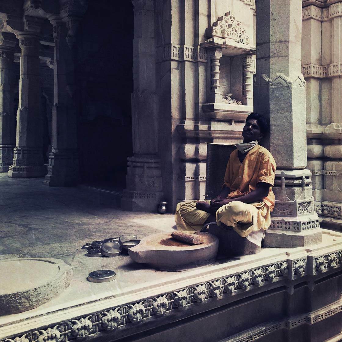
As a photographer, what is the story you want to tell? Is it about the vibrant color of the pigment the man is grinding or is it about the mood of the location? That is for you as a photographer to decide, and luminance can play a role in the story.
4. Warm And Cool Colors
Colors in the red, orange and yellow family are considered warm. Blues, greens and purples are defined as cool.
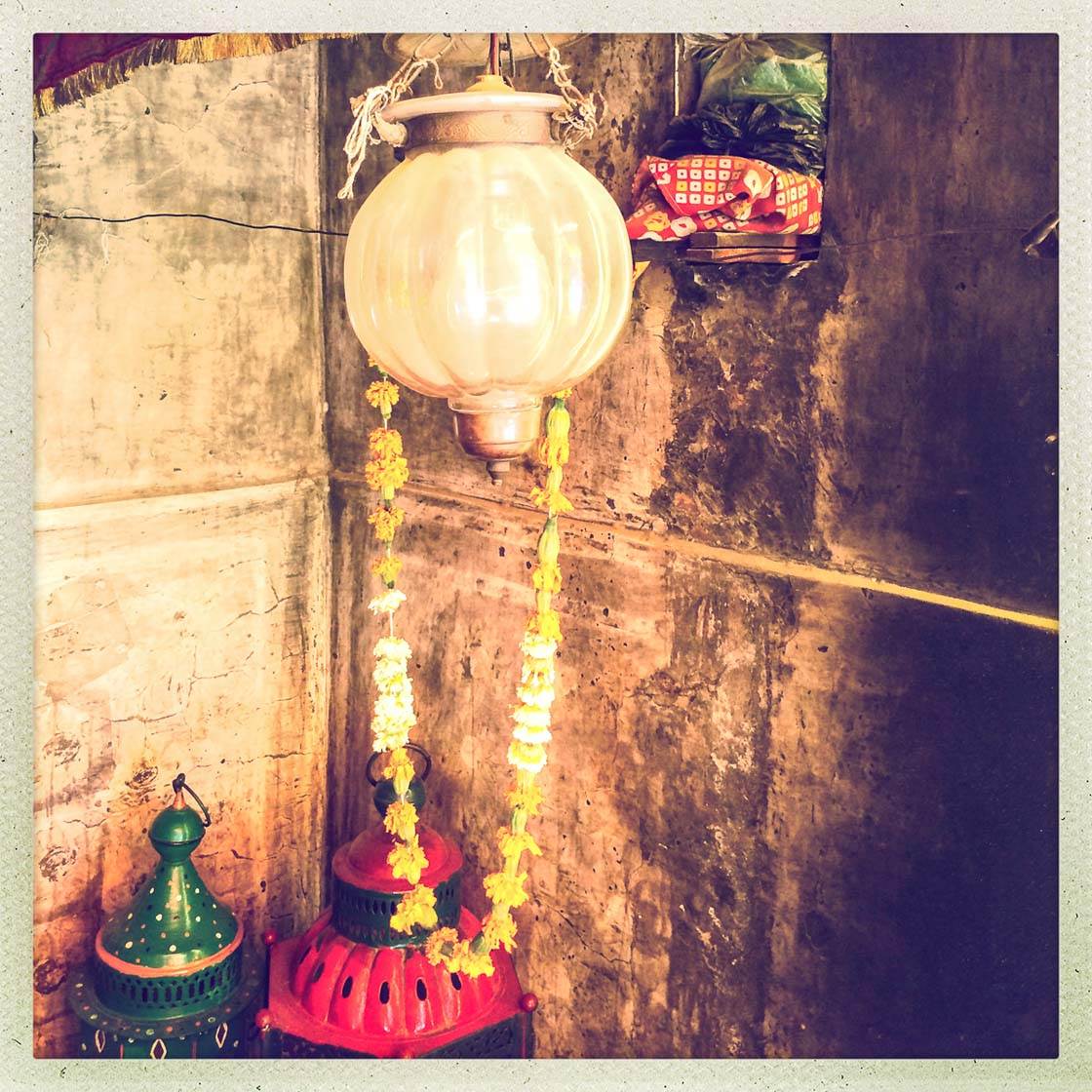
Warm colors are more intense than cool colors. Warm colors tend to appear to advance towards us, while cooler colors recede. Warm colors are thought to be stimulating. Cool colors are more calming, and in some instances imply sadness.
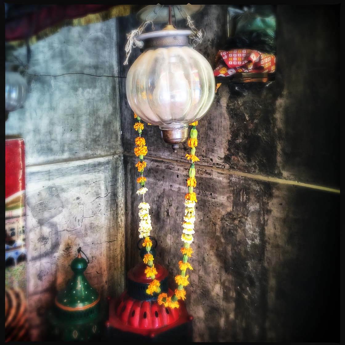
Light, the most integral element of a photograph, can also be warm or cool. Think of how images made on an overcast day compare to those made during a beautiful sunset.
5. Harmony And Discord
The simplest harmony exists within a color composition when three adjacent hues on a color wheel are placed together, with the center one being a primary hue.
An example of harmonious colors would be the primary hue blue, together with its two adjacent hues on the color wheel which are blue-green and blue-violet.
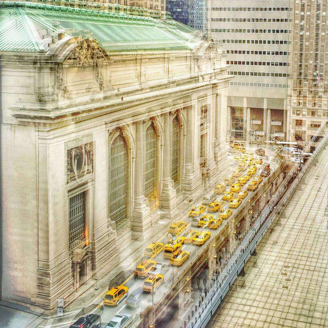
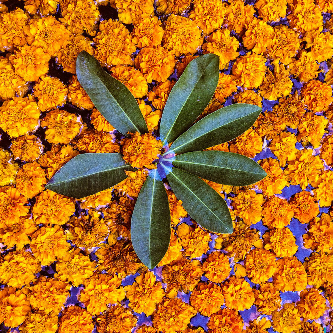
The colors in the above image are considered harmonious. The photo contains the primary hue yellow, together with its adjacent color wheel hues which are yellow-green and yellow-orange.
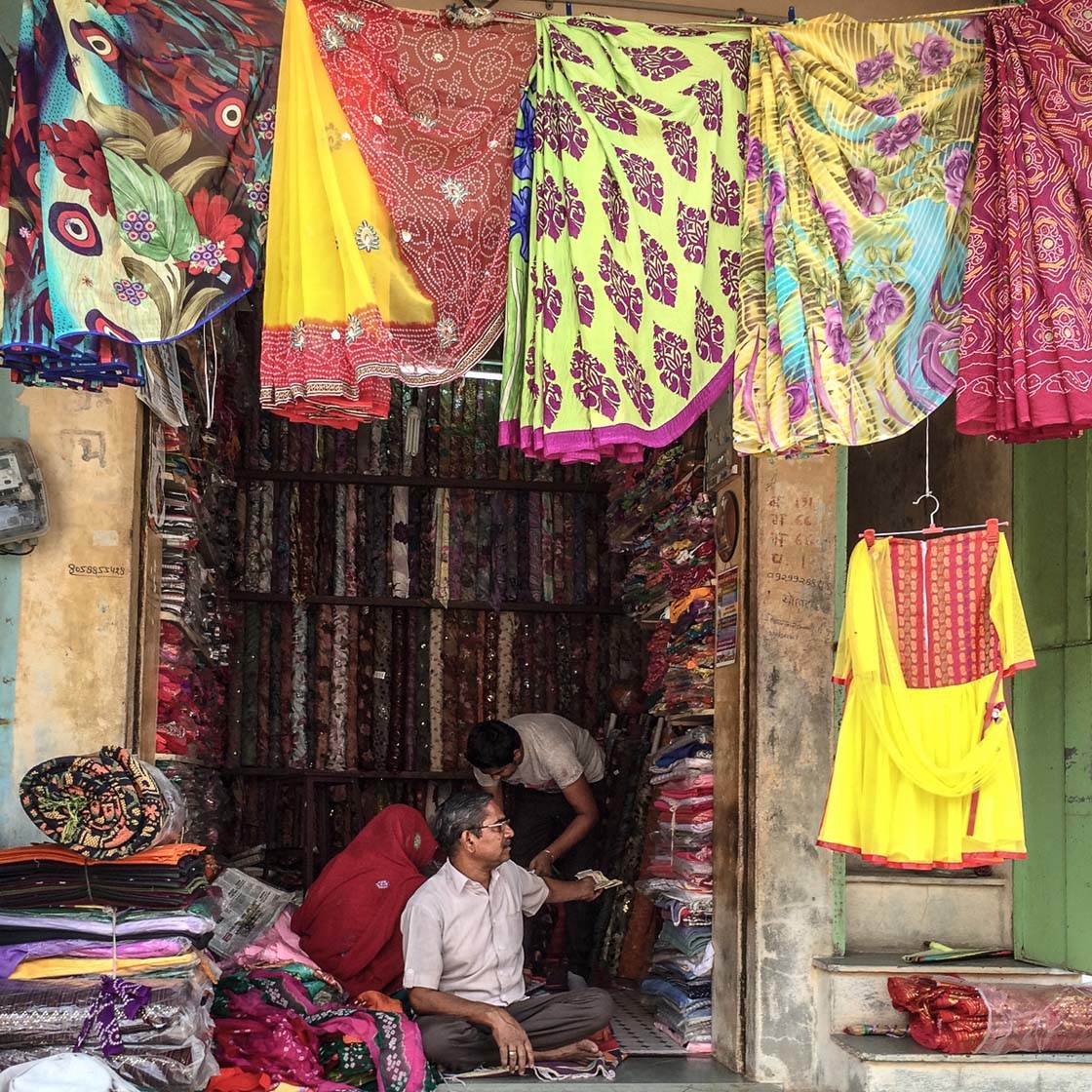
Using colors that are widely separated on the color wheel creates color discord. The combination of these colors are visually disturbing – they clash. Though the combination may be unpleasant, it can provide excitement. The image below demonstrates that excitement.
6. Contrast
Johannes Itten, a Swiss painter, educator and preeminent color theorist, identified seven types of color contrasts:
Contrast of hue
Contrast of light-dark
Contrast of cool-warm
Contrast of complements
Contrast of saturation
Contrast of extension
Simultaneous contrast
The first five types are probably self-evident by now. The last two are more complex and simultaneous contrast does not apply to photography so we won’t explain those here.
The image below represents many contrasts. Blue and orange are complementary colors on the color wheel. They are also a contrast of cool and warm. The different shades of blue in the circle are contrasts of saturation and light/dark.
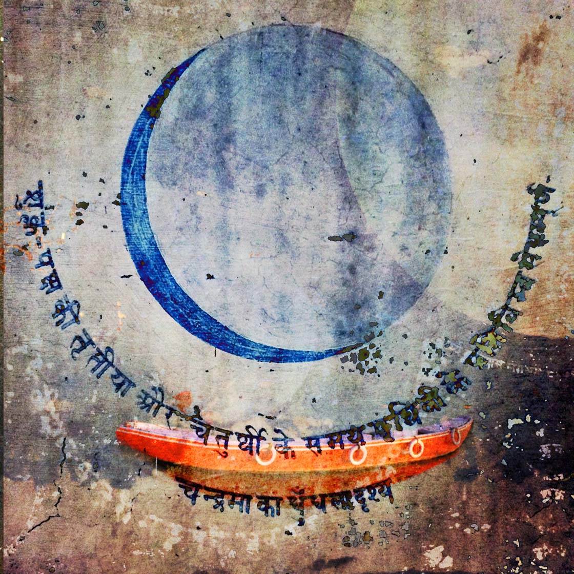
All those contrasts psychologically lead to a more interesting composition. If the circle were a solid color blue it wouldn’t be as interesting, right?
These basics of color are a few concepts to keep in mind as you make and process your photographs. They will make your images stronger and help you tell your stories more effectively.
About the Author
Pamela H. Viola is a Washington DC visual artist creating fine art photography and mixed media works for corporate and residential collectors. Though she segued from still photography and into the world of motion pictures for a portion of her career, she was ultimately pulled back to her true artistic passion several years ago.
Today she enjoys a successful career as award-winning artist, well known for her innovative images and interpretive style that has emerged as an outgrowth of her cinema background and experimentation with various forms of photographic transfer printing.
You can see more of her work using the following links:
Website | Instagram | Facebook | Twitter | Flickr
***

Thank you Pamela for sharing your photos and tips with us!
A wonderfully informative tutorial Pamela.
A great tutorial Pamela. Thank you.