Are you often disappointed with your iPhone photos? Do you ever wonder how other people manage to capture such incredible pictures with their iPhones? If you’re struggling to take high quality and eye-catching iPhone photos, it’s likely you’re making some very common mistakes. Luckily there are simple solutions to fix these problems! In this tutorial you’ll discover how to avoid some of the most common iPhone photography mistakes, so you can start taking pictures that you’re proud of.
1. No Focal Point
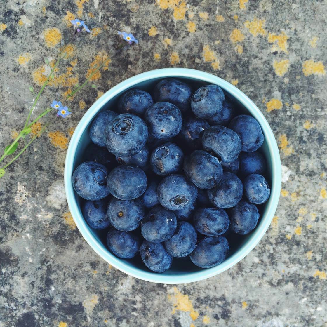
It seems simple, but if your photo doesn’t contain a main subject or point of interest, it will most likely fail to grab the attention of your audience. Think of a subject as a resting place for your eyes – somewhere that your gaze can easily fall.
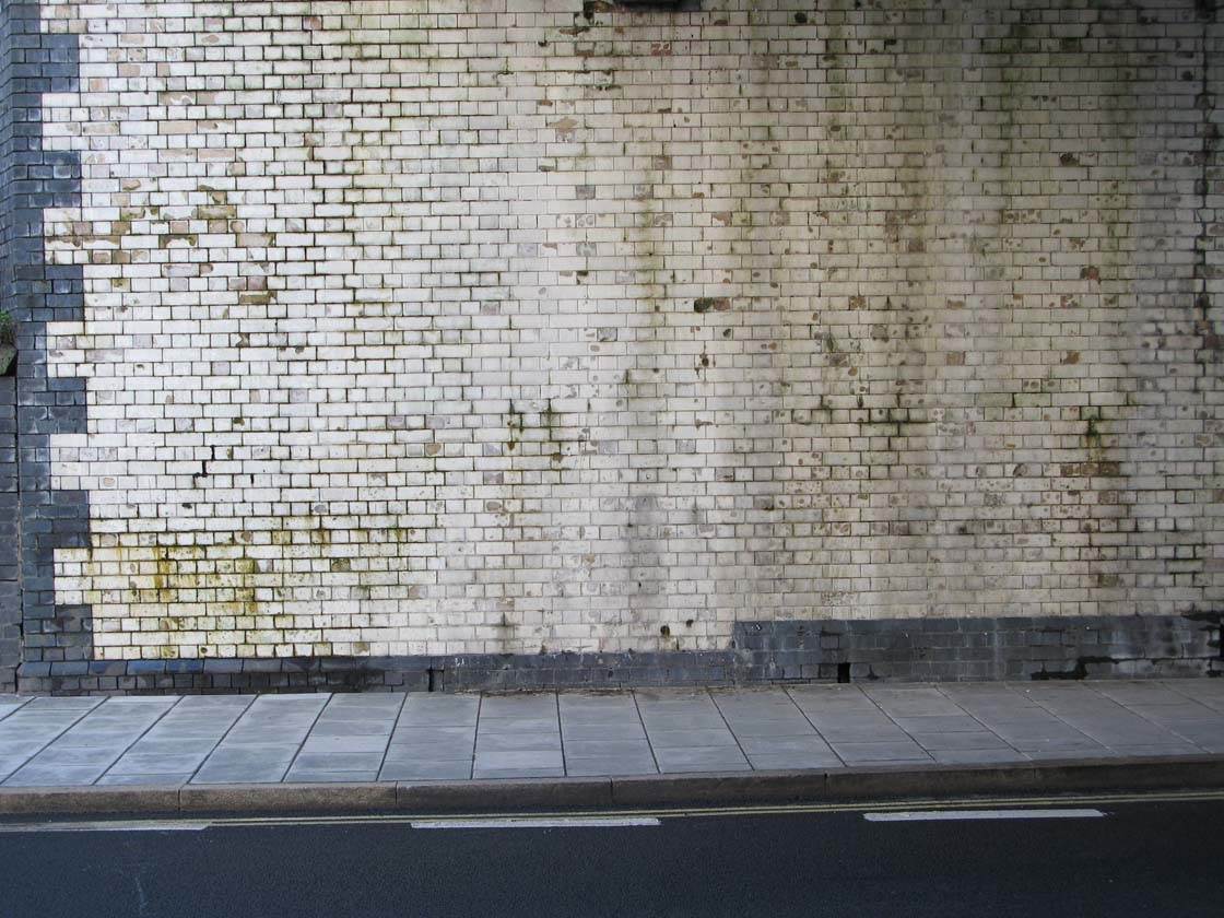
When I spotted this wall with its interesting pattern and texture I knew I wanted to photograph it. But because there’s no main focal point, your eyes don’t have a place to rest and it’s a pretty boring photo.
Until the viewer’s brain and eyes lock onto a subject, they have to keep hunting around for one. This takes effort and feels unresolved until the subject is found.
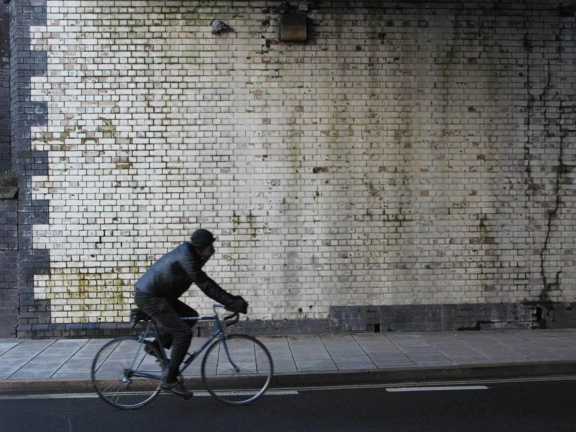
In situations like this, waiting until a person appears in the scene is a good option. This cyclist provides a strong focal point and adds a storytelling element to the photo. You still get to photograph the interesting wall, but it acts as a backdrop to the main subject.

Here’s another example of a photo that doesn’t have a main focal point. Because all the stones are similar in color and form, your eye isn’t able to pick out a main subject.

By including a different colored rock (or brick in this case), I’ve created a similar image to the first one, but this time it has a strong focal point which catches the eye. It makes for a much more interesting image that will hold the viewer’s attention for longer.
So whenever you see a scene that you’d like to photograph, always ask yourself, “What’s the main focal point in this scene?”
If there’s no obvious focal point, look around for a different viewpoint that allows you to include a subject of interest, or wait until something interesting appears in the scene.
2. Subject Not In Focus
When you’ve worked out what your main subject is, it’s vital to ensure that object appears in sharp focus. Rather than letting the camera’s autofocus decide which part of the scene to focus on, you should always take control and set the focus manually.
Thankfully the native iPhone camera app makes focusing simple. All you have to do is tap where your subject is on the screen and take the photo.
Below you can see two examples showing how the focus can be set on different parts of the scene.

In the photo above the background is in focus and the main flower in the foreground is out of focus. This happened because I tapped on the background part of the scene before taking the photo.
By tapping on the main flower, the camera now focuses on that area of the photo as shown below.

You should experiment with setting focus on different areas of the scene to get an idea of how this works. Just tap different parts of the screen and watch how the focus changes. You’ll notice that a yellow box appears to indicate the area of focus.
You’ll need to take more care with subjects that are very small in relation to the rest of the frame as it can be difficult to tap on that exact spot. It may take a few attempts to set focus on a small subject.

When taking close up photos, especially with a macro lens, the depth of field will be very shallow. Be careful not to alter the distance between your iPhone and the subject after tapping to set focus, otherwise the wrong part of the scene will be in focus.
3. Under Or Over-Exposure
Our eyes do a great job of discerning between very dark and very bright subjects at the same time. But digital cameras suffer with a narrower range of darkness/brightness that can be captured simultaneously.
The iPhone camera analyzes the scene and decides on an exposure that will best capture the mixture of dark and light areas. Inevitably this means that detail in either or both extremes (the most dark and most light areas) may not be captured.
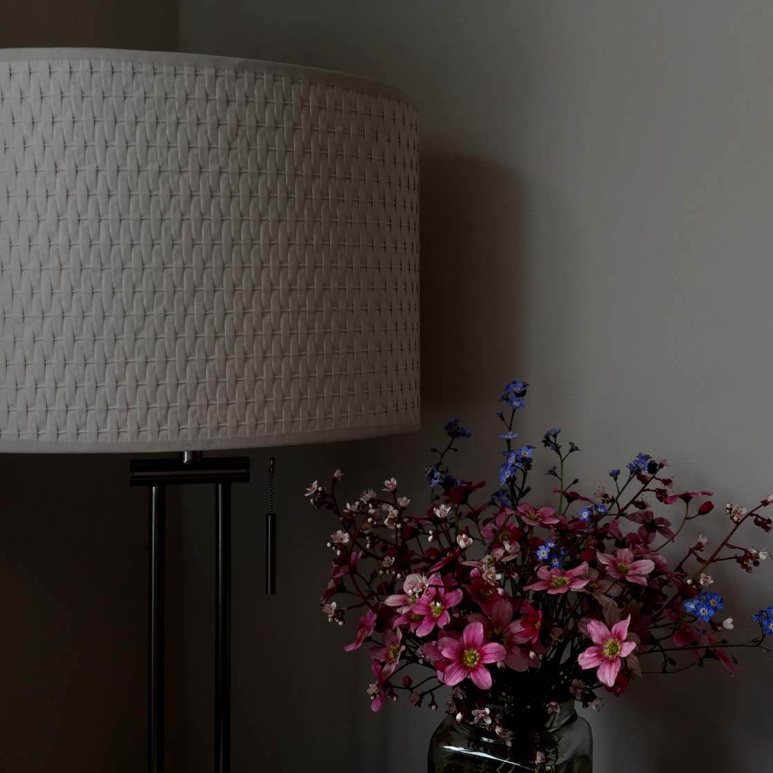
If the camera doesn’t get the exposure right, you can end up with an image that’s under-exposed (too dark) as shown in the example above, or over-exposed (too bright) as shown in the example below.
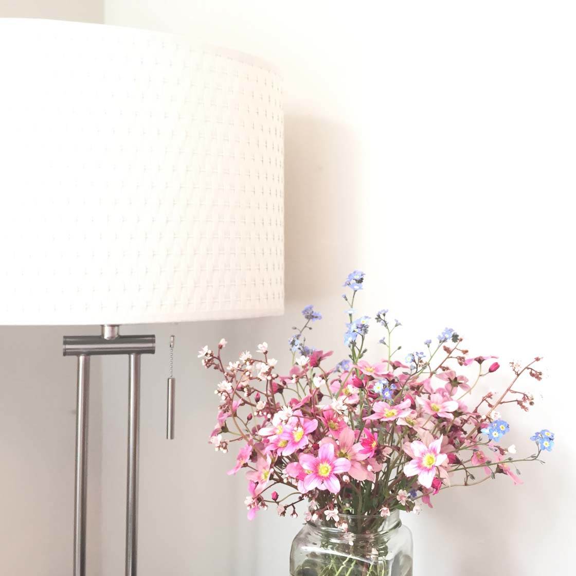
Therefore it’s important for you to take control and adjust the exposure to ensure the photo is exposed correctly. The iPhone makes it very easy to adjust exposure in the native camera app.
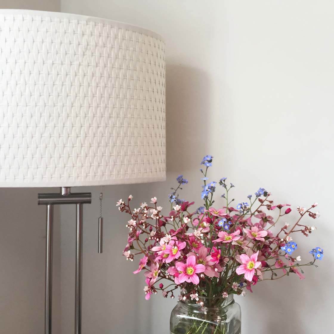
After you’ve tapped to set focus on the main subject, simply swipe up or down on the screen to access the exposure slider. Swiping up will brighten the image, and swiping down will darken it.
4. Blurry Photos From Camera Shake
Even if you tap to set focus on your subject, you can still end up with a blurred photo if you move your iPhone (even slightly) while pressing the shutter button. This movement is called “camera shake” and it will result in a completely blurred image.
Camera shake is more common in low light situations and when you shoot at night.
Why? Because the iPhone has to use a slower shutter speed to let enough light in for a decent exposure. If the camera moves at all during this longer exposure time, it will result in a blurred image.

There are several things you can do to prevent camera shake. The obvious way is to keep the iPhone as still as possible while you take the shot. There are a number of techniques that you can use to keep your iPhone’s movement to a minimum.

Of course, an iPhone tripod is the ultimate tool for keeping your camera still. But if you don’t have one you can improvise by resting your iPhone on top of a wall, a fence, the roof of your car, or any other solid surface.
Alternatively, hold it up against a wall, window, lamppost, signpost, or any other steady object in order to keep the phone more steady.
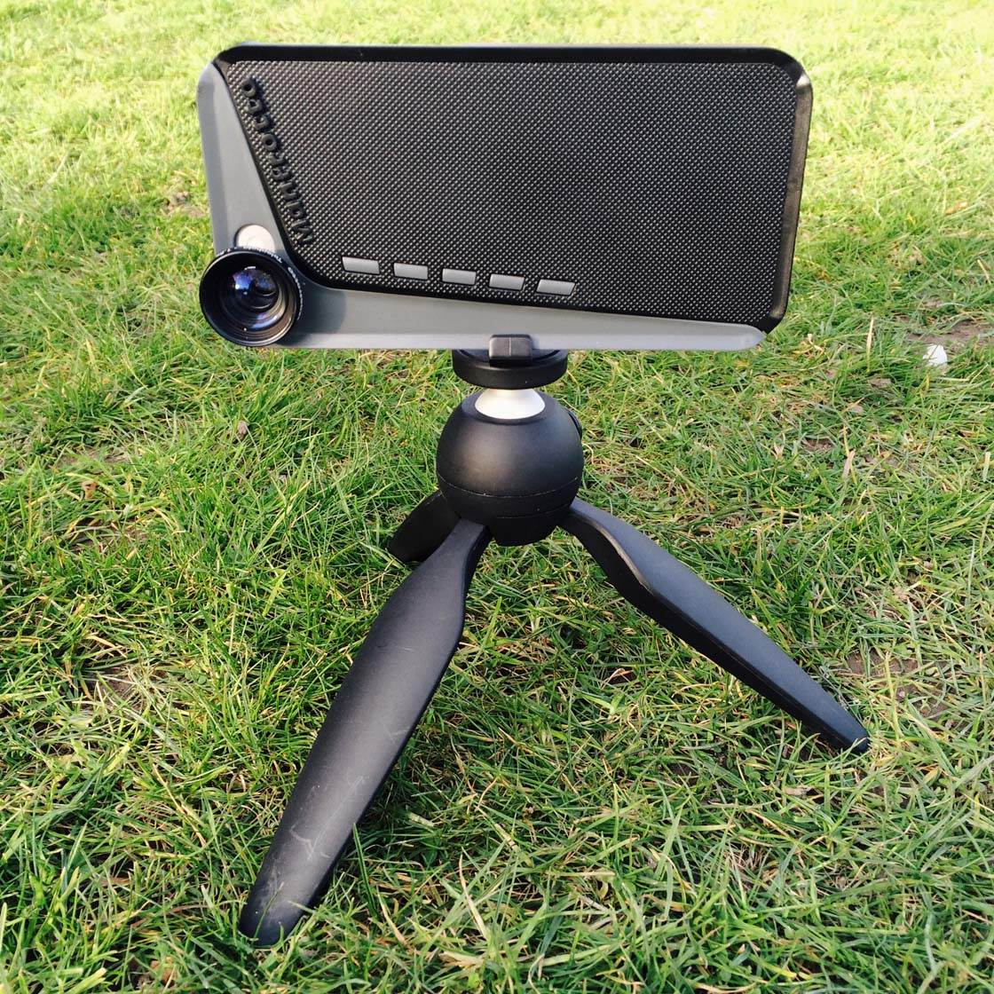
If you have to hand-hold the iPhone without any support, avoid the temptation to hold the iPhone at arm’s length as it’s harder to hold it steady this way.
It’s better to bring your elbows down onto your stomach (or legs if you’re sitting) and hold the iPhone closer to your body. Steady your breathing before shooting, and hold your breath just before you press the shutter.
The other thing you can do to minimize camera shake is to force the camera to use a faster shutter speed. Let’s take a look at a couple of ways to do this.
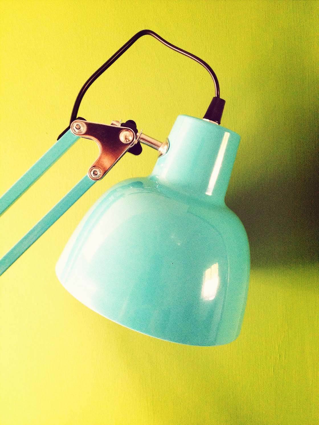
The first method is to introduce more light onto the scene. You could turn a light on if shooting indoors, or shoot in full sun rather than shade.
The second method you could try is to manually decrease the exposure a bit (using the exposure slider in the camera app).
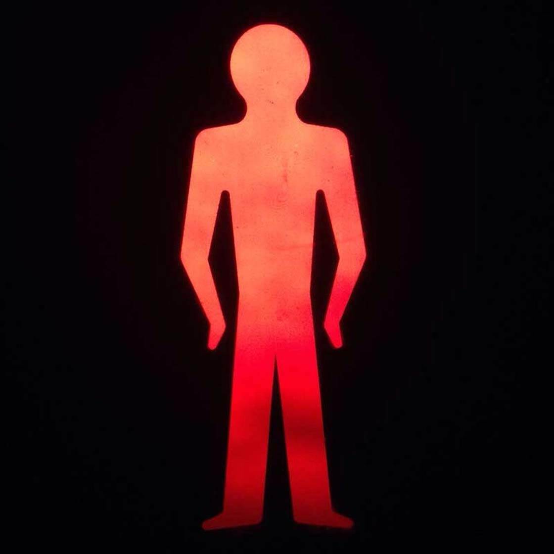
Decreasing exposure basically tells the camera to use a faster shutter speed. If this isn’t going to completely under-expose your photo, it’s definitely worth trying.
Of course, camera shake and blur can sometimes be used intentionally for creative effect. Moving the camera deliberately while taking the photo can convey a sense of speed or motion in your photo.
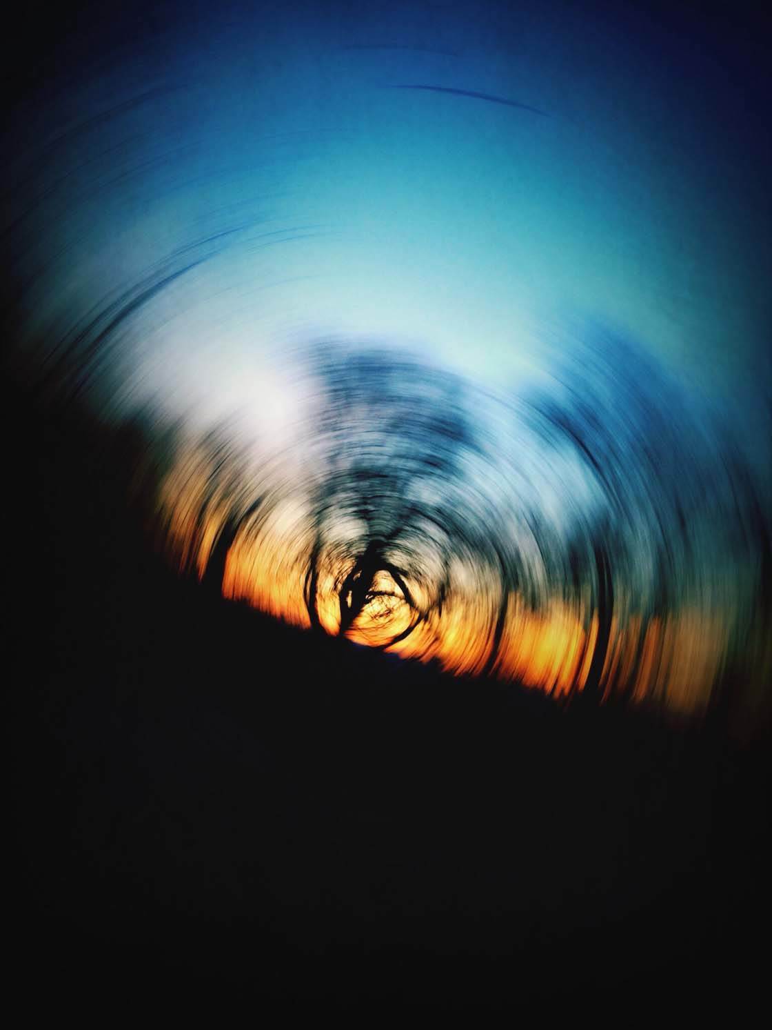
When I took this photo I decided to deliberately move my camera during the exposure. By rotating the iPhone very fast in the palm of my hand, keeping the lens in the same position, I’ve created a fun circular motion blur. This kind of shot works best in low light when the camera is using a slow shutter speed.
5. Poor Composition
Composition is such an important part of photography and it’s so common to see photos that have good focus and exposure, but demonstrate little or no thought about the arrangement of the elements in the scene.
We’ve already discussed ensuring that you have a subject in the shot, but what about the position of that subject within the frame?
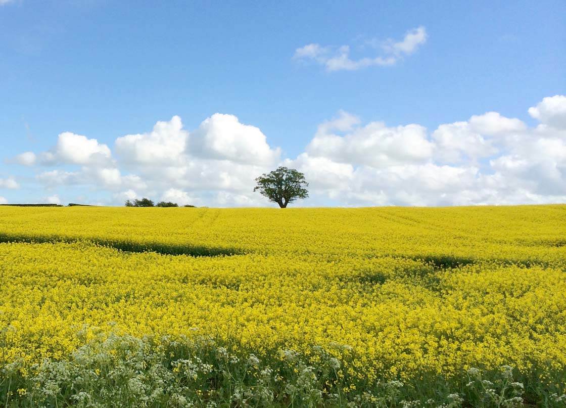
A “mistake” that many beginners make is to always position the main subject or horizon directly in the centre of the frame. But it often creates a more natural and balanced composition if you place these elements off-centre.
Of course, this is subjective and it’s always worth trying out different compositions until you find the best one to suit your scene.

A useful guide to help you with off-centre positioning of the main subject or horizon is the Rule of Thirds.
If you switch on the grid in your camera app (Settings > Photos & Camera > Grid) you’ll see two horizontal lines and two vertical lines that separate your frame into horizontal and vertical thirds.
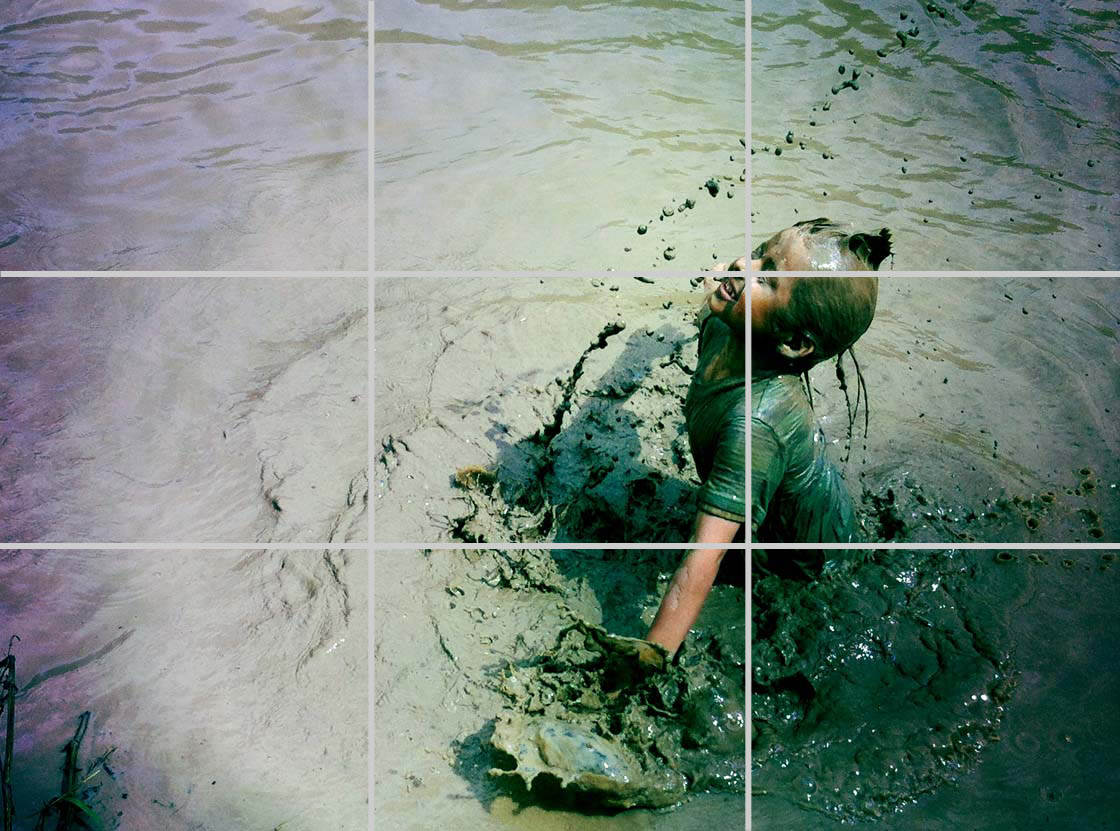
To use the Rule of Thirds, simply ensure your subject (or subjects) fall as close as possible to the lines on the grid. Even better, try to get the most important part of your scene to be positioned where any two lines converge.
Try placing any vertical subjects, such as a person or tree, on either of the two vertical lines on the grid. This often results in a better composition than placing the subject centrally.
When shooting landscapes, position the horizon on or close to either of the two horizontal lines on the grid, rather than across the center of the frame.
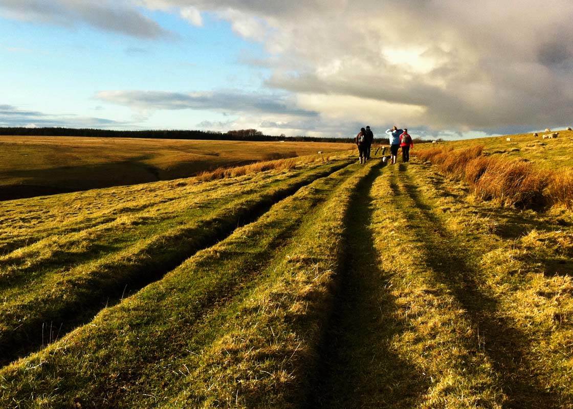
Other “rules” of composition that you should try to follow include using leading lines to draw the viewer’s eye into the photo, using foreground interest to add depth to a scene, and using objects to create a frame around your subject.

You could also try using lots of negative space to create minimal compositions that place maximum emphasis on the subject.

Experimenting with different shooting angles can be very effective too. You could try shooting from a very low angle or from directly above your subject for a bird’s eye view.
6. Cluttered Backgrounds
Sometimes we’re so focused on our main subject that we completely forget to check if the background is suitable. It’s only when we check the photo later in more detail that we realize the background ruins the photo.
Maybe there’s a discarded plastic bottle on the ground, dirty marks on the wall behind the subject, a lamppost appearing from the top of a person’s head, a person walking into the shot behind your subject, etc.
Taking a moment to check the background before pressing the shutter button will make a big difference to your photography. It gives you a chance to remove distracting objects, reframe your shot slightly, shoot from a different angle, move your subject to a location with a better backdrop, use Portrait mode, or wait a few moments until the background is clear of other people.

Above is a photo of a fern leaf that I wanted to photograph, but the angle I was shooting from meant that I ended up with a lot of other plants and a window frame in the background. The shot looks messy and it’s unclear what the main subject really is.

By changing my viewpoint and shooting just a single fern leaf from a very low angle, I was able to get just plain sky behind my subject. This creates a much stronger impact, putting all the attention on the intricate detail and vibrant color of the leaf.
Shooting from a lower angle is a great technique to use when photographing outdoors where you have distracting backgrounds. Aim to get only the sky behind your subject for maximum impact.

Clean and simple backgrounds will always make your subject stand out much better as there won’t be anything else competing for the viewer’s attention.
A good trick to use is to always look at each corner of the frame on your screen before pressing the shutter button. This gets you in the habit of checking every part of the scene for distractions and it will soon become second nature.

Another good technique is to get up close and fill the entire frame with the subject. This is a really simple way of eliminating a distracting background from your image.
7. Subject Too Far Away
Sometimes, even when we include an interesting subject in our scene, we make them so small that they hardly even look like the subject!
If your subject isn’t strong enough in the composition, try getting closer before taking the photo. The more detail that can be seen in your subject the better, and it’s only by getting closer that you can achieve this.

Don’t be afraid to get really close and fill the entire frame with your subject, or even just a part of it. Sometimes cropping off some of the edges of the subject will create a more powerful composition than including the whole object and some of the background. It also allows you to see much more fine detail.
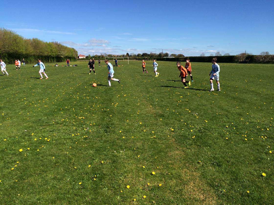
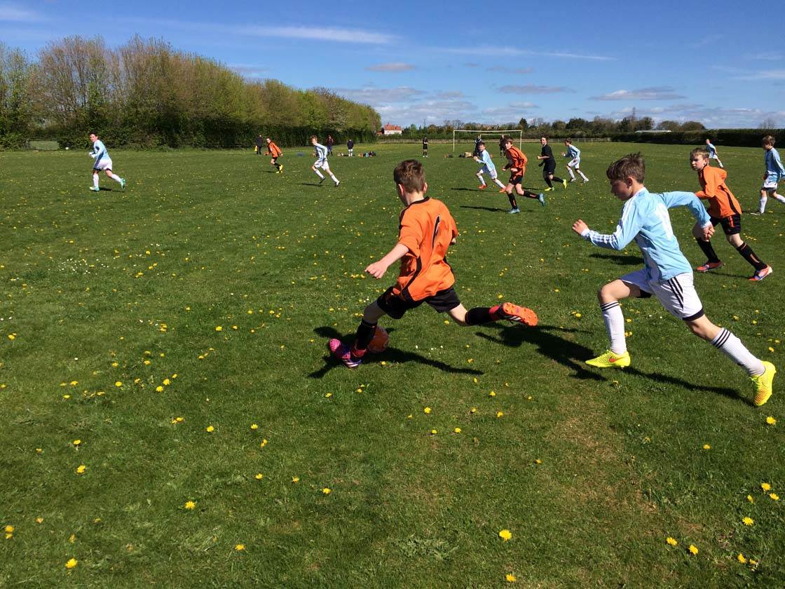
Sometimes you may need to be patient and wait for the subject to come to you. For example, when photographing my son’s soccer match I couldn’t walk onto the pitch to get a closer shot, so I had wait on the touchline until the players came closer. Sometimes it’s worth waiting for a distant subject to get closer before taking the shot.
Obviously, there are times when a tiny subject can be useful, such as when you want to show a sense of scale. A tiny human subject in a vast landscape, or next to a large building, tree or sculpture can exaggerate the size difference and create a more interesting shot.
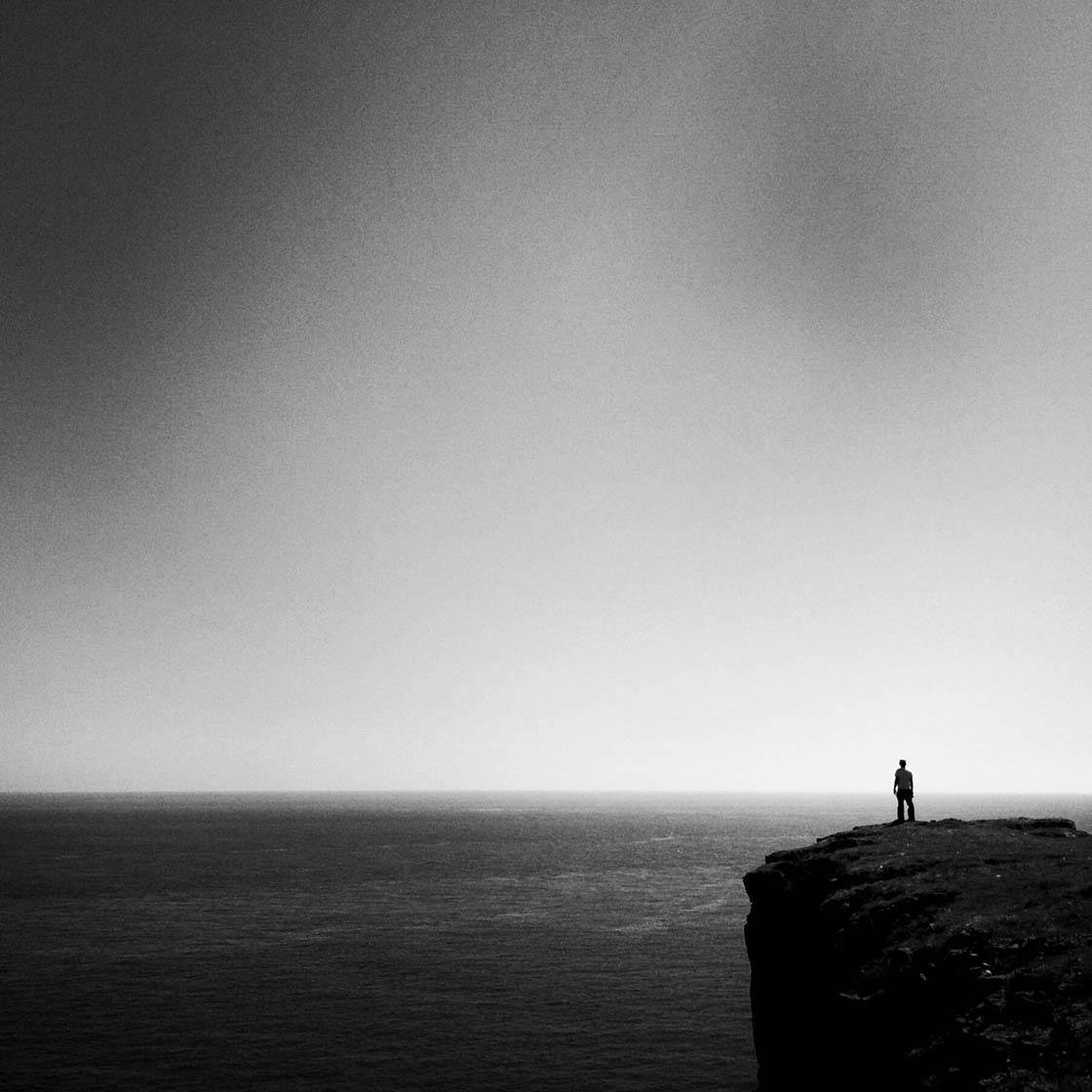
But the decision to make your subject small should always be a conscious choice in order to enhance the composition. This kind of shot usually looks best when you have a plain background and lots of empty space so that your tiny subject stands out.
8. Using Digital Zoom
A cool feature of most digital cameras is the ability to zoom in without having to physically move closer to the subject. On the iPhone this is done by pinching outwards on the screen with two fingers. While this sounds like a great feature, it’s actually something that you should avoid.
If you’ve ever tried taking a photo using the zoom on your iPhone, you’ll probably have noticed that the quality of the image was dramatically reduced. It most likely looked very blurred or pixellated, similar to the photo below which was taken at full zoom on the iPhone.
This poor quality is due to the iPhone’s zoom being digital rather than optical. Digital zoom means that a small portion of the zoomed out version of the image is being enlarged, and this process creates a much poorer quality image. The more you zoom, the poorer quality your images will be.
The solution is to use the zoom very sparingly, if ever. The best option is to zoom with your feet! If possible, always get physically closer to your subject rather than using the zoom feature in the camera app.
This photo shows a much sharper version of the first image. It was taken without zooming in – I just moved closer to the subject.
If you can’t get closer to the subject, it’s usually best to shoot without using zoom and then crop away the edges of the image in post-processing.
9. Over-Editing
As iPhone photographers, we’re spoilt for choice when it comes to editing our images. There are there many apps that you can use to edit your photos, including the iPhone’s native Photos app.
Using apps, we can easily adjust brightness, contrast and color. We can add filters, textures and vignettes, sharpen or soften our images, and more.

But regardless of how much you rely on these tools in your photography, it’s important not to go overboard when editing your iPhone photos. Over-editing will take attention away from the story of your photo and reduce image quality.
Garish colors, grain from over-using exposure adjustments, and over-the-top filters, textures, vignettes and HDR effects are unlikely to enhance the visual appeal of your image.
It should also be noted that no amount of editing can turn a bad photo into a good one. So concentrate on taking good photos that are sharp and correctly exposed before you even think about editing them.
Below are some examples of what I consider to be over-edited photos (on the left), together with more subtle and natural edits (on the right).
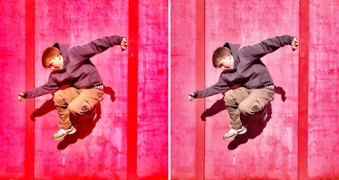
A common mistake that many people make is over-saturating the colors. It can be tempting to boost the saturation to make the colors really vibrant, but this often results in an overpowering image with unnatural colors.
It’s especially important not to over-saturate colors in portrait photos. If you make the colors too vibrant, skin tones will become an unsightly orange, as you can see in the left-hand photo above.

Another common mistake is over-using HDR effects. HDR stands for High Dynamic Range and it helps you to even out the lighting in your photos by making the shadows brighter and the highlights darker.
However, if you apply HDR effects at too high a strength, you’ll end up with soft and grainy photos with unnatural colors and “muddy” skies (as shown in the left-hand photo left above).
If you choose to use HDR filters, use them very sparingly. In my opinion, it’s better to have a more natural looking photo as shown on the right.

Applying distressed textures and painterly effects can be a fun and artistic way to add a bit more visual interest to your photos. However, it’s very easy to over-do these effects and ruin the photo.
Applying texture to a photo with a large amount of sky can be a good way of adding a bit more interest to this large empty space. I chose to do this in the photo above. On the right you can see the result of using a very subtle texture at a low intensity.
Compare this to the picture on the left which has several different textures applied at maximum strength. These textures are overbearing, creating unnatural colors and taking attention away from the intricate detail of the silhouetted grass.
Any editing that you do should always enhance the scene, adding to the beauty of the picture rather than destroying its quality. It should never take attention away from the main subject or point of interest. In most cases you should keep things subtle and natural.

It’s important to use apps that have adjustable tools and filters, so that you can control the intensity of the effect. Whenever you apply an adjustment, dial back the strength of the edit so that it enhances the natural features of the subject, rather than overpowering them.
We live in a time where it seems acceptable to apply lots of editing to our images, but that’s not a reason to do it to extremes. A good rule of thumb is that if you (or your photographer friends) can easily identify what types of effects and filters have been applied, then you’ve used too much.
Sometimes you might choose to apply “heavy” artistic and painterly styles for creative effect. This is perfectly fine, as long as it suits the photo you’re working on and enhances the original image.

It’s definitely worth taking a look at your own photos with a critical eye to work out whether you’re over-processing your images.
And next time you’re editing your iPhone photos, pay close attention to the strength of the effects you’re applying. Remember less is more when it comes to photo editing!
Click here to learn how to edit photos on iPhone using the native Photos app.


Great tutorial – thanks
I’m glad you enjoyed it Tracy – thanks for the feedback 🙂
Thanks for pointing out these common mistakes. It’s so important to avoid all of these pitfalls if you want to improve your iPhone photography! 🙂
Thnk u i have found my mistakes
Glad you found this helpful Margarette. We’ve all made those mistakes, but once you recognize them you can start working on fixing them! 🙂
Thank you for reinforcing the fundamental rules for taking great photos.
It’s our pleasure Phillip. I’m glad you found it useful to go over these essentials 🙂
Inspiring tutorial….thank you!
So glad you enjoyed it Lyna 🙂
great tips – thank you!
Great tips! I look forward to your emails! Thank you!!
Excellent!
Excellent tutorial. I always learn something new when studying your tips. Thanks so much!
This is a good reminder article, Rob. Thank you.
I love and agree with everything you are saying, but sometimes the ‘drama’ part of Snapseed will do the trick in making the details in pics simply ‘POP’!! Sometimes it’s fun to ‘overdo it’ to have that edgy look…it all depends on your native style 🙂
It’s definitely all down to personal taste. The key is to ensure the image still looks great quality when applying effects at a high intensity 🙂
You mention native iPhone app what and where can I locate this with thanks
Francien it is my understanding that the native app means the iPhone camera app. (The camera app that is already on your iPhone). It’s a very good app.
Wonderful advice as always!
Awesome tips! It will be a great help towards my photography! Thanks
So glad to hear you enjoyed these tips Ravi! 🙂
It is especially helpful to have 2 pictures that show good then bad uses of editing.
Terrific! Big thanks!
Glad you enjoyed this tutorials Judy! 🙂
I find the tips extremely valuable. I have a new appreciation for my Iphone. I can’t wait to get accessories to help me with holding steady
Hi Edwin. Really glad to hear you found these tips helpful. Here are a couple of articles we wrote about tripods which might help you make a decision about which one to get:
http://iphonephotographyschool.com/iphone-tripod/
http://iphonephotographyschool.com/tripod-for-iphone/
Always look forward to your daily email turtorials. This one was especially helpful and educational. Keep up the great work👍.
So glad to hear you enjoy our tutorials John 🙂
I normally focus on the points I want but if I do very close focus it loses clarity so I do the photo close an finish it of on a computer to finish it off
Thank you. Another very helpful and informative article. Cheers.
Your tips in layman terms has helped me improve my understanding about my iPhone and how to make great pictures! Thank you so very much! I share what I’ve learned with others–hope they subscribe and have as much fun as I am!
So much to learn; so many wonderful tips! I am enjoying these emails. Tutorials very easy to understand and I really like the comparisons. Thank you!
You are a great teacher and a really nice person Emil !!!
So glad I took course. You are amazing
So much to learn about the iPhone settings. This has helped me to find those settings and how to use them. Thank you!
This was awesome! So true, although I find it sometimes ‘artistic’ and ‘fun’ to ‘overdo’ images. Life is short. I’m a little bit more on the edgy side. If I’m only displaying my photos as home, then no harm done!