As you probably already know, Instagram only supports the sharing of square images. However, the iPhone’s default camera app, which I use 99% of the time, only shoots 3:2 photos. If you attempt to share such photos on Instagram, you will either have to crop them or leave black margins on the sides, which is something I don’t recommend for aesthetic reasons.

Considering that the iPhone’s screen is already quite small, it’s a good idea to only share square photos on Instagram. Using any other aspect ratio will make your photos appear even smaller and thus less likely to make an impact.
However, cropping should not be reduced to simply making squares out of your 3:2 photos. In fact, cropping is one of the most creative and important aspects of iPhone photography. If done correctly, cropping can turn a messy and poorly composed picture into a beautiful high-impact composition. To illustrate my point I will discuss some of my Instagrams along with the source photos before they were cropped.

The photo above is rather messy in its original state. I also think it’s beautiful, but it would be a lot nicer without all the shoes and bags in the sand. Since none of this stuff was mine, I couldn’t quite fix that. However, I can simply crop it all out to make the image cleaner.
According to the rule of thirds, which is a good starting point for many composition decisions, the main subject of the photo (the sun umbrella) should be placed at the intersection of composition grid lines. However, in the original photo the sun umbrella is positioned close to the center of the image, which is something that I want to correct with cropping.
I also like the empty blue sky at the top of the photo. It adds an airy feel to the photo and conveys the fresh and open feel of the beach.

Taken together, the above considerations helped me create this Instagram. Note that the women on the right side of the photo are also positioned roughly at the intersection of the grid lines, which makes the image more dynamic by showing that they are about to leave the scene.
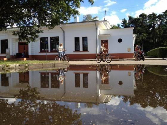
Now let’s consider the photo above. The coolest part about this photo is the highly-detailed reflection. So it is quite clear that the reflection should play a major part in the composition. What else is there in the photo? To me the two bicycles stand out as well.
Now that we know what we want to show with this image, it’s time to adjust the composition. According to the rule of thirds, important lines in the picture should be placed along the grid lines. However, in the original photo the division between the reflection and the real objects, which is the most important line here, is placed in the center of the photo.
Since we already decided that the reflection is way cooler than the actual objects, it will take up the bottom two thirds of the photo. That way the resulting photo will also contain a full reflection of the house and even some reflection of the sky.
Next we want to make sure that the bicycles are placed roughly at the intersection of grid lines. Since they are both moving to the right, I will leave slightly more space on the right side. If there is an obvious direction of movement in a photo, the human eye will tend to follow it, and it will be more satisfied if it sees where the subjects are going.
Finally, I want my photo to contain as few unnecessary details as possible, because they tend to divert attention away from the main subjects of the photo. For this reason I chose not to include the roof of the building and the bus stop sign on the left side.
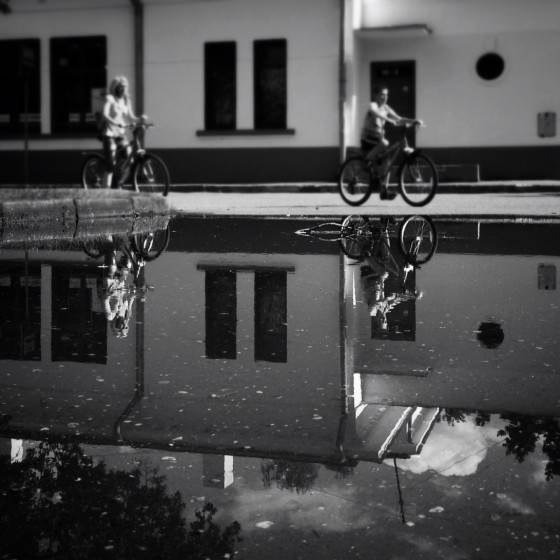
In addition to cropping, I also made this photo B&W, adjusted contrast and brightness, and made the top part blurry using Snapseed’s tilt-shift. As you can see from this example, you don’t have to be afraid to crop out most of the photo if that makes it look better. The newer iPhones have enough megapixels to make it possible, especially if you are publishing on Instagram where the photos will be relatively small.

Finally, let’s consider the photo above. It’s a pretty nice sunset image on its own, yet it’s not quite perfect in terms of composition. If you look more closely, you will also notice that the horizon is tilted quite a lot. I corrected the horizon first using the Straighten tool in the Snapseed photo editing app.
Afterwards I started playing around with cropping and composition, until decided that – surprise! – I did not want to closely follow the rule of thirds in this photo. Instead I chose to keep the horizon a little higher than the bottom grid line, and the silhouettes of people, especially the left one, closer to the edges of the image.
Similarly to the previous photo, I also chose to give the moving man on the right some space so that we can subconsciously see where he is going.

These adjustments resulted in the composition above, which I think is more interesting than what I would get by strictly following the rule of thirds. The important point here is that no matter what the formal composition guidelines say, you have to keep experimenting until you find a composition that really works best for you.
Gallery
Even though I have already explained the most important cropping principles, there is more that I want to show you. So I created this small gallery of before and after photos. I really hope they inspire you to try out creative cropping with your own iPhone photos.
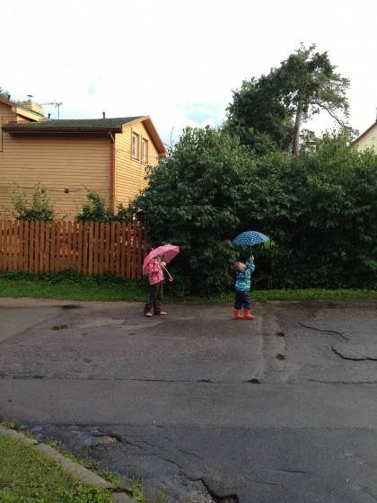
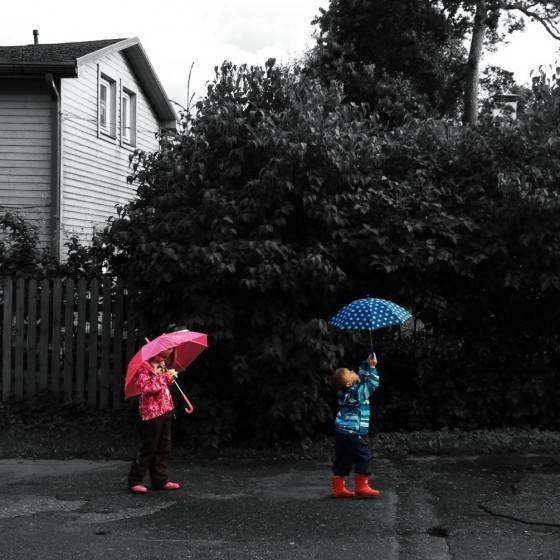


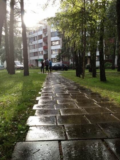
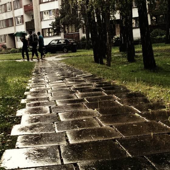
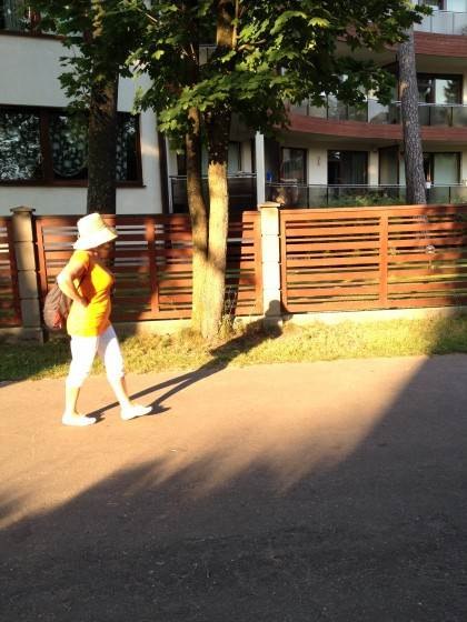
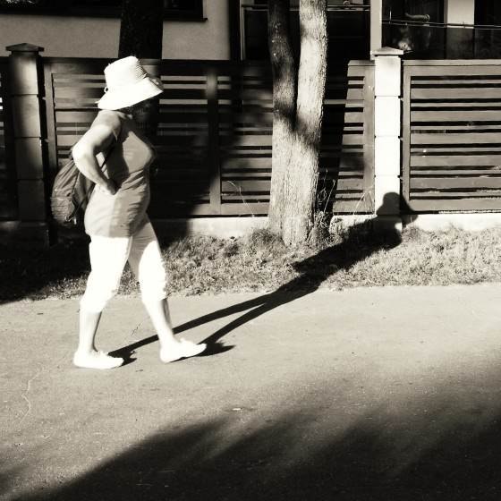
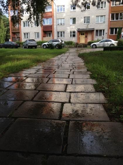
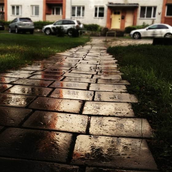


Did you notice how the Instagram photos have considerably brighter colors? That’s because they were created specifically for the iPhone’s screen on which bright and colorful photos look a lot better. They might look a little overdone on a computer screen though.

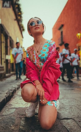
What did you use to create the photo with the children in color, and the background b&w?
That was done using Color Splash:
https://itunes.apple.com/us/app/color-splash/id304871603?mt=8&uo=4&at=1l3v39L
I saw your vid on how to use it, and been having a blast!