Do you struggle to take striking and eye-catching photos with your iPhone? We all strive to create images that command attention, but how do we achieve this? One extremely effective approach is to include strong graphical design elements in your pictures. In this tutorial you’ll discover how to use classic elements of design such as shape, form, line, color, texture, pattern and text to create incredibly impactful iPhone photos, even from the most ordinary of subjects.

What Are Graphical Design Elements?
In photography, you can consider graphical elements to be geometric shapes, forms or patterns. Often these elements are man-made or designed, however that doesn’t mean they can’t be found in the natural world.

Strong shapes, symmetry and repeating patterns are often found in nature and are a wonderful source of graphical elements for your photos.
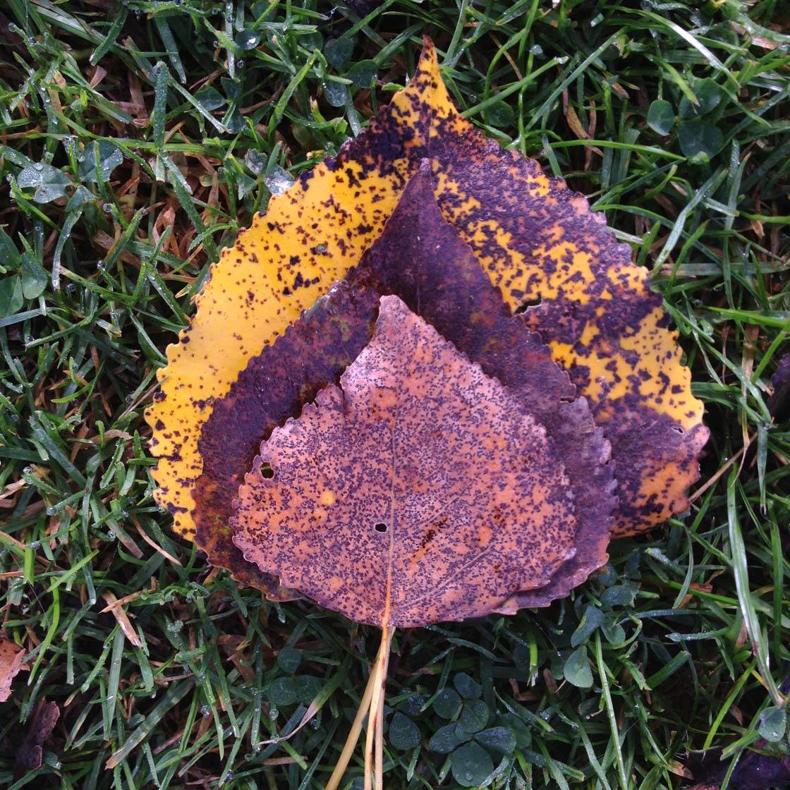
How Graphical Elements Will Improve Your Photos
Our brains are constantly trying to “resolve” what we see, hear, smell and feel. This is one of the reasons that some photos work and others don’t – our brains are trying to make sense of what we’re seeing.
We can use this to great effect in photography, by either satisfying our need for aesthetic harmony and accord, or deliberately creating tension by leaving the scene unresolved in a way that leads the viewer to ask more questions.
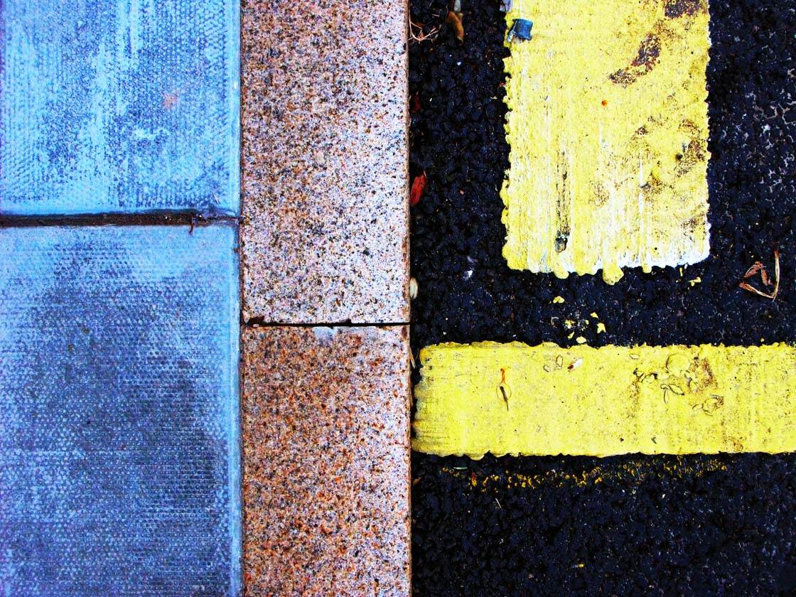
When we think about the scene we want to photograph in terms of the graphical elements within it, we give ourselves more tools to tell our story.
So how should you use these graphical elements? Should they be the main subject of your photo? If the elements you’ve found work as the subject then, yes! Many graphical elements work extremely well as the main subject.
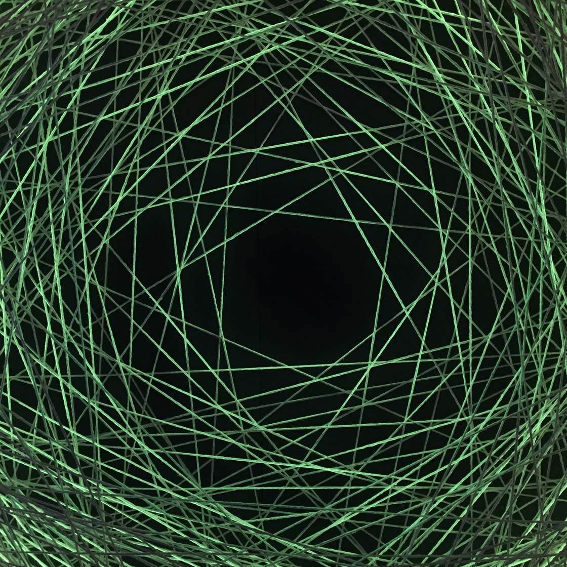
If the elements aren’t strong enough to work as a main subject, they might be better used to augment a more traditional subject, e.g. a person, building, plant, tree, vehicle, landscape, etc.
In such cases you can use your chosen elements within the composition to draw attention to the main subject. Or use several graphical elements together to create a cohesive and harmonious composition.
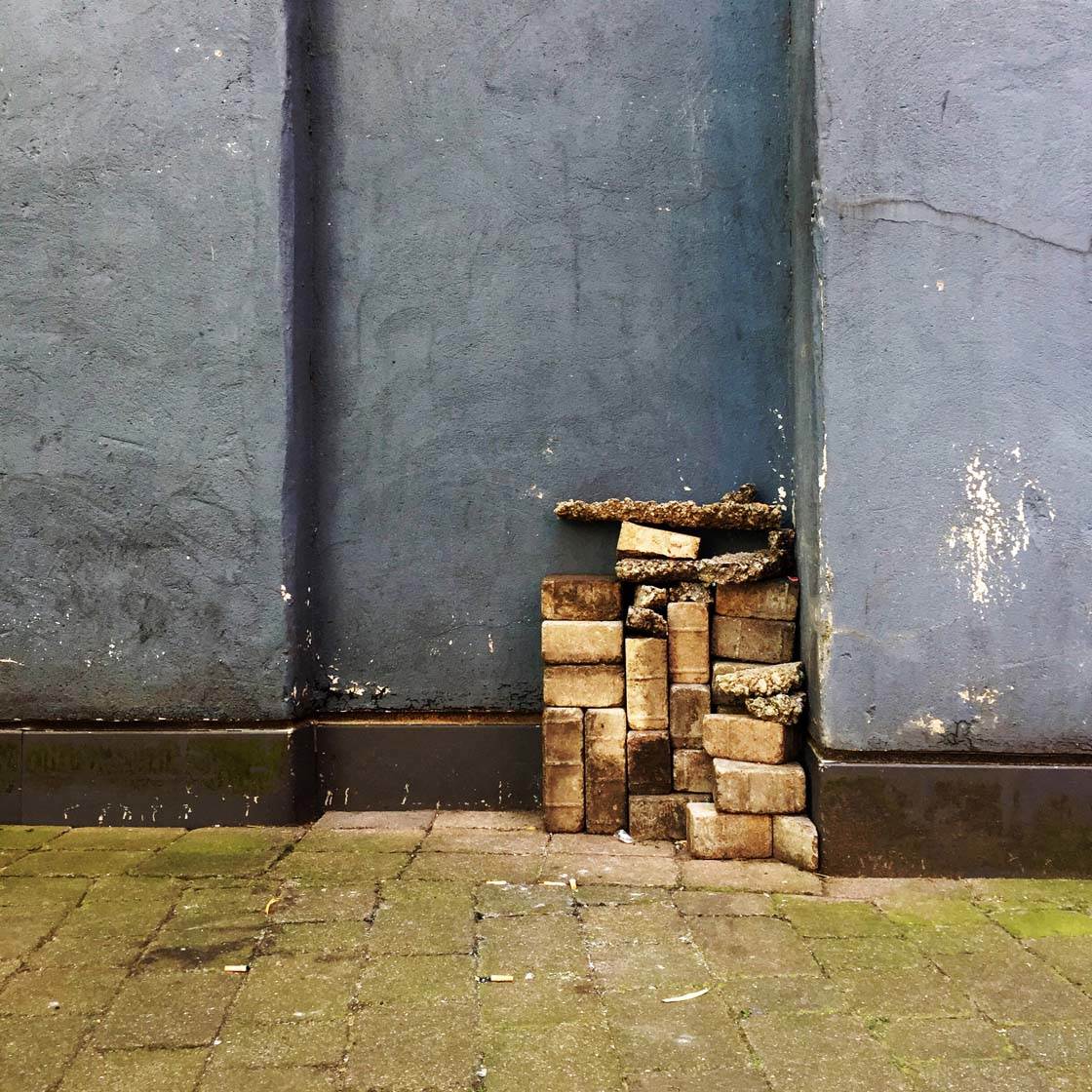
We’re surrounded by objects that have useful graphical properties we can use in our photography. You may not normally notice them, but after reading this tutorial you’ll start seeing them everywhere!
So let’s take a look at seven different types of graphical design elements that we can incorporate into our iPhone photos.
1. Shape
Two dimensional shapes are so important to us as humans. They help us identify things and we find them very pleasing to the eye. In photography we have the opportunity to include shapes to create strong and striking compositions.
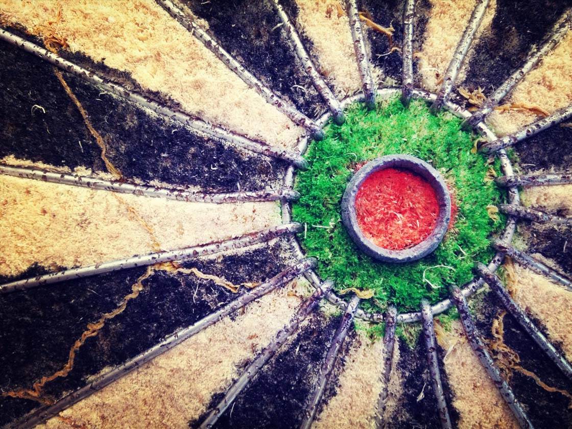
Circles, squares, rectangles, triangles, diamond shapes, heart shapes, and all manner of irregular shapes can be used to create strong visual interest in your images.
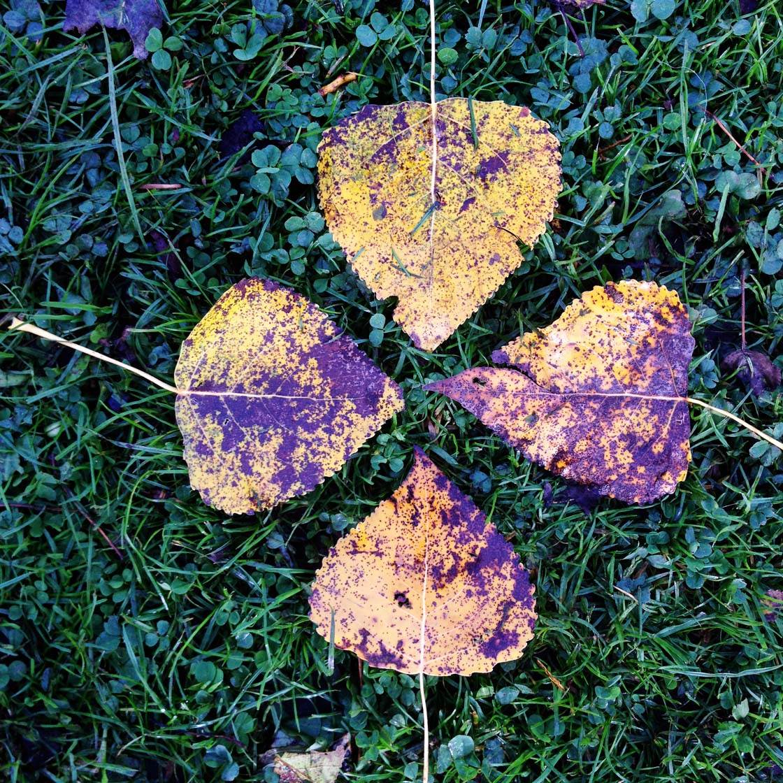
We can use certain objects with interesting shapes, or we can even make shapes out of objects within the scene. In the example above I arranged these familiar shaped leaves into a new shape.
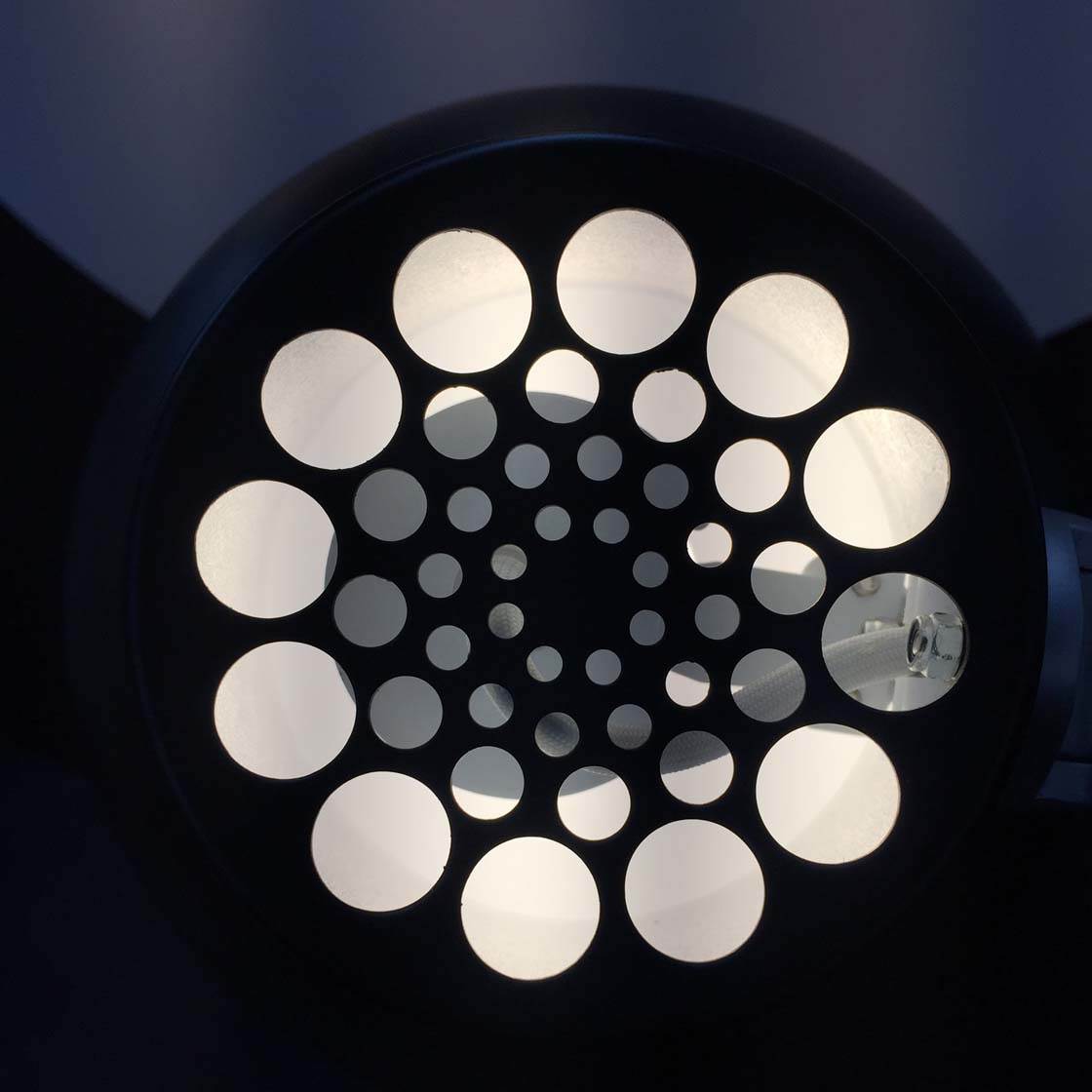
You can find interesting shapes all around you – in your house, in your garden, out on the street, at the beach, and anywhere else that you might happen to be!
Many household objects provide us with shapely subjects, such as plates, bowls, cookware, cutlery, lamp shades, etc.
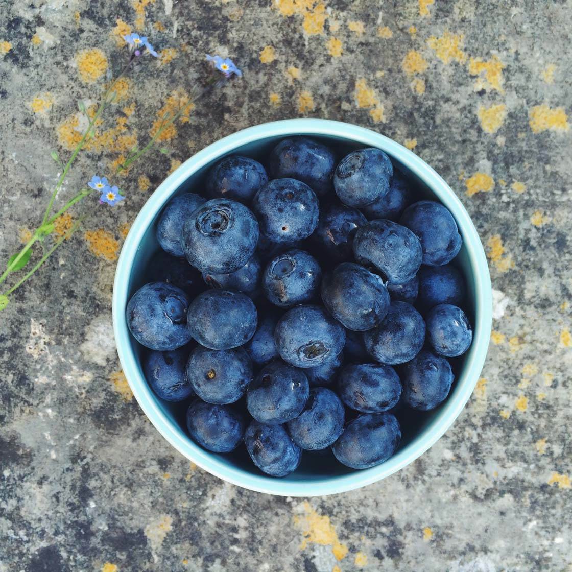
Photographing your object from above often helps to emphasize the shape of the subject, as was the case with this round bowl of blueberries.

We can even create shapes from nothing! In this example I was intrigued by the shape created by the gap in the rocks. The shape changed depending on the angle I shot from, and in this case the “empty” shape acted as the perfect “frame” for the distant cottage beyond.
2. Form
As we’ve just seen, shapes are typically two dimensional. But we can go a step further and introduce three dimensional graphical elements into our photographs. We call this “form.”
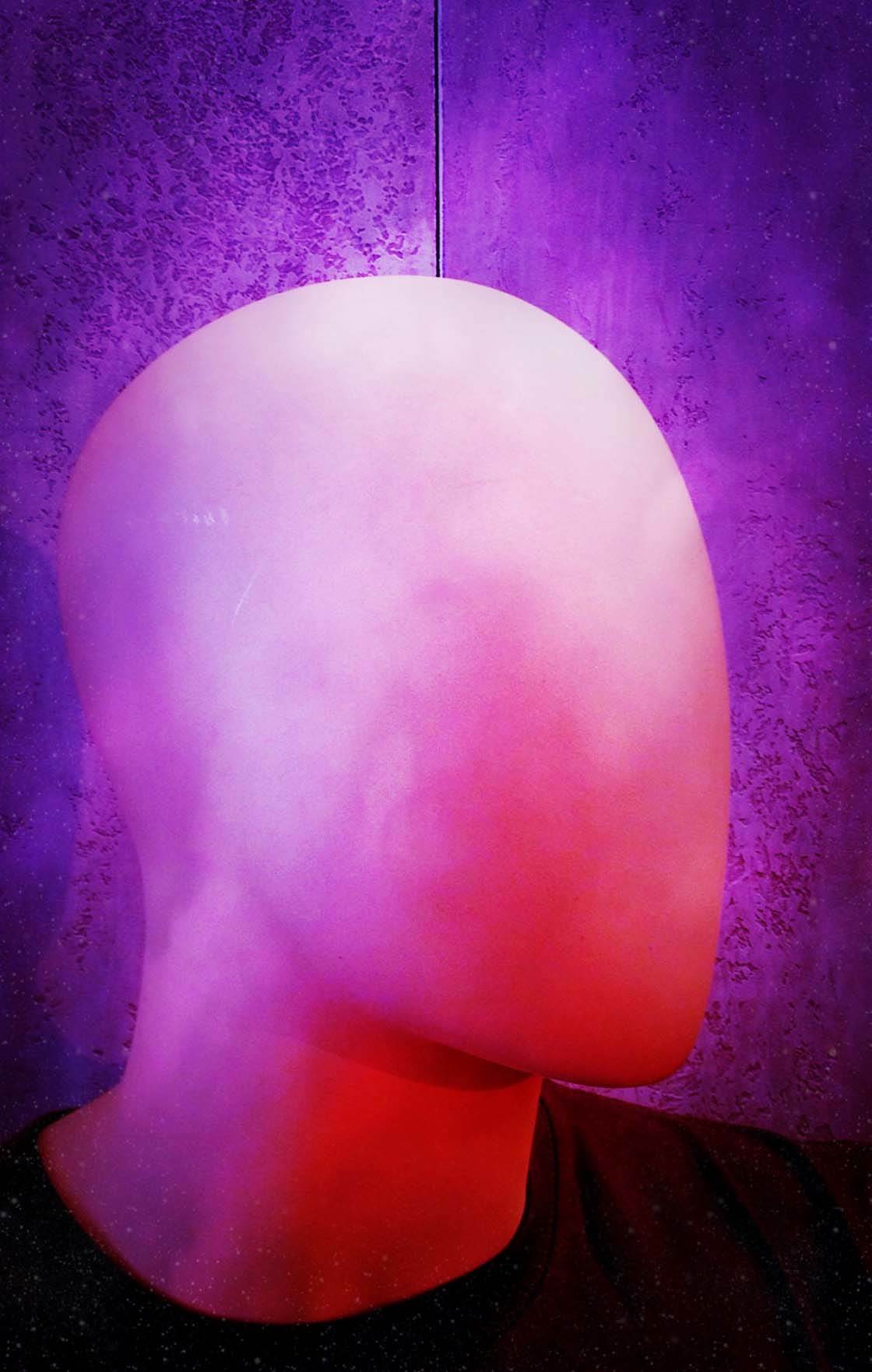
By emphasizing the three-dimensional form of the subject, we create a sense of depth in the scene. Traditionally we create depth by using leading lines, creating a sense of scale, or using a shallow depth of field to suggest a feeling of distance.
So how do you emphasize the three dimensional form and depth of your subject? One incredibly effective way of doing this is to use light and shade. Capturing your subject with varying degrees of light and shadows automatically creates a sense of depth as you’ll see in the examples below.
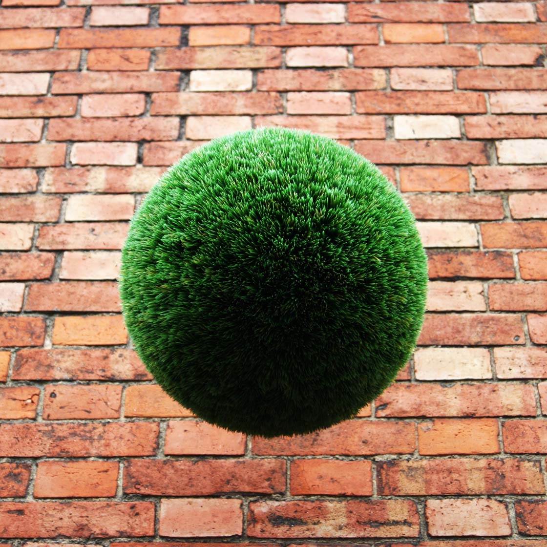
In the photo above I captured this hanging bush from an angle where the light and shade helps to emphasize its three dimensional form. This makes it appear to be almost popping out of the picture.
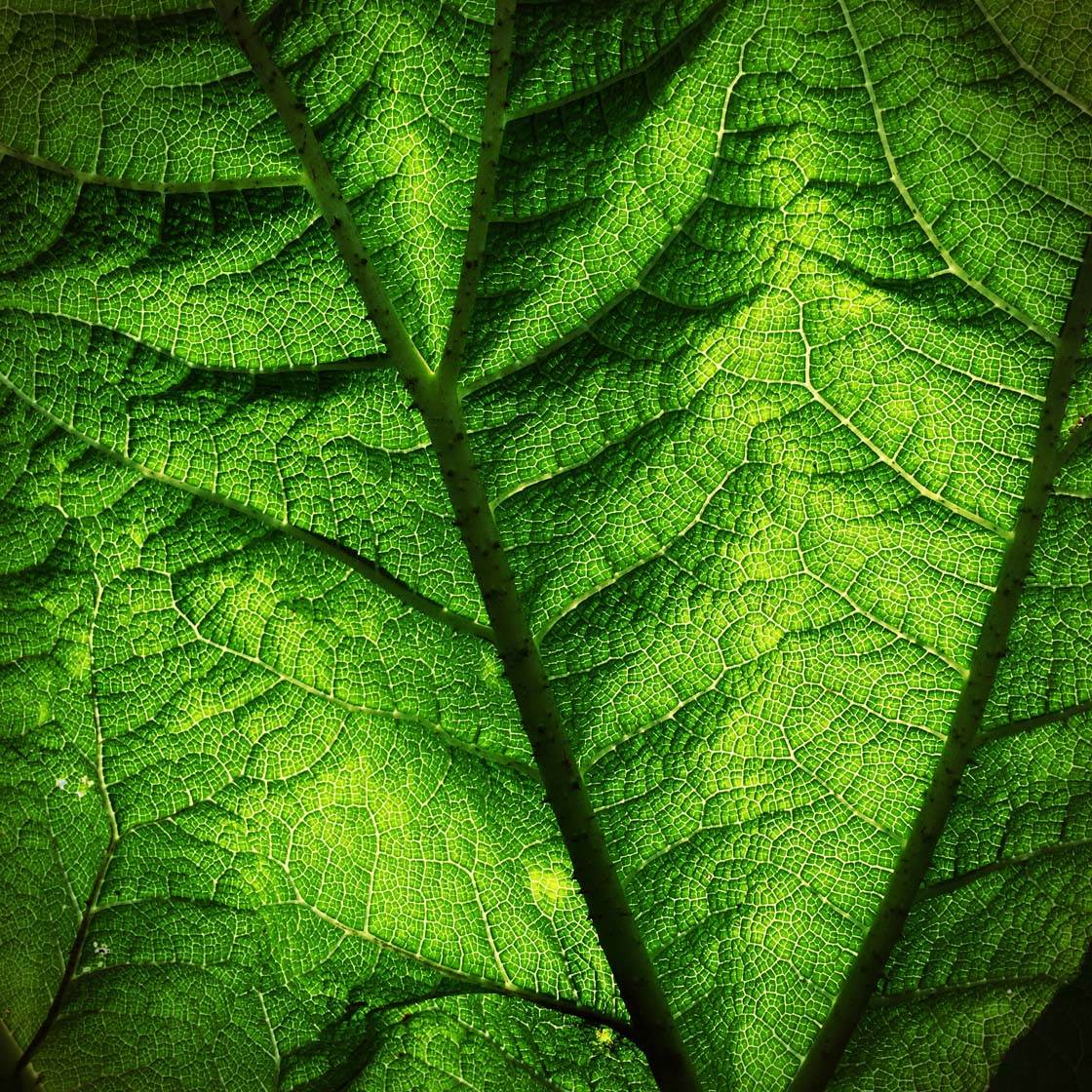
Above is another example where light and shade emphasizes the three dimensional shape of an object. This is a close-up shot of a large leaf, but it looks almost like a mountain range!
By experimenting with your shooting angle and the position of your subject in relation to the light, you can capture wonderfully three dimensional images that emphasize the interesting three dimensional form of the object.

Form can also be represented with elements that flow around the image. Here I photographed the arm of a bench which curls and flows from one part of the image to another.
3. Line
Lines are probably the most powerful design element that you can include in your photos. Lines are everywhere around us, and they can be used to create incredibly striking compositions.

Whether you live in a busy urban city or in the middle of nowhere, you’ll always be able to find lines that you can incorporate into your images.
Lines can be straight, curved, S-shaped, parallel, converging, vertical, horizontal, diagonal, etc. There are so many different types of line, and so many ways to use them, that you’ll never run out of ways to incorporate them into your iPhone photos.
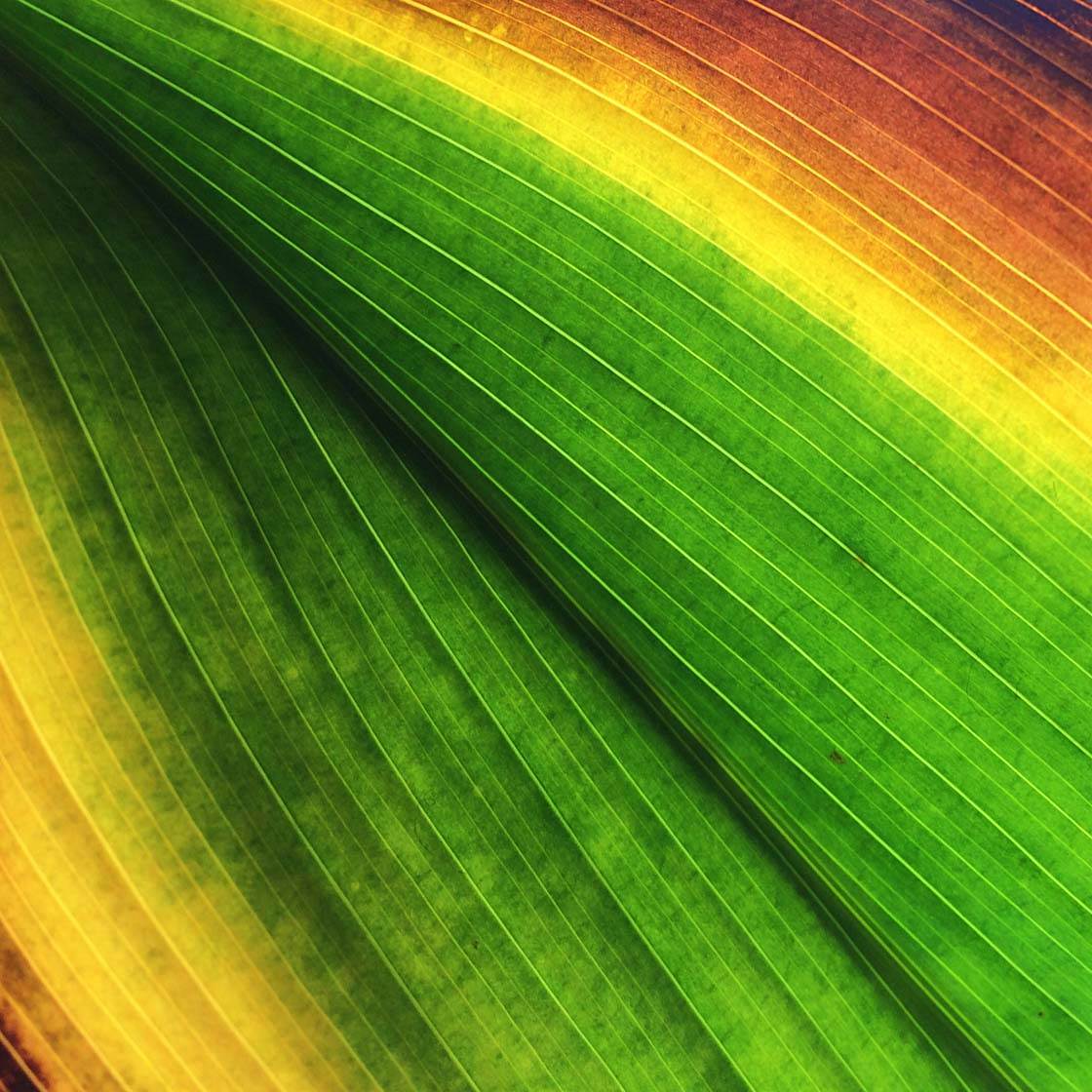
Look around you and take note of any lines that you might be able to include in your pictures, such as roads, fences, bridges, railway lines, rivers, architectural elements, the veins on a leaf, etc.
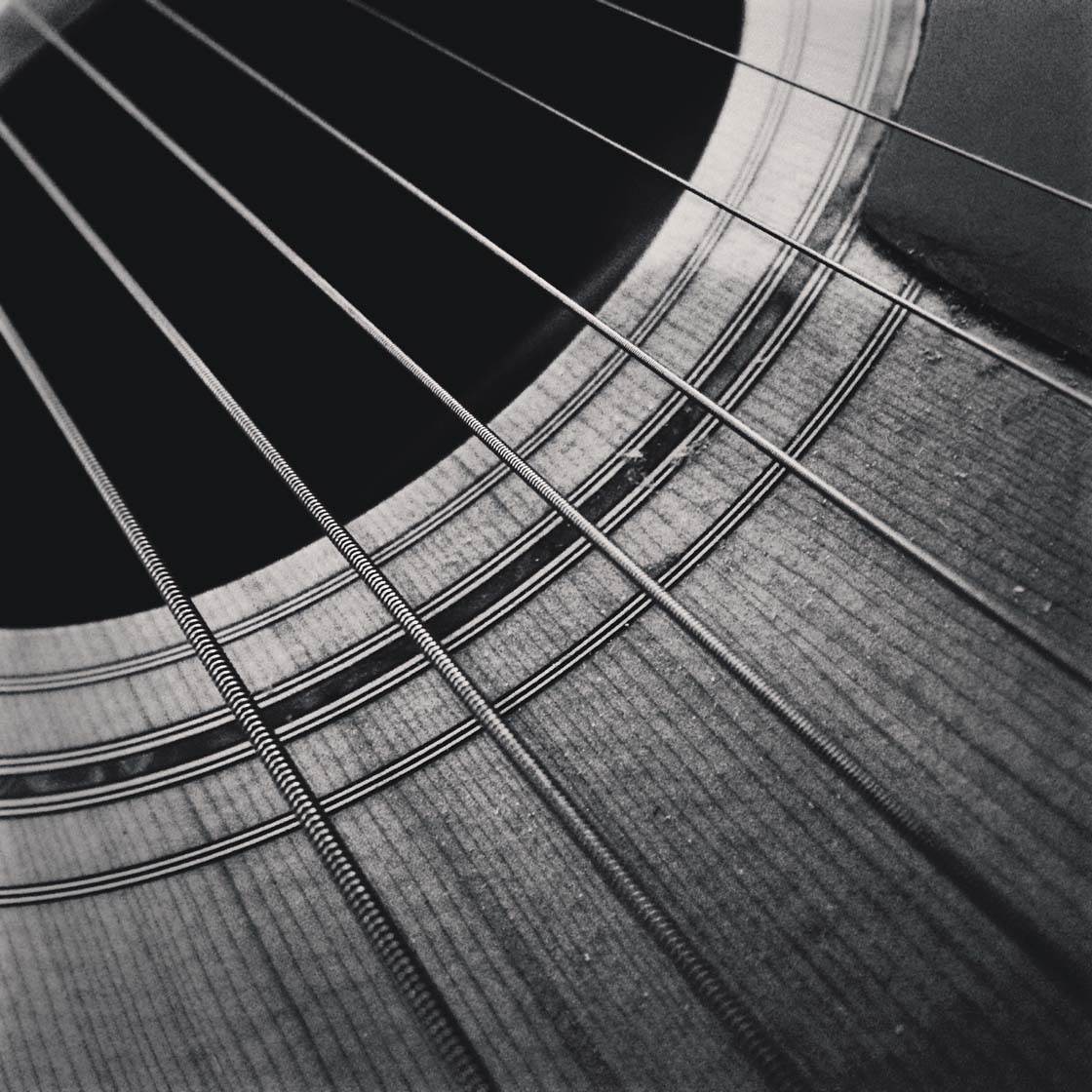
You’ll also be able to find plenty of lines to photograph in your own home too. This close up shot of my guitar provides many different lines, both straight and curved.
When you find a line, or lines, that you want to include in your photo, think about the best way to compose the shot and experiment with different viewpoints until you find the best angle.
Ask yourself whether the lines would look best if they run horizontally, vertically or diagonally across the frame. Also, think about your shooting angle. It might work better if you shoot from a low angle or maybe from above.

Photographing parallel lines that converge into the distance add a strong sense of depth to an image. You can also use lines to lead the eye towards the main subject. We refer to these types of lines as leading lines as they lead your eye from one place to another within the scene.
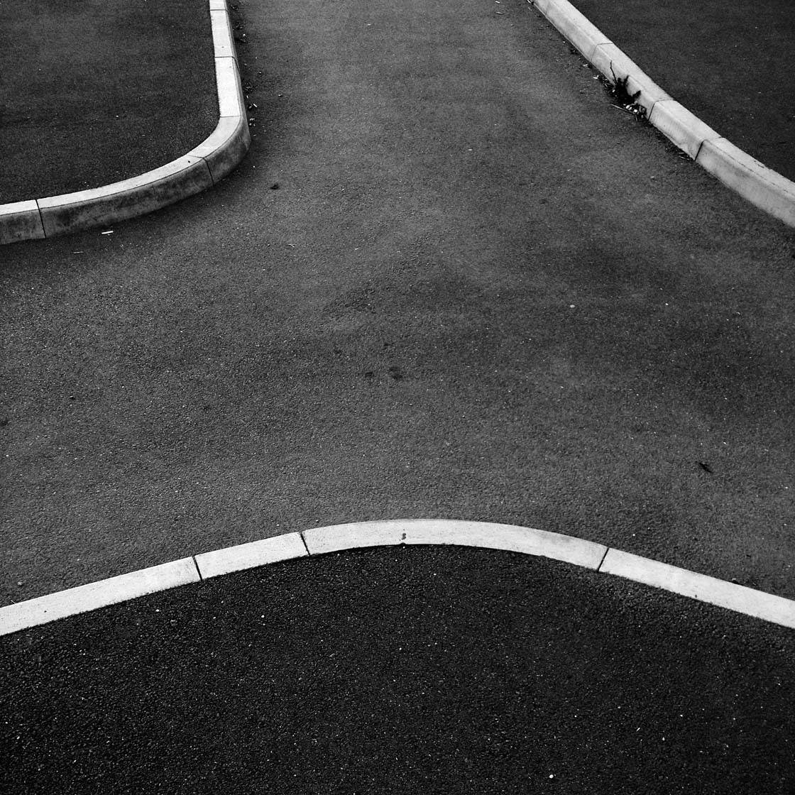
Lines are also great at forming shapes. Train your eye not only to recognize lines, but also to spot whether the space between the lines form any interesting shapes. The shapes created by the lines of this cycle path and the surrounding sidewalks make a great minimalist and abstract shot.
4. Color
Understanding how to use color in your iPhone photography is very important as different colors, or combinations of colors, evoke different emotions and feelings in the viewer.
We don’t really have much, if any, control over the color of our photographic subjects. But we do have control over which subjects (regardless of their color) are included in our scene.
Careful selection of subjects based on their color can really add impact to your photos. Choosing a strong background color can work too.
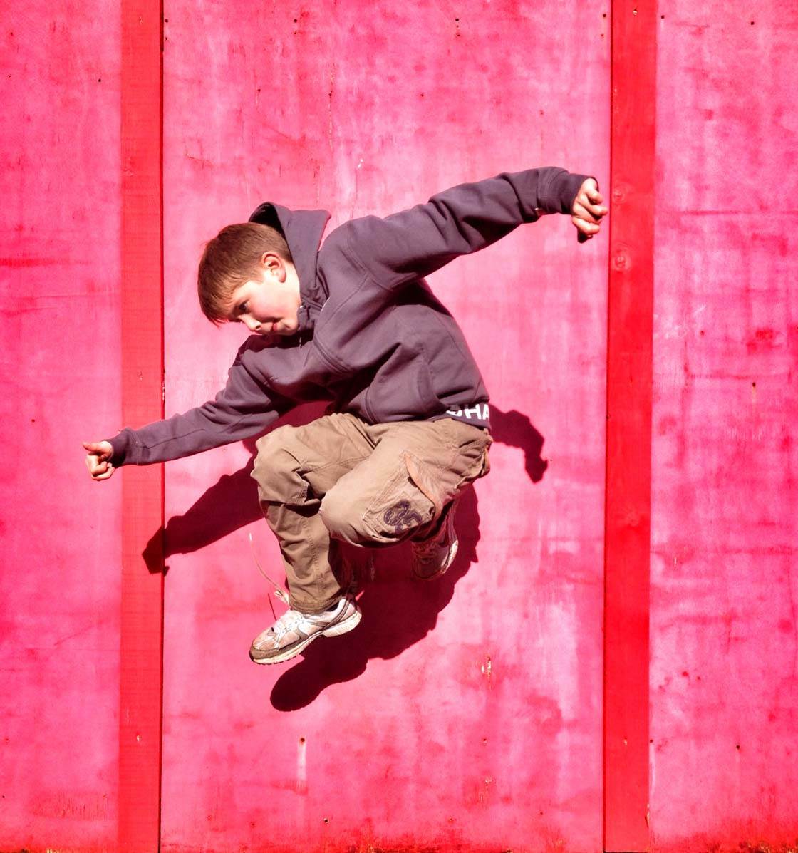
This photo of my son jumping in front of a colorful background demonstrates how a vivid colored background can help draw attention to the subject, even though the subject isn’t particularly colorful.
Look for punchy, vivid colors for maximum impact, but don’t underestimate the power of subtle, pastel shades which can be just as effective so long as they’re not overpowered by a dominating color.

This color of this lamp isn’t too dissimilar in color to the background. Yet the background is so neutral and plain that it still allows the subject to stand out.
Be wary of overloading your scene with too may different colors as this can become distracting for the viewer. However, in certain situations a multi-colored image might make a bold statement.

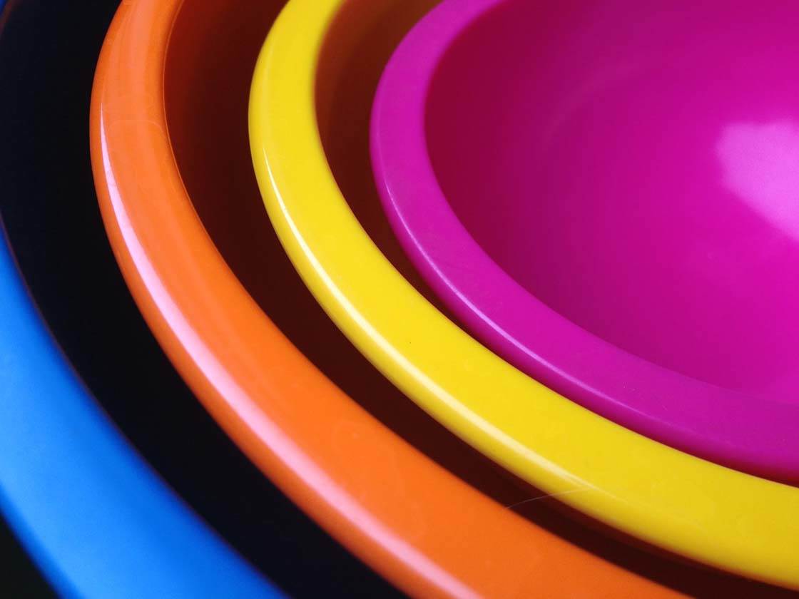
Even though there are five different colors in the photo of these nested bowls, I think it works because the shapes are so strong and the colors are all so vivid and contrasting.
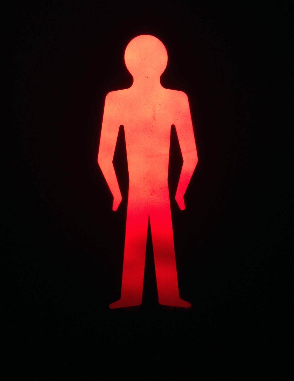
Remember that we usually want our subject to stand out in some way, and using color is a great way to achieve this. Having a single colored subject against a neutral (white, black or grey) background is a really powerful way of getting your subject noticed.

Sometimes just a single color can have the most impact, especially when combined with interesting shapes or textures as shown above. Filling the entire frame with one color places maximum emphasis on the subject, and the color itself can often become the main feature of the image.
You can of course alter color after taking the photo using image editing apps. For example, you can saturate the colors to make them more vivid, desaturate them to make them more muted, warm up or cool down the colors, or even change the colors to completely different hues.
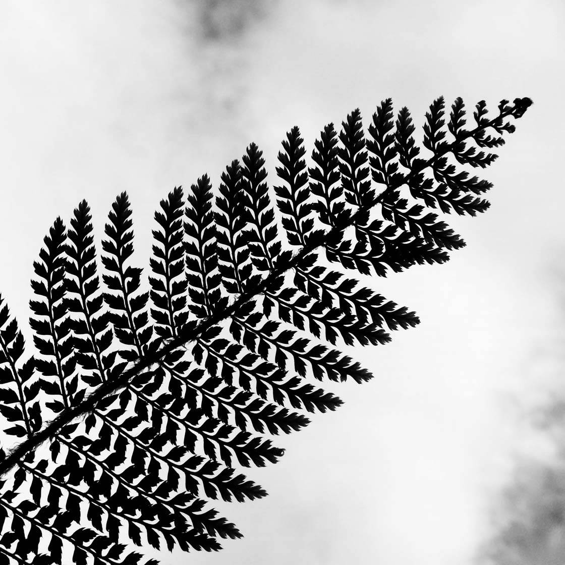
Completely removing all color can work well in certain situations as it takes attention away from any distracting colors. This works especially well with silhouette photos as it lets you place maximum emphasis on the shape of the silhouetted subject.
Black and white doesn’t work well for all pictures though. High contrast images that have very dark and very bright areas, as well as photos with strong shapes and texture, tend to work best for black and white photography.
5. Texture
Texture is a design element capable of evoking strong emotions in the viewer. When we see textures in a photo they bring out different feelings depending on whether that texture is rough, smooth, soft, shiny, slimy, etc.

Textures make your photos more tactile, inviting the viewer to reach out and touch the picture. This creates a more engaging image that the viewer will want to interact with.
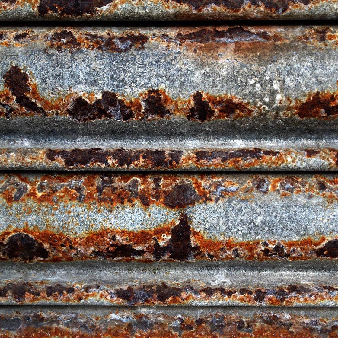
We can use texture in photography to emphasize a certain atmosphere in our images. For example, the rough texture of the rusty metal above creates a completely different feel to the soft texture of the feathers in the photo below.
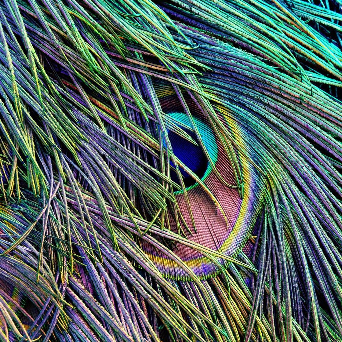
Texture helps to create images that appear more three dimensional. Textured surfaces can almost appear to be popping out of the photo if you capture them correctly.
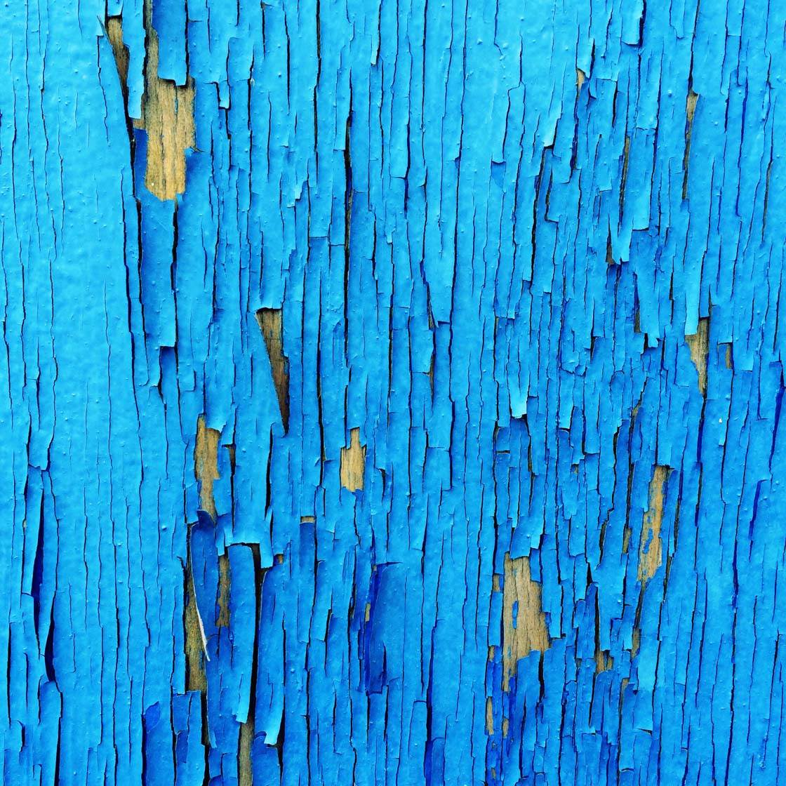
When you spot an interesting texture, such as peeling paint, rusty metal, rough wood, a soft feather, etc. be sure to get up close and fill the frame with the texture. Close-up shots of texture will have much more impact as it shows the fine detail of the subject.
The key to capturing amazing textures in your photos is to shoot in the right kind of light. When the light is hitting the textured subject in such a way that it casts small shadows, it usually makes for a more interesting and three dimensional shot that really shows off the form of the textured subject.
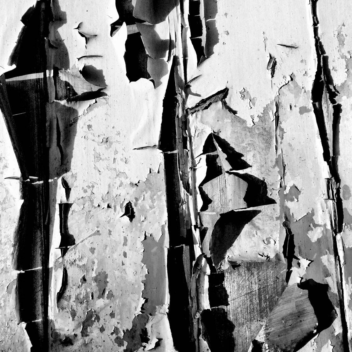
The texture of this peeling paint on an old door was enhanced by the low, directional sunlight cast across it. The difference between light and shade on the different sides of the paint helps to emphasize the texture of this subject.

Water can be a great surface for photographing texture. Depending on whether the water is still or moving, different textures can be captured. In the picture above I photographed the colorful reflections of the sky and trees in the slightly rippled texture of this slow moving river.
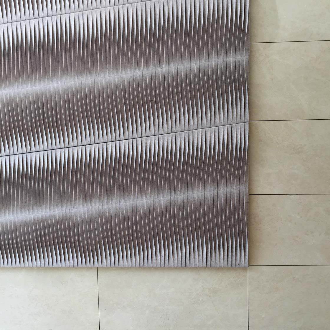
Another interesting thing you can do with textures is to photograph two contrasting textures next to each other. Here I’ve captured the smooth texture of the tiles, together with the rough texture of the metal wall-hanging. This juxtaposition creates an added element of interest to the image.
6. Pattern
Patterns and repetition are all around us. Capturing patterns in your photography will create wonderful abstract images with a strong visual impact. Shapes, lines, color and texture all contribute towards creating repetitive and eye-catching patterns.
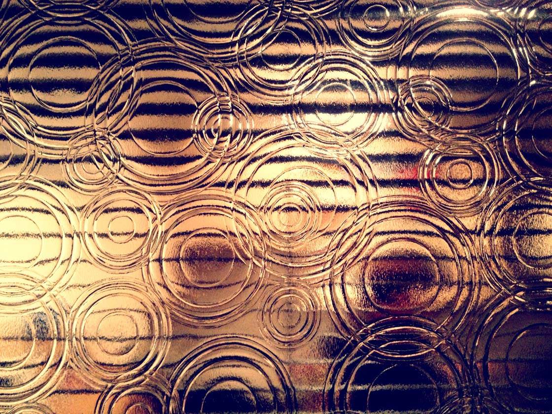
Many patterns that you find are man-made or designed, such as fabrics, wall coverings, decorative tiles, patterned glass, etc. I spotted the window above with a pattern of clearly defined concentric circles. The backlighting from the light indoors helps to highlight the pattern in the glass.

You’ll often spot patterns that are created by the positioning of multiple repetitive objects, such as brick walls, roof tiles, stacked timber, a row of cars, etc. Others patterns are completely natural, such as pebbles on a beach, leaf veins, ripples on water, fish scales, feathers, wood grain, etc.
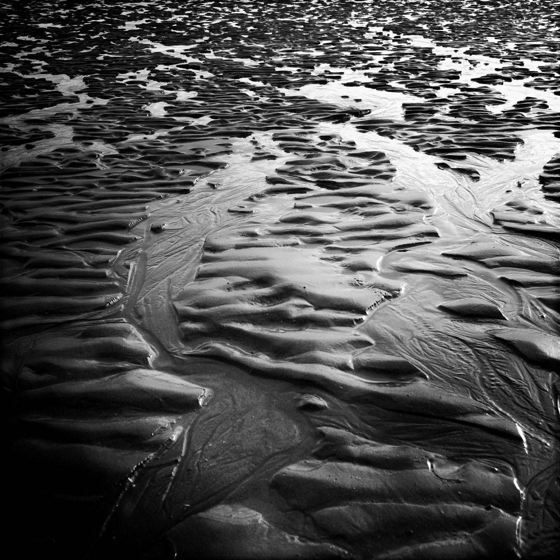
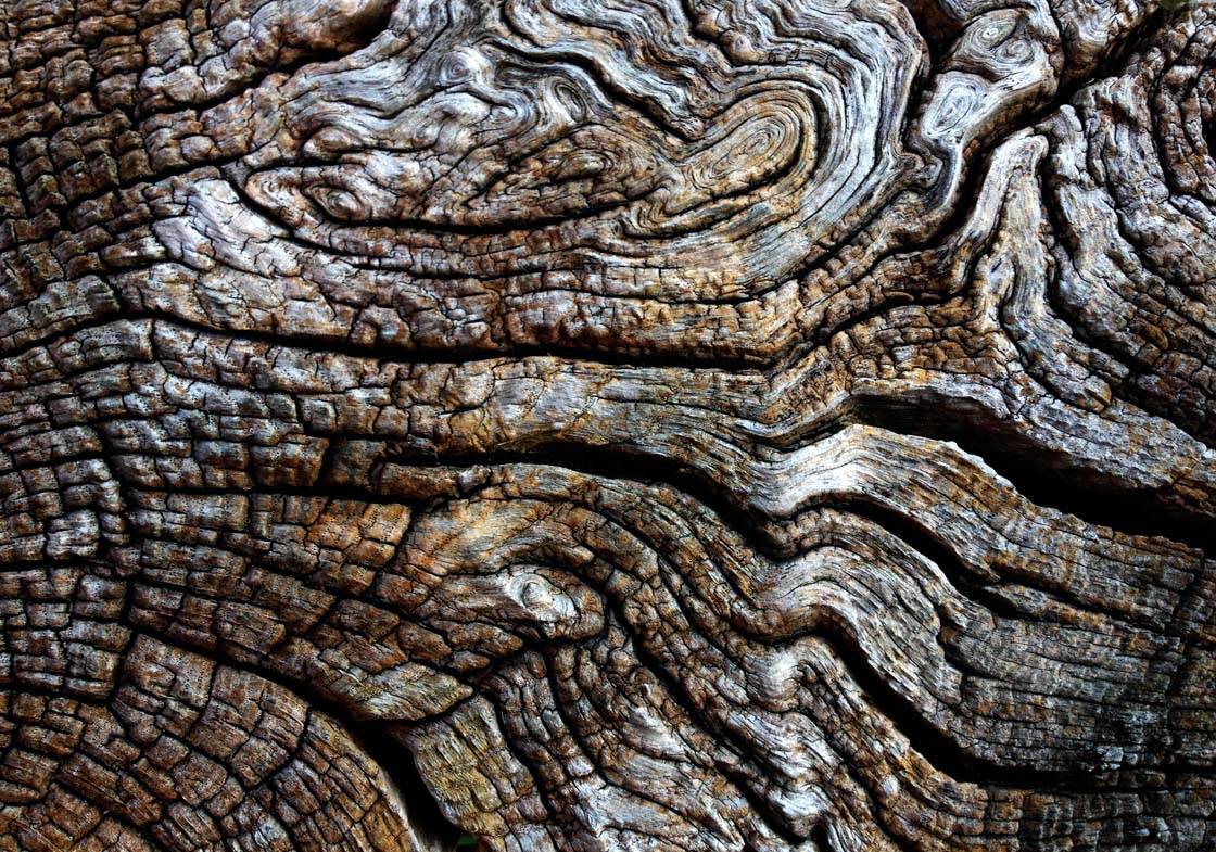
Patterns in nature tend to be more irregular, such as these ripples in the sand that I captured at the beach, or the wood grain of an old chopped log as shown below.
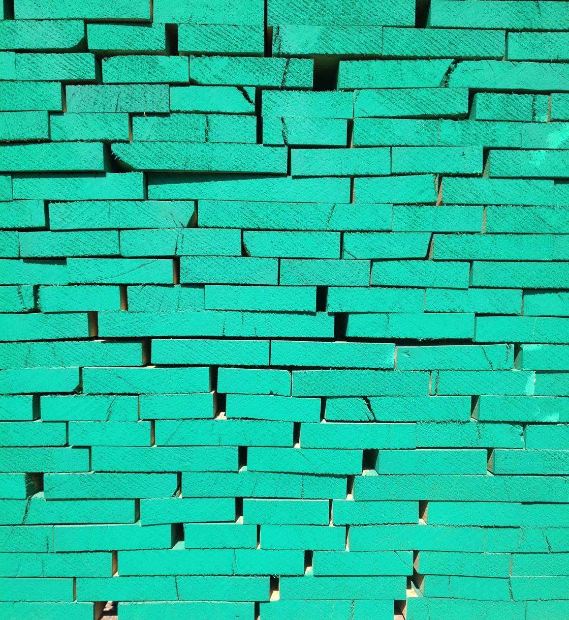
Combining patterns with strong vivid colors work particularly well. When I spotted the treated ends of a neatly stacked pile of timber shown below, I knew it would be a great opportunity. The slightly irregular pattern, combined with the vivid green color creates a striking image.
When photographing patterns, it’s best to fill the entire frame with your subject. This puts maximum emphasis on the subject and helps to create stunning abstract photographs.
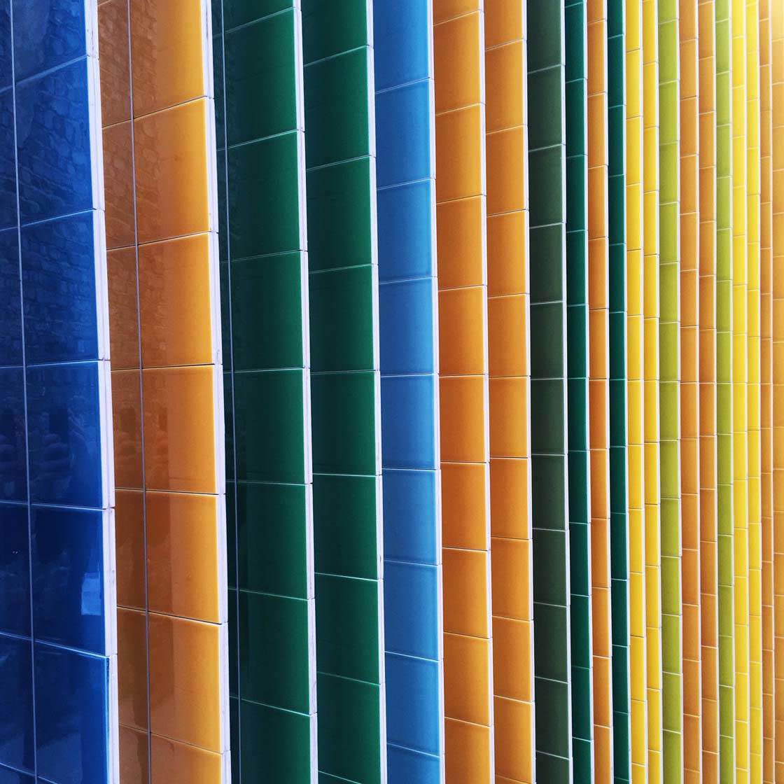
Patterns will often look very different depending on where you view them from. Experiment with shooting from different angles to capture the pattern in a variety of ways. That way you’ll have several images to choose from.
7. Text
The final design element that we’re going to look at is text. We see words and numbers so often that we tend to forget how interesting they can be when presented in the form of an image. We can use text to communicate powerful messages and even convey humor in our photography.
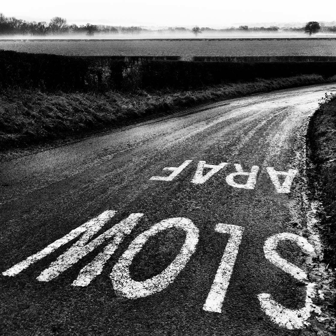
We’re bombarded by signs, advertising and road markings on a daily basis. They’re everywhere we look! As photographers, we can use this text as the subject matter for our images. Not only do they help us to convey messages to the viewer, but they also add a strong graphical element to our photos.
Personally I find worn road markings and signs very intriguing. When I stopped at the crossing below, I noticed how worn the letters were, and wondered how many people had stopped at these road markings, and how many hadn’t.
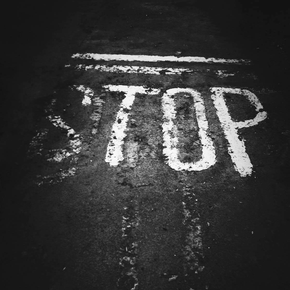
By capturing just the word “STOP” without any of the surroundings, I’ve placed maximum emphasis on the text as there’s nothing else to distract the eye. It also makes it more intriguing and the viewer can add their own context and unique story to the image.
My intention with this image was to give the viewer a jolt and make them stop for a few moments – stop whatever they’re up to, stop and look at the photo, stop and think about what they’re doing.
When you spot a sign containing text, think carefully about how to compose your shot for maximum impact. Sometimes it works best if you include the surroundings to add context, but often a better option is to crop in closely and eliminate any unnecessary elements from the scene.
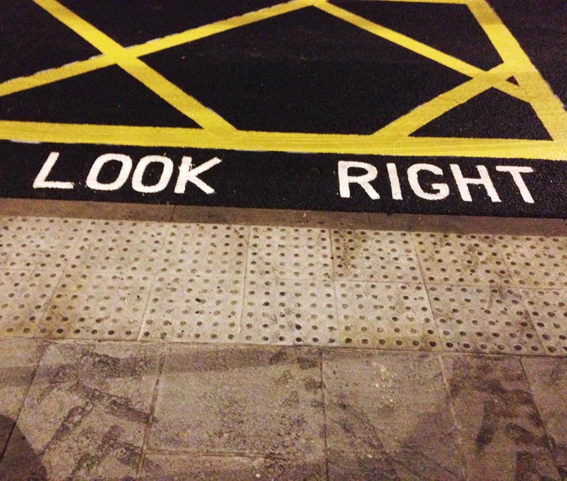
In the photo above, I could have included the arrow pointing to the right, but I deliberately chose to crop it out so that the text stood on its own.
This creates a more ambiguous message that the viewer can interpret in their own way. To me it seems like it’s trying to give us style or fashion advice… “Don’t look wrong, look right!”
Taken in isolation, some text can have a strong artistic and aesthetic appeal. The doorway into an office building that I passed recently had its street number tiled into the floor.
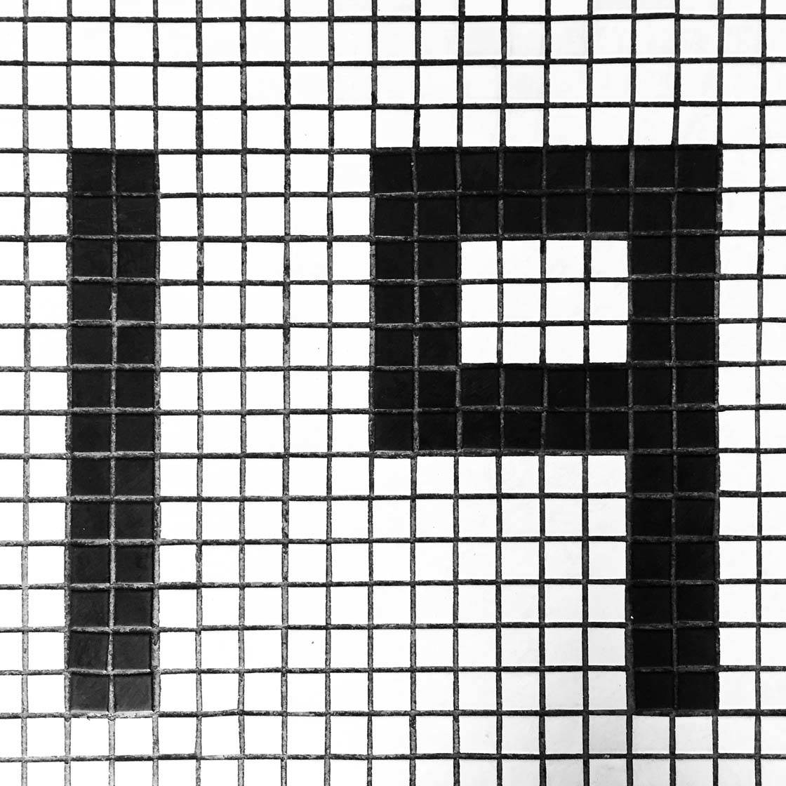
The grid pattern, as well as the contrast of the dark numbers against the bright white tiles, creates an images with a strong graphical design element.
Next time you’re out walking through the streets or riding the subway, keep your eyes peeled for interesting street signs or road markings that might make a good subject for your iPhone photos.
Summary
You should now have a good understanding of how to use a variety of graphical design elements in your iPhone photos to help improve their visual impact or tell a story better.
Learning to capture strong shapes, three dimensional form, lines, color, texture, patterns and text will dramatically improve your photography.
These elements of design can often be used in conjunction with each other to create powerful and striking images that grab the viewer’s attention and invite them to engage with the scene.

excellent tips, now it’s just practice!
Thanks Israel. I hope you’ve been able to incorporate some of these design elements in your own photographic work. 🙂