Double exposure photography allows you to combine photos to create truly unique images. Using apps on your iPhone allows you to create amazing double exposure portrait photography that will surely have your friends and family asking “How did you do that?!” In this tutorial you’ll learn how to unleash your creative side and produce these incredible double exposure portrait photos on your iPhone.
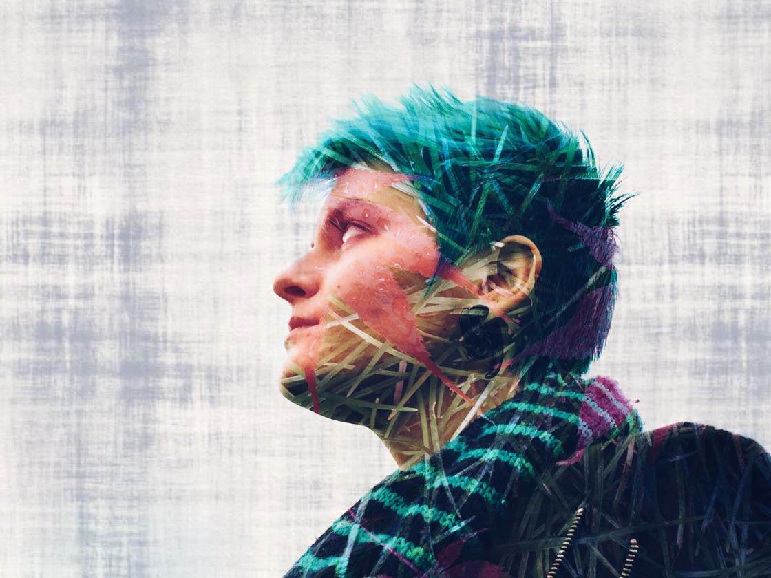
What Is A Double Exposure Image?
A double exposure image is one where two photos are merged into a single image. It is done in such a way that the images blend into one another, with one photo superimposed on the other.
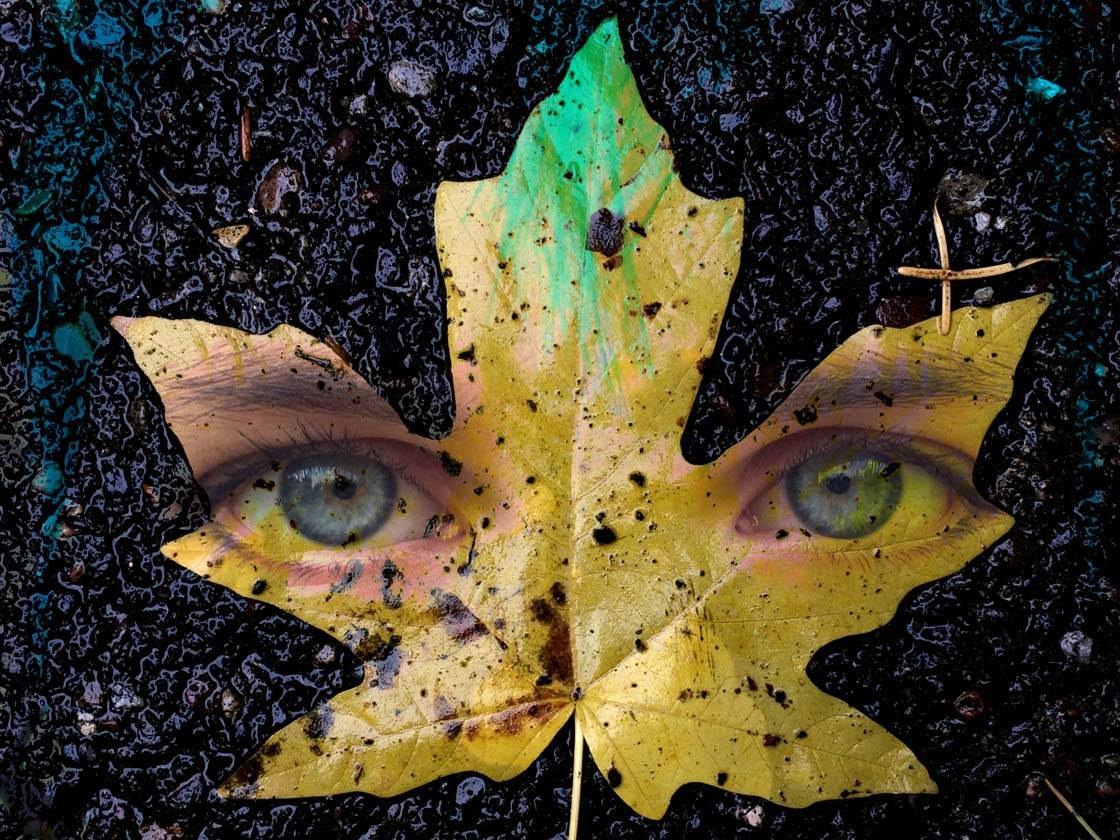
Using an app such as Union, you can blend the images together so that the bottom image is partly visible though the top image. This allows you to create some really unique images that will intrigue the viewer.
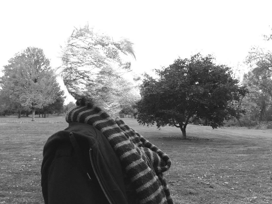
Of course, you can blend any two images together, but in this tutorial we’ll be focusing on portrait double exposures. This involves blending a portrait photo of someone with another image of your choice.
You can see lots of awesome examples of double exposure portraits in our interview with my buddy Brandon Kidwell.
What Kind Of Images Work Well For Double Exposures?
I’ve found that a tight headshot of the person works best, so get close to your subject to include just their head and part of their shoulders.
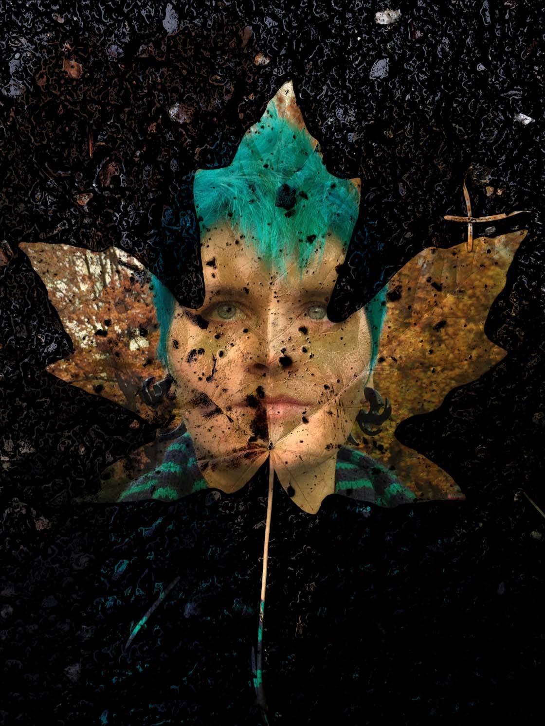
The blending of the images works best if the sky is overexposed. It’s usually best to look for cloudy or overcast conditions to take your headshot photo.
What you lay on top of that image is really up to you. I would say it depends on your subject. What are their passions? What best expresses who they are inside?
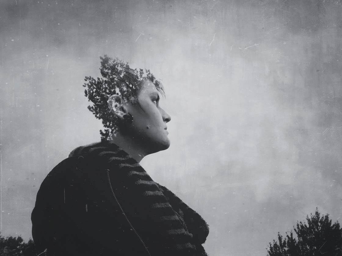
A lot of people have a love of nature, which is why you may have seen a lot of double exposures with trees, branches and leaves over the past couple of years. Or maybe they just think it looks cool… which it does!
Combine Your Images Into A Double Exposure
I’ll now take you though the process of creating a double exposure portrait image. The Union app is great for blending two images together to create a double exposure image. It costs $1.99 to download from the App Store.

The first thing you need to do is import your two images into the Union app. When you open Union, tap Background then tap Photo.
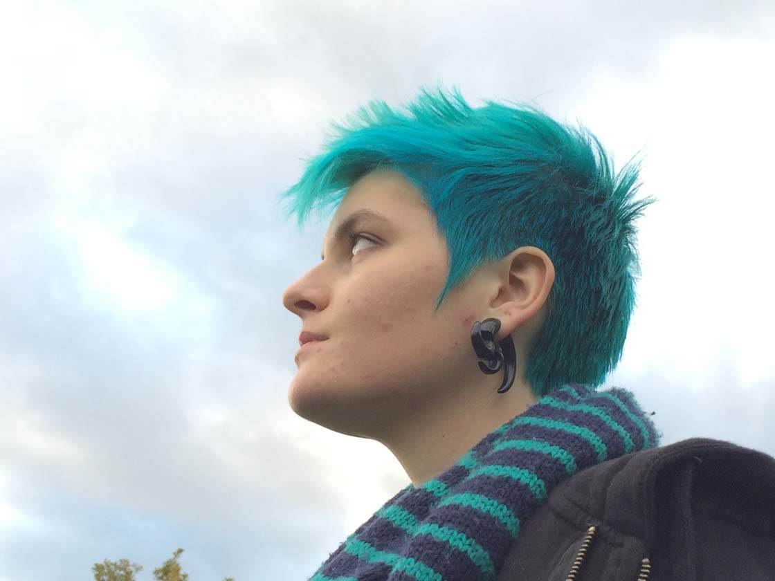
The background image should be your photo of a person, so select the portrait photo that you want to use, then tap the checkmark at the top right. Below is the portrait image of my friend Beth which I used to create the double exposure photo above.
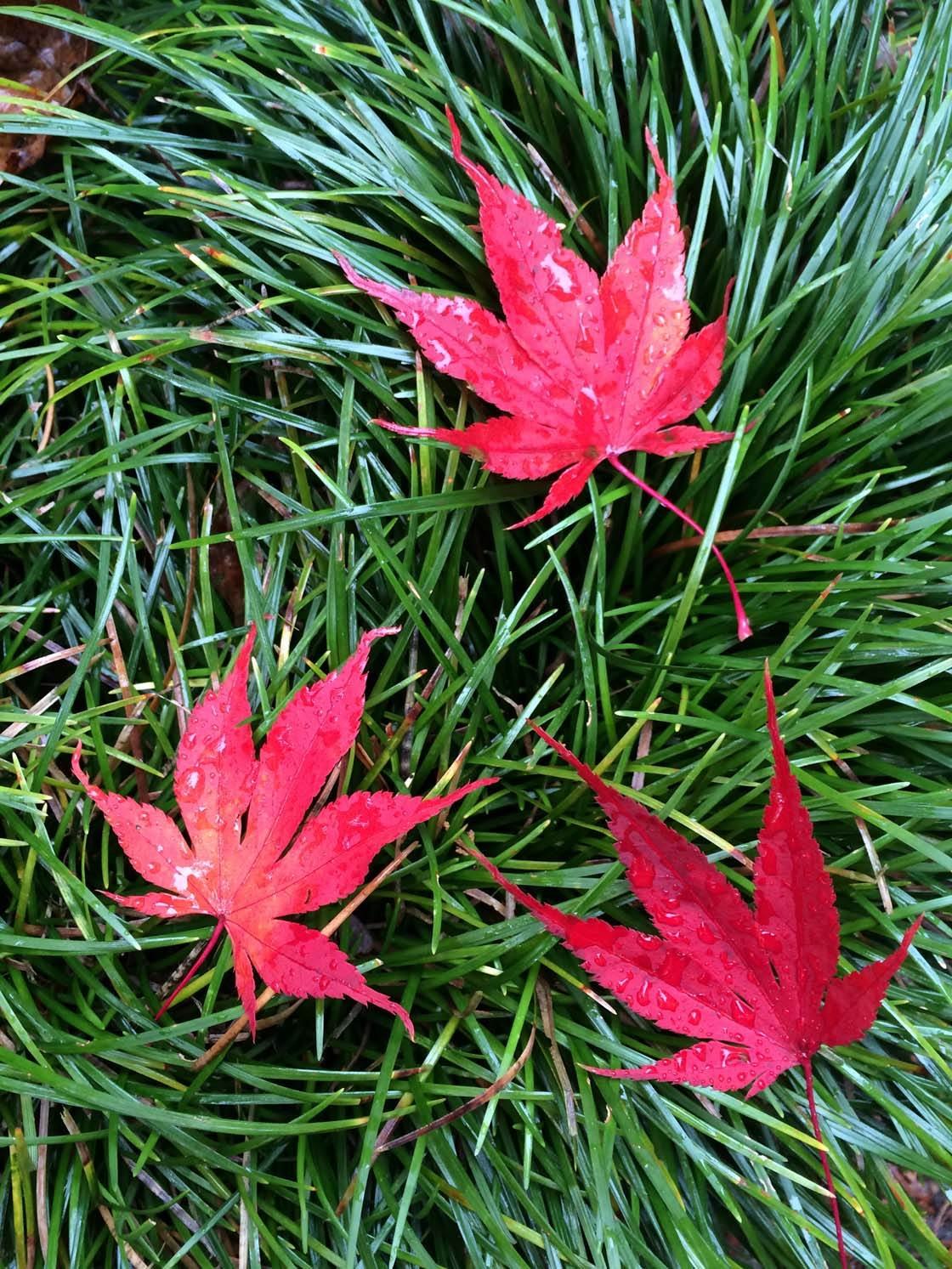
The next step is to add the foreground image – this is going to be whatever you want to lay on top of your subject, e.g. trees, flowers, etc. Tap the menu button at the top of the screen, then tap Foreground and select the photo you want to use. I chose the image of grass and leaves shown below because I liked the colors and texture.
Once you’ve loaded both images into Union, you can rotate and resize your foreground image to get it in the exact position that you like. Don’t worry, you can always change its position at any point.
You’re now ready to blend the two images together. Tap the Blending Mode icon (two orange circles) at the top of the screen. The list of blending modes probably won’t mean a lot to you at the moment, so I’ll briefly explain a bit about the ones you might want to use.
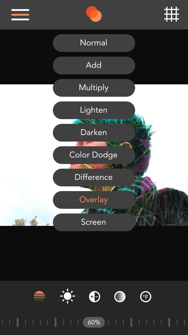
“Normal” blending mode means you won’t see the background image as there is no blending going on. However, if you reduce the opacity of the foreground image, you’ll begin to see the background image show through.
“Add” blending mode deals with luminance, or brightness. It brightens the background colors, unless there is black on the foreground image – black areas remain unchanged. This is useful for adding trees or other objects to heads.
“Multiply” is used to darken the background image. “Screen” blending mode produces a lighter image. “Overlay” blending mode adds contrast.
Now, if you don’t know exactly which blend mode to use, simply try out each one to see how it changes the way the images interact with each other.
For my image I chose Overlay because I really liked the way it kept contrast in the image, whereas Add, Lighten or Screen would have washed out a lot of contrast. I especially liked the way the grass added more texture to her hair, and also the way the leaf over her face seemed to look like a mask.
If you find that the blending effect is too strong, you can reduce the opacity of the foreground image using the slider at the bottom of the screen. I ended up lowering the opacity to 60% to decrease the contrast of the resulting image a bit, making it look more realistic.
You can further affect the way the images blend together by playing with the brightness, contrast, saturation and opacity of your images. Start by tapping the menu button at the top left and select whether you want to work on the background or foreground image. I started with the background image.
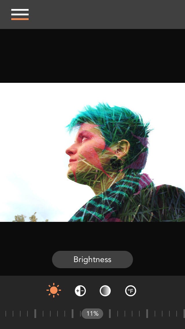
Tap the Brightness button at the bottom (shown in orange above) then use the slider to brighten or darken the background image. In my photo I chose to increase the brightness of the background image by 11%. By increasing the brightness, I could overexpose the sky which makes for a clean blend.
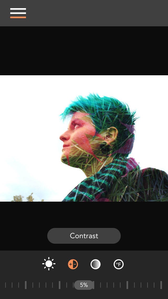
You can tweak the image contrast using the Contrast button at the bottom of the screen. I only made a slight adjustment to the contrast, increasing it to 5%.
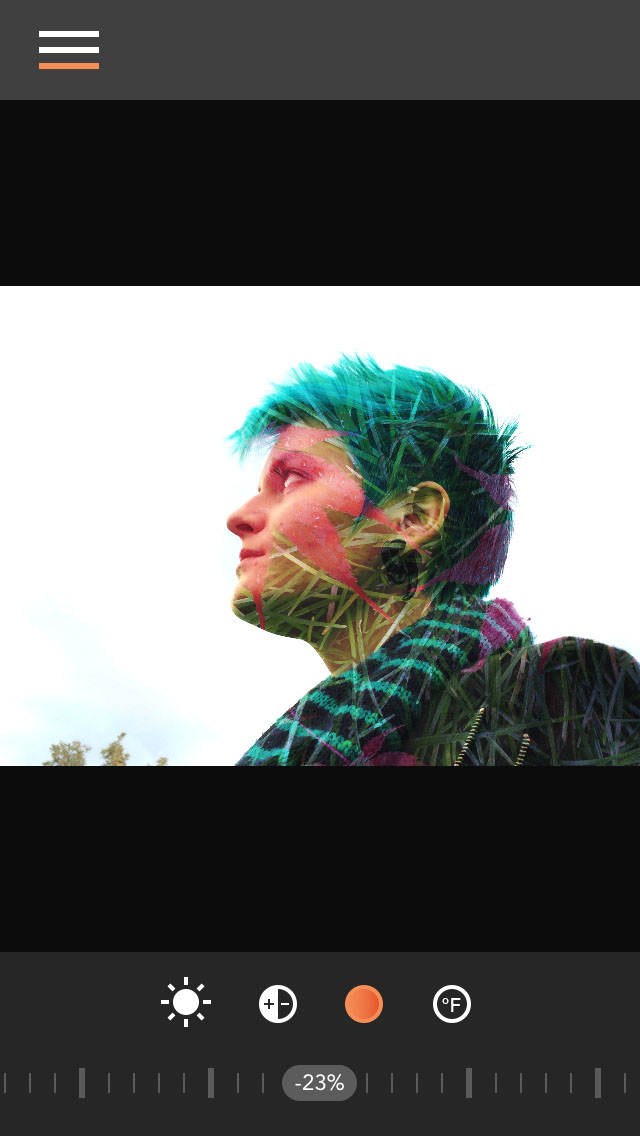
Using the Color Saturation button, I lowered the saturation of the colors to -23%. This is often necessary when using the Overlay blend mode as it will add some saturation to the background image.
If you want to make alterations to the foreground image, tap the menu button and select the foreground option. Below are the settings that I chose for my foreground image. Keep in mind that all of these adjustments are done to your taste. There is no special formula that works on every pair of images.
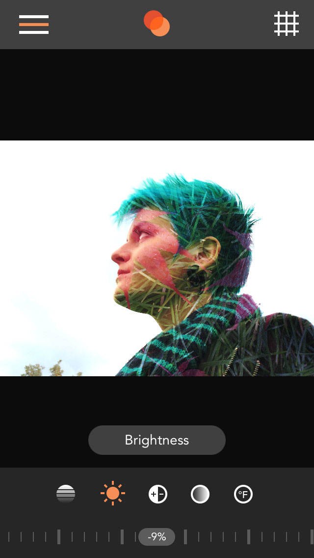
I lowered the brightness to -9% which added a little saturation to the leaf on her face.
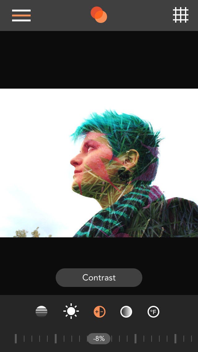
Reducing the contrast of the foreground image to -8% helped to fix some of the areas that have become too dark in the blend.
Remember you can alter the opacity of the foreground layer using the Opacity button on the far left at the bottom of the screen. This reduces the effect of the blend. I found that 60% was the sweet spot where it looked really good.
To save your double exposure image, tap the menu button, then tap Export and Save To Camera Roll.
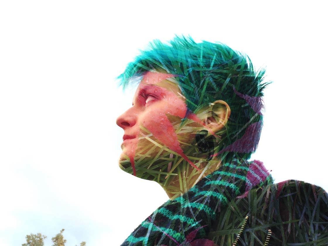
After using the settings above, my image now looks like this. I’m not crazy about the sky being all washed out, nor do I like the tree in the bottom left.
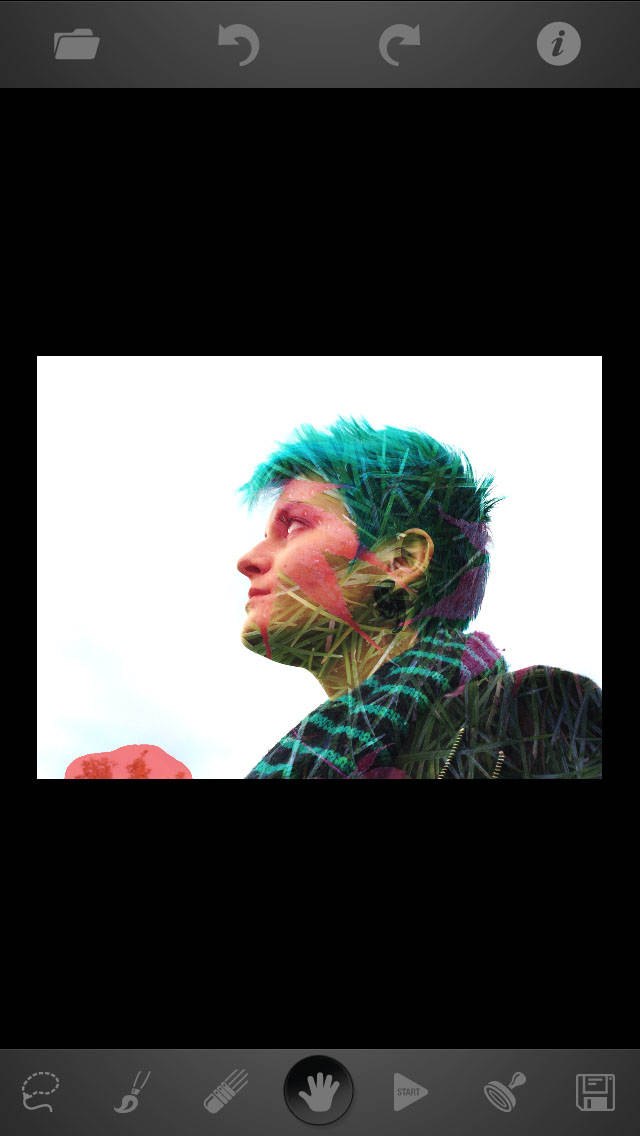
To fix the tree issue, I used the TouchRetouch app which is great for removing unwanted objects. I simply selected the tree by painting over it with my finger so that it appears covered with red paint (as shown above), then pressed the Start button to magically remove it.
Add Finishing Touches To Your Image
Now you may be happy with your double exposure image as it is, however, when I combine images I like to add color, light, and/or texture, just to give it a cohesive feel. Otherwise, it can look like two images stuck together that were shot at different times and with different settings.
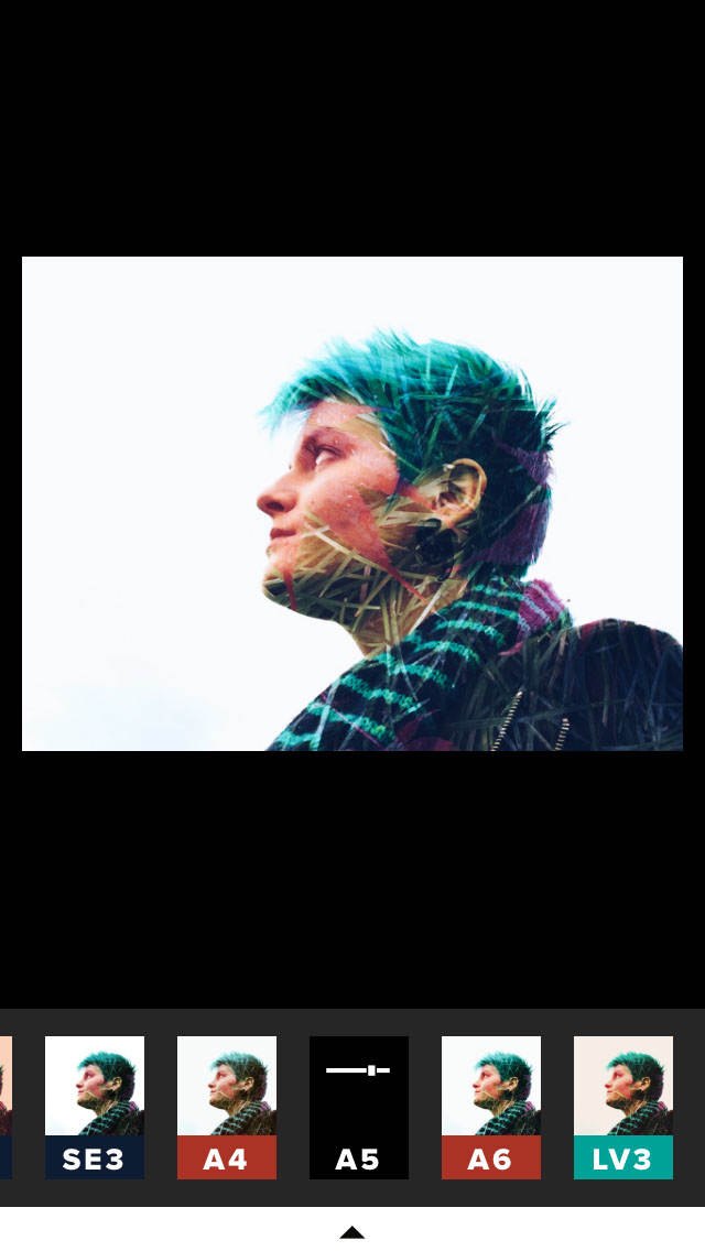
The first thing I did here was open my double exposure image in the VSCO app and apply the Aesthetic 5 (A5) filter. I thought the blue tint to the image was perfect because Beth has amazing blue hair.
The image still feels a little sterile with that empty background, so I decided to add some texture. I used the iColorama S app which has 485 textures to choose from! To get to the textures, tap on Tone at the top of your screen, then select Preset.
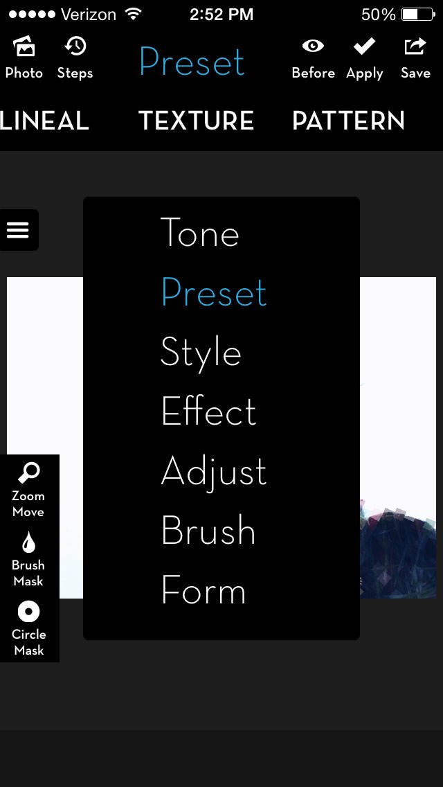
Swipe left on the options just underneath Preset, until you see Texture. If you tap on Texture, you can then tap on presets in the bottom right to browse them all. I chose number 359.
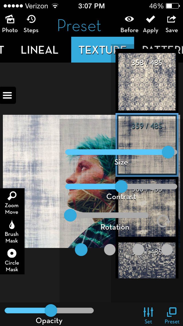
I lowered the opacity to about 50% and increased the size to .97. These are sort of arbitrary and each image will need to be adjusted to your own taste.
The last thing to do is to erase the texture from her face. Tap the Brush Mask option on the left. I chose Paint and quickly brushed over her skin with my finger. I don’t need it to be precise and mask every inch of skin. As long as I don’t accidentally mask out part of the background, the image will be fine.
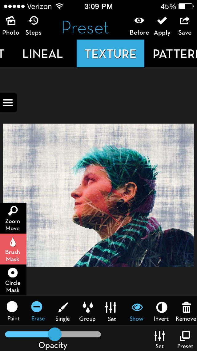
Now, if I tap on Show, a red mask appears to show which parts of the image I’ve chosen to protect from the texture. In this case, it may be hard to see the red, because there is already a red leaf on her face. But I promise, its there!

And there you have it. The process isn’t so scary now, is it? If you simply allow yourself to explore and play with the Union app, you’ll become more comfortable with its features and be able to create some really cool double exposure images.
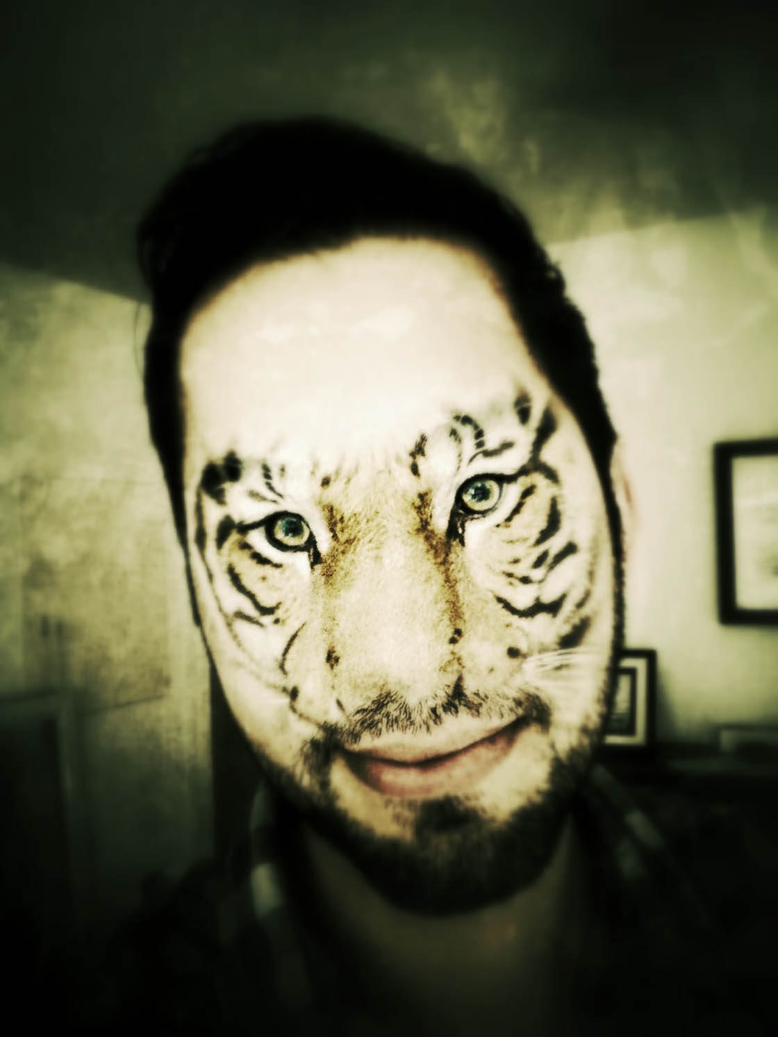
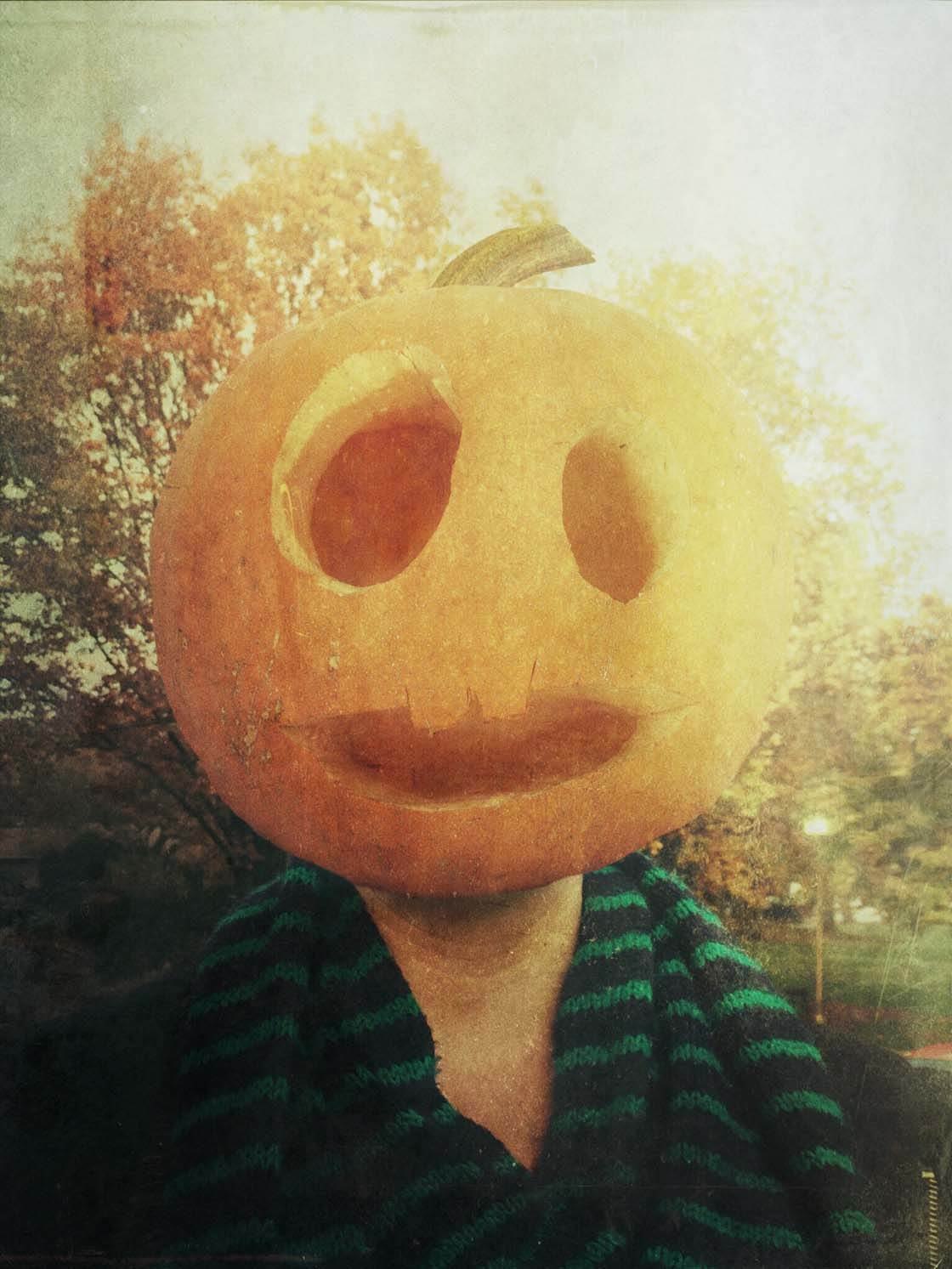
You can also use the popular Superimpose X app to create double-exposures. Click here to learn how to use Superimpose X to blend multiple iPhone photos.

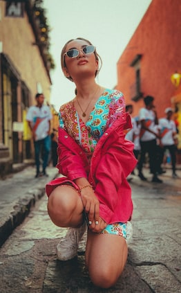
Thanks David! These are some really neat double exposures. I like to use them for selfies and combine my profile with nature shots.
Thank you! I’m glad you enjoyed the article. I hope you submit some of your double exposures on EyeEm this week, with the tag IPSMultiple.
I like the Union app, but I personally prefer the Diana app for double exposure. Just seems easier to use, IMHO.
Diana is a fantastic app, and is definitely easier to use. I absolutely recommend it to people. It’s great for those that want to let the app do the heavy lifting, while still allowing for your own personal touch.
Thanks for this great tutorial David! 🙂
can anyone tell me is there a way that I can get an app that shows a double exposure like a picture of me twice in two different position but on one picture
try Instafusion app for double exposure….it has a very easy and beautiful interface…
Are there any unique advantages of Union app that similar software don’t have? In the recent IPA/IEA/IAA courses, and also on IPA FB group, Superimpose seems to be the app being used the most. And in 2018 people are slowly starting to use SuperimposeX.