One of the most important photography techniques to master is creating an image that has a strong focal point. Without an obvious point of interest, your photo won’t hold the viewer’s attention for long. In this tutorial you’ll discover the best composition techniques for creating more impactful iPhone photos with a stronger focal point.

There are two main things to consider when you’re taking photos. What is your main subject? And what can you do to draw attention to it? Of course, you can’t ask the second question until you’ve answered the first one!
So the most important part is finding something of interest that will act as the main subject in the scene. Sometimes this is obvious, such as a person you want to photograph, but other times you’ll need to look a bit harder to find something that would make an interesting subject.

Once you’ve decided what your main subject is, that’s where the fun begins! You can start thinking about how to place the subject within your frame to create a strong point of interest. This is where the composition techniques come in.
Creating an interesting composition is pure joy to me. I just love aiming my iPhone at the scene and fitting objects in a certain position within the frame.
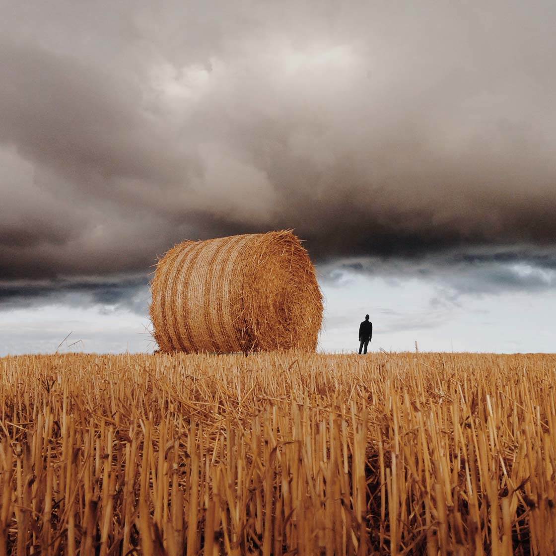
In this article I’ll be sharing my eight best tips on how to compose an image to create stronger and more distinct iPhone photos that will grab the viewer’s attention from afar.
1. Find A Strong Focal Point
If you want your photo to have a strong impact, you should ensure that it has a distinct center of attention. We call this the focal point because it’s what you want the viewer to focus on.
Without a focal point, your photo will most likely be forgotten as fast as the viewer takes their eyes from it. A strong focal point will leave a longer lasting impression and will create a much more impressive image.

A distinct focal point immediately gives the viewer a hint of what you’re choosing to present in a particular photo. Without the man in the picture above, this photo would be pretty boring – just a brown hill and a plain grey sky. By including a person in my photo, I’ve added a focal point that gives the viewer a place to rest their eye.
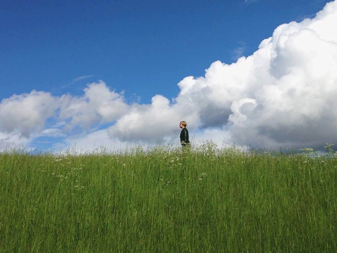
Including people in your landscape photos is great way of creating a strong impact, especially in landscapes that don’t have any outstanding features. A person or any other interesting object in a landscape scene will add meaning and a storytelling element to the photo.
Your focal point might be a person, tree, building, flower, umbrella, etc. Think of it as the most important part of the scene and the reason that you’re actually taking the photo in the first place.

Taking props with you when you’re going out on photo shoot is a great way of adding a focal point when you can’t find one in the natural surroundings.
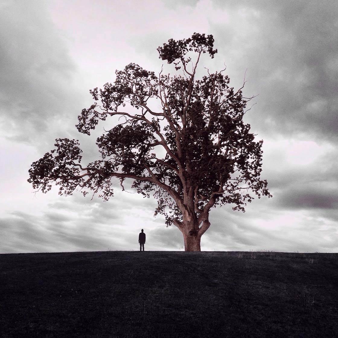
Sometimes your image might include several focal points, such as the tree and the man in the photo above. That’s absolutely fine, as long as the subjects work together to create a strong image.
In the photo below I decided to place my hand in the foreground, reaching out towards the light and the smoke that you can see in the background.

Without my hand, the smoke and rays of light would be the center of the attention here, but placing my hand there creates a small visual story with the hand as the center of attention. When you have a busy scene like this, adding a strong focal point is very helpful.
2. Use Negative Space
My favorite trick for creating a strong focal point is to leave a lot of negative space in the photo. This empty space will create a minimal composition with strong focus on a single object that stands out against the background.

Using negative space allows you to photograph small subjects without them becoming lost in the scene. This is a great technique to use when shooting your subjects from a distance.
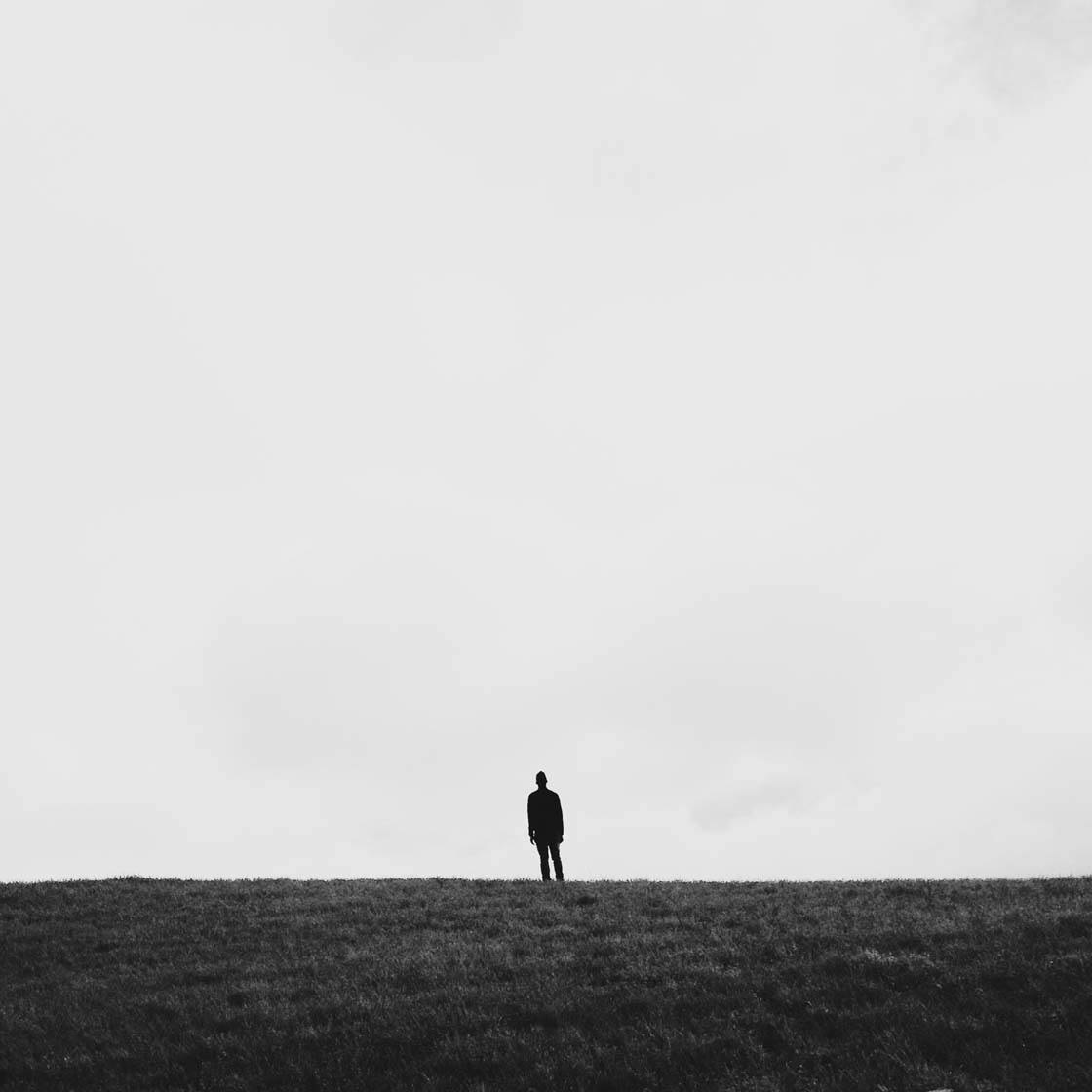
In the example above I was shooting from afar, so I included a lot of empty sky which has the effect of putting more emphasis on the tiny subject in the distance.

In this photo the focal point (a tiny island) in the centre of this frame is quite small, but because the rest of the scene is fairly empty it still acts as a strong point of interest that catches your eye.
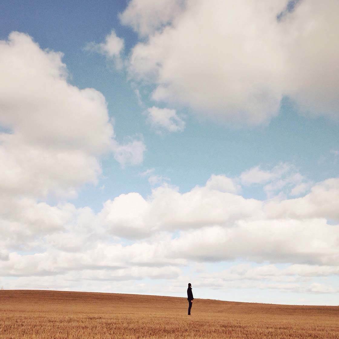
Don’t be afraid to include a lot of empty space in your iPhone photos. In most cases it will help to give your subject more impact, creating a strong composition even though the subject is small within the scene.
3. Use Color To Your Advantage
Understanding color can be a great advantage in your photography. Using an object that has a much stronger color, or just a different color than the background, will create a very strong focal point. Anything can be used, whether you’d like to tell a story or just want to create a strong visual impression.

Here I was at a beautiful lake, and while the lake would be good for a nice photo on its own, I felt that I didn’t really have a focal point in the image. The solution was to put my sister who was wearing a red jacket in the frame.
The red jacket creates a strong focal point because the color really stands out against the muted colors of the background. This easy trick made the image much more interesting than it would have been if I’d just shot the lake on its own.

Here I used a rose that someone had dropped on the ground. Considering there was a huge field of green grass where I was, I immediately thought that the red color of the flower would serve as a strong focal point against the grass.
So I just put it on the ground and took the shot. The rose catches the attention of the viewer in a way that the grass on its own could never do. Just adding one tiny colored object into the frame completely changes the outcome of the photo.

As you can probably tell, I love to use red objects in my photos! Red is one of the most powerful colors, and it will stand out incredibly well in almost every kind of scene.
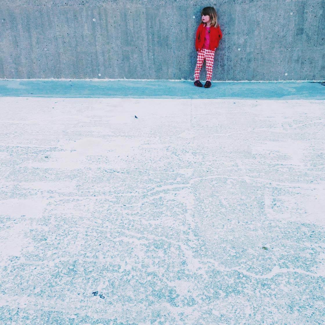
But try experimenting with different colored objects against different colored backgrounds and you’ll soon discover how effective this is.
4. Use The Rule Of Thirds
The rule of thirds is probably the most famous composition technique in photography. You should make a point of learning this “rule” as it will help you to position your main subject or focal point in the best part of the frame.
The rule of thirds is based on two horizontal and two vertical lines that create nine equal-sized rectangular areas within the frame as shown below.
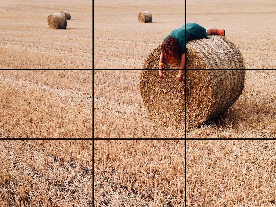
The rule of thirds states that you should place your point of interest along one of the lines, or more accurately where they cross each other. The reason for doing this is that the human eye tends to be naturally drawn to these parts of the frame.
We perceive the placement of the object as more harmonious and balanced if it’s positioned according to the rule of thirds, as opposed to it being placed anywhere else within the frame. So in the photo above, I placed the woman and straw bale at the intersection where two lines meet to create a natural and balanced composition.

If you switch on the grid in your camera app (Settings > Photos & Camera > Grid) you’ll be able to see the rule of thirds grid on your screen.
This is great for helping you to position your main subject according to the rule of thirds. You can also use it to position the horizon on one of the horizontal lines, rather than across the centre of the image.

The rule of thirds can be used in all kinds of photography, such as urban, landscape, portrait, nature, sport, etc. While it’s not my favorite way of composing a picture, it feels natural to use the rule of thirds in a lot of cases.
Knowing where to position your main subject within the frame is an important skill to master. The aim is to position them in such a way as to draw the most attention to that point in the scene. The rule of thirds is a great place to start.

It’s a good thing to think about using the rule of thirds as much as possible when you’re a beginner. I used it a lot when I started out photography.
It helps you to start thinking in images, so to speak. If you start using the rule of thirds, don’t be surprised when you start composing your food on your dinner plate based on this principle as well!
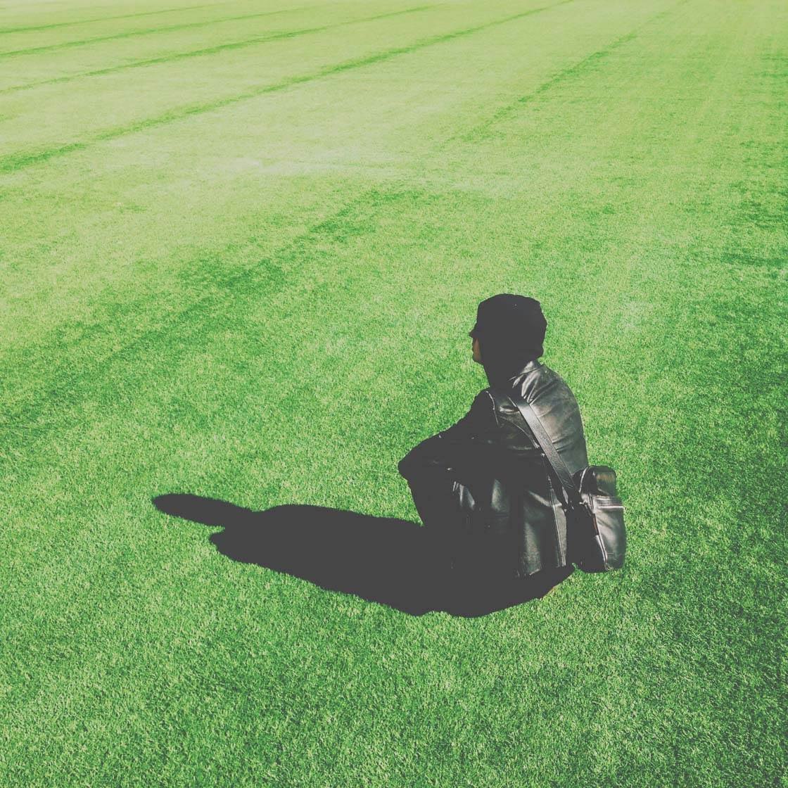
When you’ve been photographing for a while and feel more secure about your images and composition, you’ll naturally let go of using the rule of thirds in all of your photos and you’ll start to seek out your own ways to compose a picture.
For example, you may often find that central subject placement works well when creating square images because this can create stunning symmetrical compositions. But the rule of thirds will always be there to support you. Never forget that!
5. Use A Shallow Depth Of Field
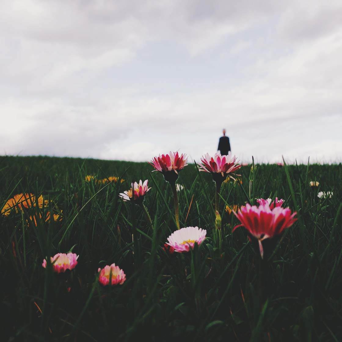
Shallow depth of field is where only a small portion of your image, from front to back, is in focus. Creating a shallow depth of field is an excellent way of isolating your main subject, emphasizing that object as the focal point in the image.

By setting focus on the main subject, the objects in the background will appear blurred. Your eyes will be naturally drawn to the focused object, allowing it to steal all the attention no matter how busy the background is. Of course the background will still be present, but it won’t be as important as the foreground.

A shallow depth of field is great for scenes that have a busy background like the one above. If everything had been in focus in this scene, the water droplets would have become lost amongst all of the other detail and they wouldn’t make such a strong focal point.
So, how do you get a shallow depth of field in your iPhone photos? It’s actually very easy. Just hold your iPhone close to the object you’re going to shoot, then tap that object on the screen to set the focus on that part of the scene. The result should be that your main subject is in focus and the background appears blurred.
If the main subject appears blurred, you’re probably holding the phone too close, so pull back a bit then tap to focus again. If the background doesn’t appear blurred, you’re not close enough to the subject, so move closer then tap to focus again.
The closer you are to the subject you want in focus, the more blurred the background will appear. Experiment with the distance between your object and the iPhone until you get the desired result.

When trying to set focus on small objects such as the water droplets on a spider web in the photo above, it may take a few attempts to tap on the exact part of the screen to get them in focus. Having a plain background, such as the sky, behind the subject should make this a bit easier.
Click here to discover more ways to blur background on iPhone, including the use of Portrait mode and the AfterFocus blur background app.
6. Use Leading Lines
Leading lines are an excellent way of drawing attention to the main subject. A leading line is simply a line in the scene that leads from one part of the image to another.
Leading lines will take the viewer’s eyes on a journey from the foreground of the picture where the line starts, to the point in the image where the lines end.

Not only do leading lines appeal to the eyes of the viewer, but they’re also the perfect way to lead the eye to your main subject or focal point.
So start by finding a place that has obvious attributes that can be used as a leading line, such as a road, a railway line, a corridor, a subway station, a field with tractor trails, a tunnel, etc.

Leading lines have a very strong impact on their own, but if you can include an object at the end of the line, or somewhere along it, this is the perfect scenario. The person at the end of this tunnel makes a great focal point as all of the lines in the image lead directly towards him.

I like my shots that are built on leading lines to be somewhat symmetrical. If you want to create symmetrical shots, make sure you have your camera grid activated before shooting. It will help you to keep track of all the elements in the frame that have to be aligned to gain symmetry.

You don’t always have to use straight lines. Curved and S-shapes lines such as rivers and winding roads also make great leading lines. I particularly love to shoot spiral staircases from above. Including a person somewhere along the line of the staircase provides an excellent focal point.
7. Fill The Frame With Your Subject
A very easy way to make a bold statement about the subject of your photo is to fill the entire frame with your subject. This leaves the viewer in no doubt about what the main subject and focal point of your picture is.
Don’t be afraid to get really close to small objects. It will allow you to photograph it out of its context without any distracting background, and you’ll be able to capture close-up detail that you wouldn’t otherwise be able to see.

It doesn’t matter if you don’t include the entire object in the frame. Photographing flowers like this works really well as it eliminates any unsightly background and puts all of the viewer’s attention on the beautiful and intricate detail of the flower.

Filling the frame is great for creating abstract images. Look for patterns or lines in any object, big or small, and then compose your shot so that you include nothing but the subject in the frame. Even the most trivial object can be transformed into an exciting piece of abstract art with this technique.

In the photo above, I noticed the movement of the water’s surface and the reflection of the light, and thought it would make a good photo. But when I photographed it with more of the surroundings and the sky, it lost its impact. By filling the frame with just the water, it puts the focus back onto the interesting light and textures that caught my eye in the first place.

Here’s another example where filling the frame puts all of the focus onto interesting texture and light. I was stood at the beach and the low setting sun created this pattern where light and shadows collided in the most beautiful way.
Of course I wouldn’t have gotten this result if I’d chosen to include the sea and the horizon in this image. So don’t forget to get in close, frame your shot tightly, and exclude what you’d normally include. By doing this a new world of photography subjects will appear!
8. Develop Your Own Unique Framing Techniques
Once you’ve mastered the composition techniques discussed so far, you might want to start getting more creative with your composition, breaking the “rules” and developing a style that’s more unique to you. It would be boring if we all took the same kind of photos using exactly the same kind of techniques, right?!

That said, you should always keep the basic rules of composition in mind. You can’t break the rules if you don’t know what those rules are in the first place!
Before taking a photo, always ask yourself, “What’s my main subject, and what can I do to emphasize that focal point and draw the viewer’s attention to this subject?”

Here I’m going to share with you my favorite way of composing a picture. It simply involves centering the subject at the bottom of the frame. I tend to compose pictures like this all the time, often unintentionally. I guess this is my idea of how the perfect picture should be composed.

When I put the subject in the center of the frame, I get a strong sense of balance and symmetry. That sense of balance is very important to me, especially when I’m presenting a series of images that are placed next to each other in a grid, such as on my Instagram profile.

It helps me to create a sober and clean impression of my work. I find that when composing a picture like this there won’t be any doubts about where the focal point is, even with a strong and colorful background.

The beauty of this technique is that you can vary it in all endlessness. Basically you can recreate the same image over and over again. Just using a different subject each time will give you a completely new image.

Even if this can be seen as operating within one’s comfort zone, it also sparks creative thinking. You’ll always be looking for new combinations and different subjects to create a simple image like this.

So from now on, hopefully even while doing the most boring garden chores, a golden opportunity to create an interesting image with a strong focal point will arise!
Experiment, try out new compositions, shoot from different angles, and you’ll soon be creating amazing iPhone photos with a strong focal point that will instantly catch the viewer’s eye.


Thanks for these fantastic tips. They make such a difference! 🙂
These are great techniques for better composition. I think you mention it in your last paragraph . However, shooting from different angles gives you more options for creativity and should be #9 on your post. It wasn’t until I attended formal training in composition for photography that I realized shooting from different angles is a key factor . If you are willing to get on your stomach laying down without fear of embarrassment then you will open doors of creativity. It took awhile to overcome that but it changed my photography . I wasn’t taking snapshots anymore. 🙂
8 ways to bore the viewer
These are really good examples of boring and unimaginative compositions – all centered in the viewfinder, as if it was butts for shooting. – Come on! This is nothing to show as examples for good compositions – it’s like discount items in the supermarket: “spot price” = “focal point price!”
I am sure you can do so much better! I can’t wait to see your superior pictures… Then, I might take your comments seriously.
ignore him, what a douche, people like to criticize without providing better examples like you said. Now if he followed with, see my article i wrote, its way better, then maybe he could have some validation.
Excellent post! It covers a lot in a simple clear manner.
really perfect tips