Improving your iPhone photo composition is the single best way to make yourself a better photographer. Composition is even more important than the subject that you shoot – with good composition you can make an ordinary or ugly subject appear interesting and beautiful. In this tutorial you’ll discover ten composition techniques that will dramatically improve your iPhone photos, making you a better and more confident photographer.

1. Include A Main Subject
One of the most important rules of composition is that you need to have a main subject for your photo.
I’m surprised at how many photos I see that don’t follow this simple rule. Unless your goal is to create something abstract, your photo needs to be about something, and that thing should be your main subject.

Having a main subject allows your viewer to easily understand what the photo is about. It brings clarity to your image and creates a focal point which gives the viewer a place to rest their eye.
Take a look at the two images below. Notice how much more powerful the second one is because it has the canoe as a main subject.


A great example of this is when you go somewhere beautiful on a trip (like the mountains or the sea), and you want to record a photo of that beautiful place.
If you just take a picture of the place, you’ll probably be disappointed because the photo doesn’t give you the same feeling that you had when you were there.

But if you give your photo a main subject, such as a person looking at that mountain or sea, your photo will not only be more beautiful, but it will also carry a lot more of the emotion that you had when you were there.

2. Frame The Subject To Increase Its Importance
After you’ve decided on your main subject, you can use various tricks to increase the importance of that subject. One of the best ways to do this is by framing your subject.

“Framing” simply means using something in the environment to outline your subject, and therefore drawing more attention to it.

Often that framing will be something in the foreground that softens the edge of the photo, like some tree branches and leaves.
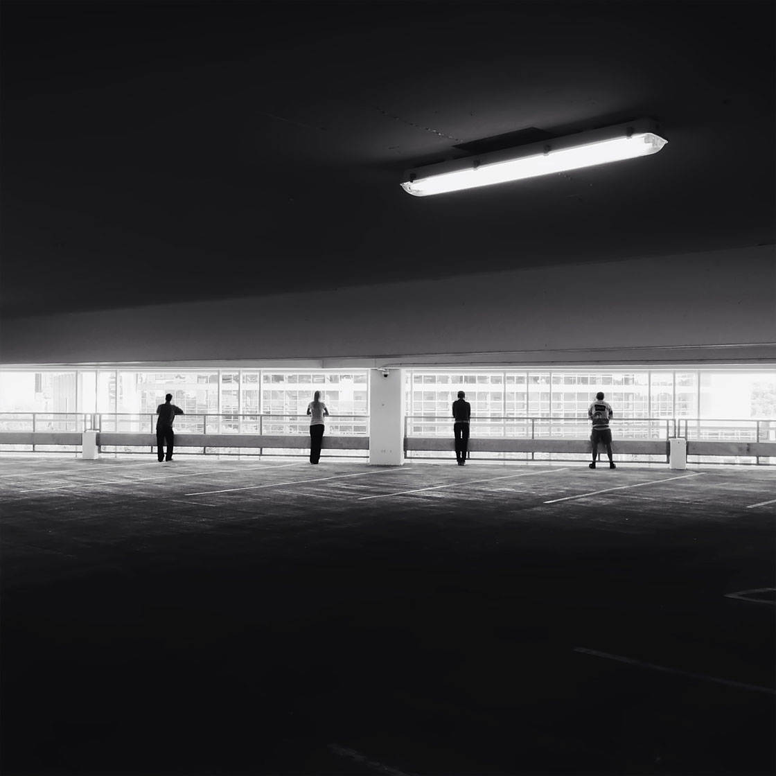
Other times the frame might just be an area of light or dark that surrounds your subjects, like in this photo of people standing in a parking garage.
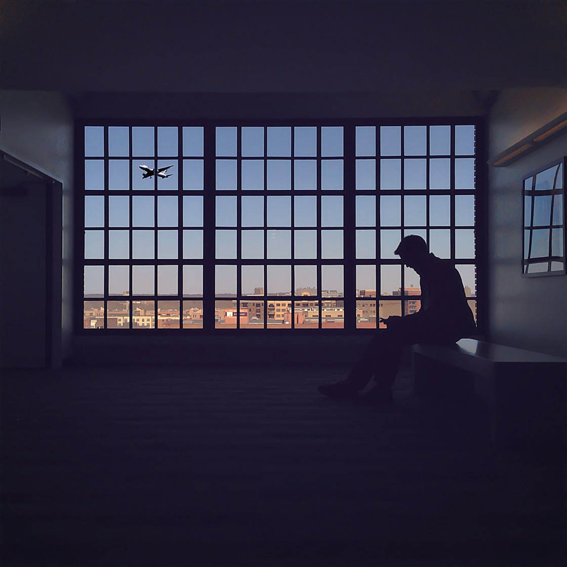
Often a window or doorway is a great way to frame your subject, and again, that opening can be behind or in front of the subject.

Once you start looking for ways to frame your subject, you’ll find that you can use all sorts of things as a framing object. Be creative!
3. Use Leading Lines To Draw The Eye Into The Photo
Another great trick you can use in composition is to look for leading lines.
Leading lines are a great way to direct the viewer’s attention where you want it to go, usually right toward your main subject.

Look for lines in your scene, such as a road, path, fence, railway tracks, a long hallway, floorboards, or any other architectural or natural element that creates a leading line.
Then compose your shot so that the lines lead from the foreground of the scene into the distance.
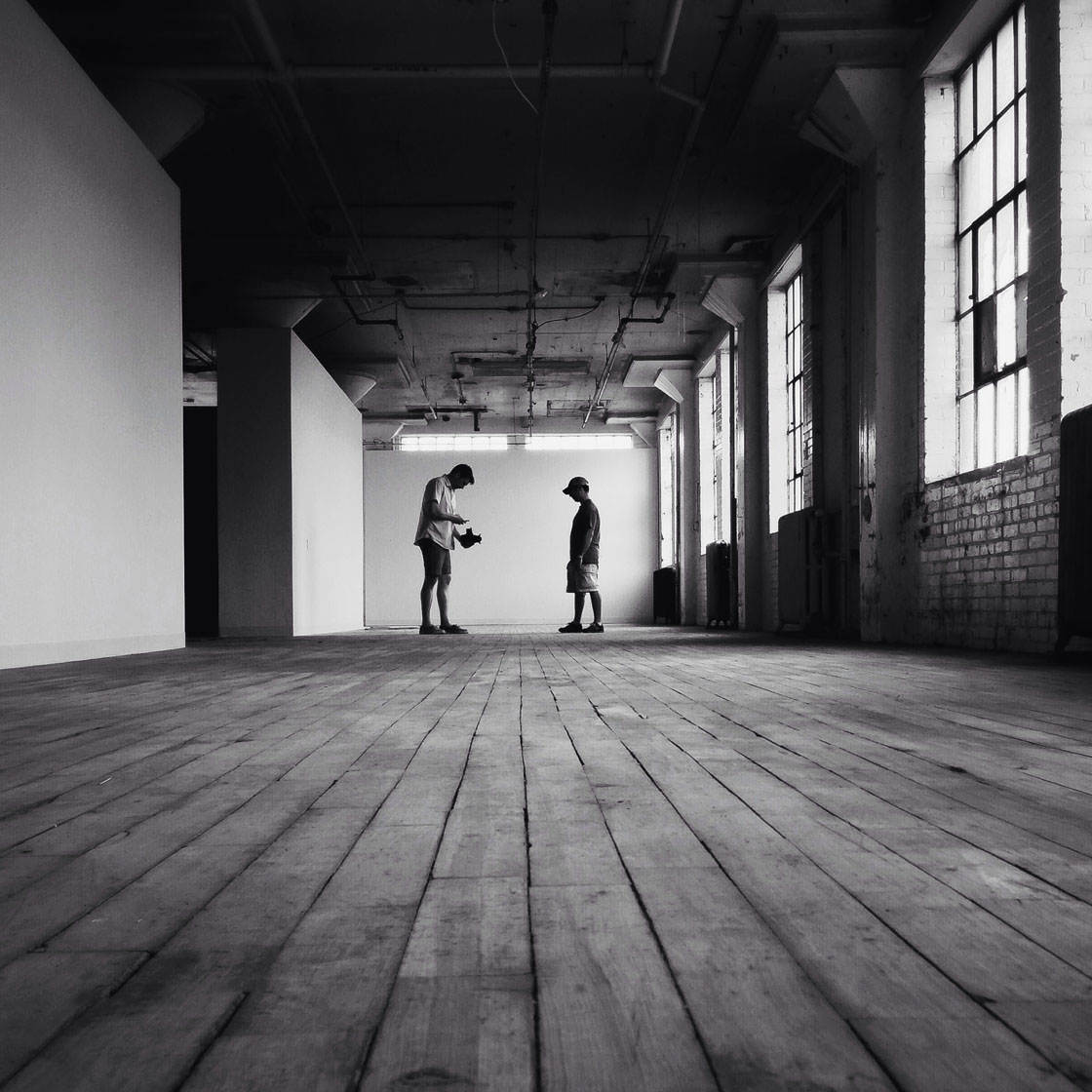
Having a subject at the end of the line, or somewhere along it, is even more powerful because the line leads the eye directly to the subject.
The great thing about leading lines is that they don’t even have to be lines! In the photo below, the bridge itself has many leading lines in it, but the shadows of the people are also leading lines in this composition.

That’s one of the great reasons to shoot at golden hour. Not only do you get beautiful light, but you can also get great leading lines from the long shadows!
4. Use The Rule Of Thirds
You might have heard of the rule of thirds before, because it’s one of the very first things that you learn as a photographer. In fact, it’s so useful that your iPhone has the ability to show you the rule of thirds as you’re shooting!
If you go to Settings > Camera, then turn on the Grid option, you’ll see the rule of thirds grid in the camera app.

The rule of thirds simply says that if you divide the screen into equal thirds both vertically and horizontally, you should place your main subject at one of the four points where the lines intersect.
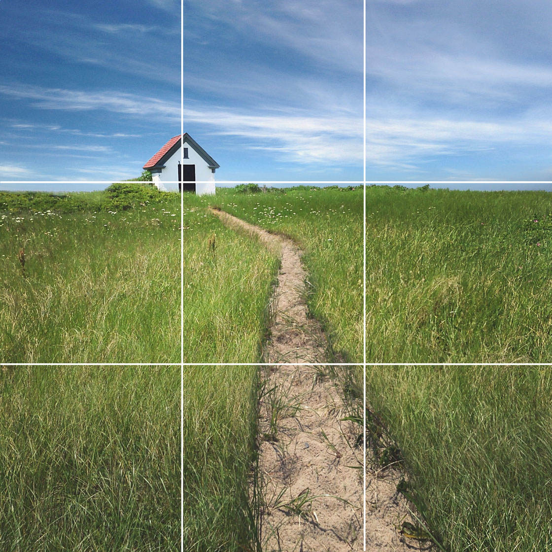
I did that in the photo above by making sure the little house was right on one of those interactions.
The rule of thirds also suggests that you place your horizon line along either the top or bottom gridline for the most beautiful and balanced composition.

The rule of thirds is a pretty reliable rule, and if you follow it, your photo should feel balanced. However, there is some flexibility to the rule.
Note that in the photo below, my main subject sits on one of the intersecting points, but the horizon line doesn’t fall on either of the horizontal gridlines.
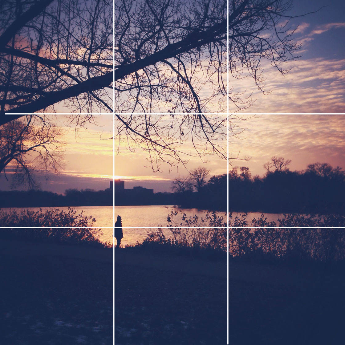
Nevertheless, the dark mass at the bottom of the frame roughly lines up with the bottom gridline, so I would still call this a good example of using the rule of thirds to create good composition.

Try looking at the world through your iPhone with the grid turned on, and lining up your main subject using the rule of thirds.
You’ll be surprised at how easy it is to make good photos simply by following this one rule.
5. Ignore The Rule Of Thirds!
Now that you’ve learned the rule of thirds, I’m giving you permission to break that rule sometimes!
If you’re shooting a photo with symmetry, you will often find that it looks better to put your subject in the very middle of the photo.

Symmetrical photos are a special case, where maintaining a mirror image between the two sides is so important that you have to keep your subject centered otherwise it will just feel wrong.

Square photos are particularly well suited to symmetrical shots that break the rule of thirds.
This is because the four sides of the image are equal lengths, and this suits symmetry really well.

So even though it’s great to be aware of the classic rules of composition such as the rule of thirds, sometimes it’s okay to break those rules if you have a compelling reason to do so.

6. Use Symmetry & Patterns To Your Advantage
Shooting photos that have symmetry or patterns is a great way to bring more visual interest to your photography.
The human brain is naturally attracted to symmetry. In fact, we’re symmetrical creatures ourselves, with a left and right side.

Symmetry can make for a very pleasing photo that will catch the viewer’s eye right away.
Building facades are a great place to look for symmetry as they’re often inherently designed to be symmetrical.
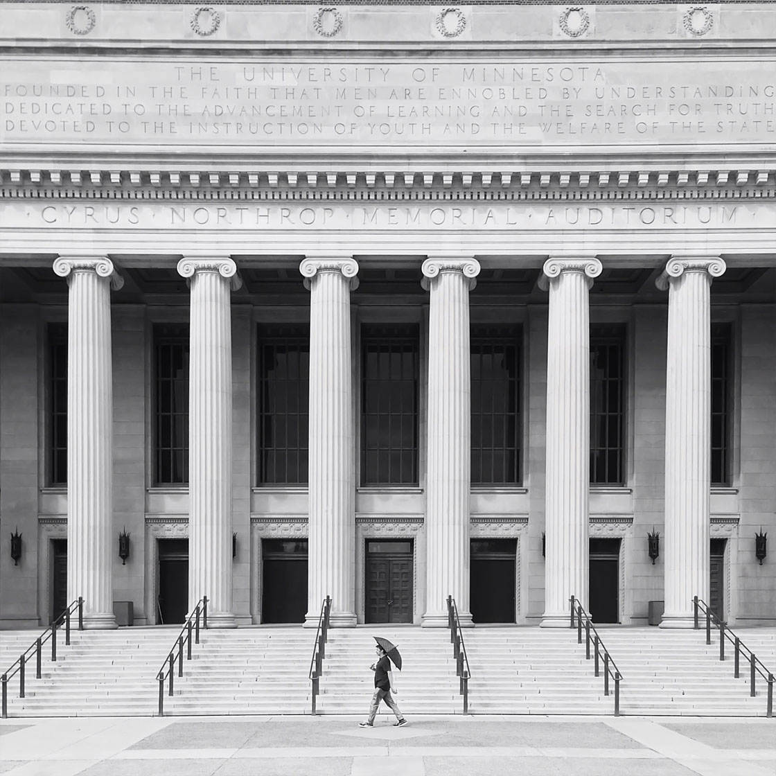
Patterns are often found with symmetry, but the two shouldn’t be confused.
In the photo below, you’ll notice that the composition is symmetrical because the left and right sides match, but you can also see that there’s a pattern of three red books that repeat throughout the photo.

When you use symmetry along with patterns, you can create a visually striking photo.
In nature you can often find symmetry by looking for water, and getting your phone down low so that the water reflects the upper part of the image.
In the city it’s usually pretty easy to find a symmetrical building to shoot, or you can make your own symmetrical shots by pressing the edge of your iPhone up to a piece of glass.
This allows you to capture your main subject reflected in the shiny surface, immediately creating a symmetrical shot.
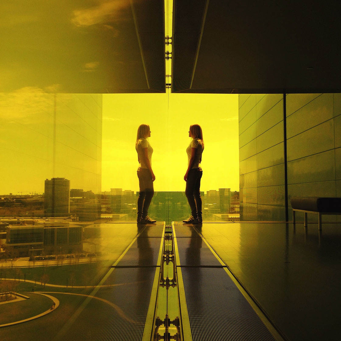
Once you start looking for symmetry and patterns, you’ll be surprised at how they appear all around you.
7. Shoot From An Unusual Angle
We’re very accustomed to seeing the world from eye level, so you can easily surprise and delight your viewers by shooting from other more unusual angles.

Simply moving your phone to a different vantage point will give your photos a fresh and unexpected point of view.
A classic tactic for this is to look up above you. There are all kinds of interesting things happening right over your head every day!

Conversely, you can also try shooting from above so that you’re looking down on your subject. You can easily do this from a high story of a building or a bridge.

Lastly, you can also look for unexpected angles by positioning your phone in an unusual way.
In the photo below I was boarding a plane, and I noticed how funny the world looked as it was reflected in the plane’s shiny surface.

To add to the disorientation, I purposely tilted my phone so that the horizon line wouldn’t be instantly recognizable. To me, this canted angle makes the image feel surprising in a good way.
So whenever you’re out shooting with your iPhone, don’t just take pictures from standing height.

Try to look for places where you can shoot the world from an angle that you don’t normally see it from.
8. Include Foreground & Background Elements To Increase Depth
A photo is a two dimensional representation of three dimensional space, which means that it can be difficult to convey the sense of depth that you saw with your own eyes.

To make your photos more engaging, you need to carefully compose your shot to increase the sense of depth and make it seem more three dimensional.
Creating photos with depth is easy. You simply need to have something in the foreground and something in the background. It’s that simple!

The photo above has some depth to it. The water is in the foreground, and the grasses and trees are in the background.
But notice how much more depth the photo has when there’s something in the foreground as shown below.

Not only does this photo feel deeper, but it now has a main subject which also helps make it a stronger photo.
Photos with a lot of depth are appealing to us because they help us understand the three dimensional space that the photo is representing.
You can also increase depth by paying attention to patterns and lines, aligning yourself so that they recede into the distance.

The next time you’re out shooting, trying composing your photo so that there’s something in both the foreground and the background.

Once you start doing this you’ll find that your images will start to feel a lot more three dimensional.
9. Leave Active Space For Moving Subjects
Sometimes your main subject will be moving, and in these situations you need to be aware of another rule of composition, which is to leave space for the moving subject.

Unless you have a really good reason for doing otherwise, it’s usually best to leave more space in front of your subject than behind. This creates the feeling that they have plenty of space to “move into.”

It’s important to leave plenty of negative (empty) space so that the person doesn’t feel crowded in the frame.
You don’t want it to look like they’re about to run into anything. Well, maybe you do, but that’s a different type of photo!

You’ll find that if you frame your moving subjects this way, your photos will feel very natural and real. This is because we’re so accustomed to seeing images this way.
If you practice shooting a moving subject using this rule, it will soon become second nature.
10. Isolate Your Subject
One of the best things you can do to improve your iPhone photos is to make sure your subject is isolated from the background.

It’s important that there are no obstructions that overlap with your main subject. Any distractions can weaken your image and make it confusing for your viewers.
One easy way to make your subject “pop” is to make sure that the background behind your main subject is very light (assuming your subject is dark).

In the photo above, I got my shot lined up, and then waited for someone in dark clothing to walk by.
Of course, you can do the opposite too. Just use a dark background with a light-colored subject to make your subject stand out.
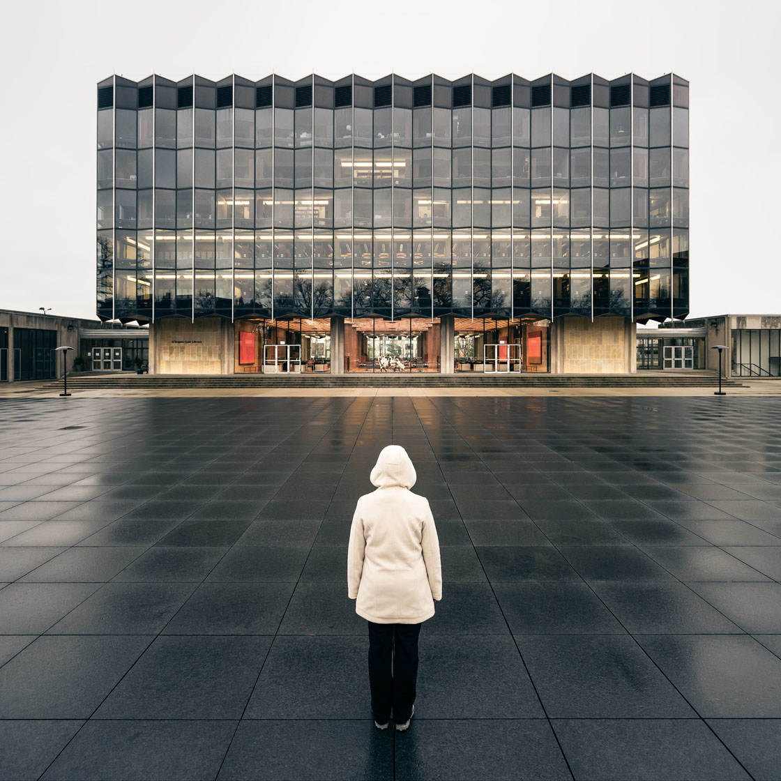
In addition to using light and dark to make your subject pop, you can also use color to help make your main subject stand out.
Our eyes will usually go to the brightest or most colorful part of an image. So if you keep the background color to a minimum, a bright color on your main subject will help draw attention to it, like the red hat on this man.

Conversely, you can make your background quite colorful, but have your main subject mostly colorless.
This is a great strategy if you’ve got a colorful wall, or if you’re at a time of day when there’s generally a lot of color, like sunset.
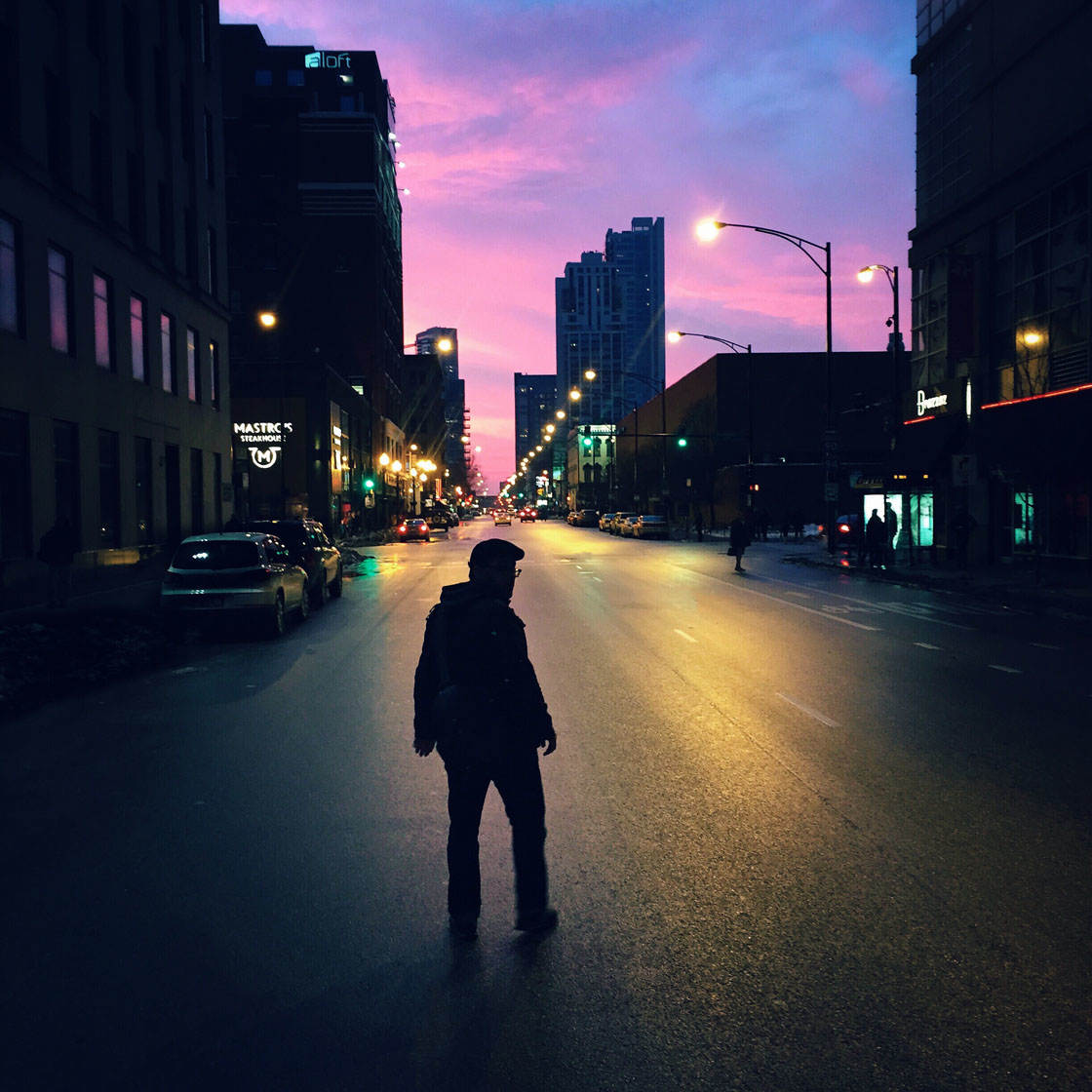
In this photo, the main subject stands out because he’s dark and the background behind him is light, but also because he’s in a colorful environment, but he remains mostly colorless.
Sometimes you might find there’s a branch or a tree that’s distracting, but there’s no way to exclude it from your composition.
Below is an example of this. The dark branch just behind my subject is distracting and interferes with the outline of the person.

In such cases, just take the photo, then use an app like TouchRetouch to remove the unwanted objects from the image. Below is the same image but with the branch removed.

The person now has a much clearer outline which creates a cleaner and more pleasing composition.
iPhone Photo Composition: Conclusion
While every scene is different, making use of these composition techniques will allow you to create more beautiful and powerful iPhone photos.

Here are the ten iPhone photo composition techniques that will dramatically improve your images:
- Include a main subject
- Frame the subject to increase its importance
- Use leading lines to draw the eye into the photo
- Use the rule of thirds
- Ignore the rule of thirds!
- Use symmetry & patterns to your advantage
- Shoot from an unusual angle
- Include foreground & background elements to increase depth
- Leave active space for moving subjects
- Isolate your subject
Of course, you won’t use every technique on every photo. It’s up to you as the photographer to work out which composition guidelines would best suit a particular scene.

If you try using these techniques on a daily basis, you’ll soon find that you’ll become a better and more confident photographer. And your images are bound to start getting more “likes” when you share them!


Great post. Thank you!
Can we expect a Quick Tips Cheat Sheet in “the iPhone Photography School Format” for this topic too?
Glad you enjoyed the article, Fred! 🙂 For now I don’t have a clear answer about the quick tips, but we’ll definitely think about this. Thanks for your suggestion!
LOVE this and big thanks!
You’re most welcome, Judy! 🙂
Great information, Emil. Thanks.
Glad you enjoyed the article, John. 🙂
In the original photo with the “offending branch” why doesn’t that branch show in the reflection?
My guess is as the branch seems to be pretty far away from the water source, it can’t be seen in the reflection. 🙂
Wow! Love all these tips. Thanks so much!
I’m happy to hear that you enjoyed the tips, Diane! 🙂
Wow great tips!! Very helpful, look forward to trying them out on our upcoming cruise.
Btw, on that subject, do you have any particular tips for cruise photo’s. I don’t want list endless pictures of water.
I’ve noticed the vast majority of photos shown here are in a square format. I realize Instagram utilizes the square format, but is there another reason?
That’s mostly the main reason. However, now Instagram supports other formats as well. 🙂