Lines are everywhere around us, whether you live in Manhattan or the Sahara desert. If you use them carefully, lines can form an integral part of your composition. In this article you’re going to discover how you can use lines to greatly improve the composition of your iPhone photos.

Using Lines in iPhone Photography
Roads, tracks and railway lines are obvious lines. Observe all the different lines around you, the way they work visually. Different types of lines work in different ways. Look up as well as straight ahead.

Here all the triangular lines lead to the weather vane and continue skywards with the line of blue sky between the clouds. The effect would have been lost by including the whole of the building.

Use the iPhone Camera Grid
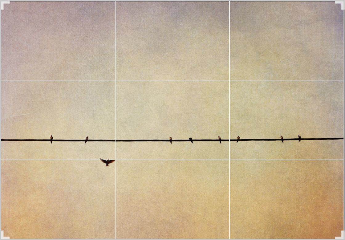
Use the iPhone camera app grid lines (go to Settings, Camera and Photos, toggle Grid on). It will help you keep horizontal lines straight.

Other than that, the major advantage of iPhone photography is that there are no complicated camera settings to worry about. The less you have to think about, the more freedom you have to observe.
The grid also gives you the rule of thirds guidelines. Place vertical or horizontal dividing lines (including the horizon) on or near the top and bottom thirds, or left and right hand thirds. Place main subjects on intersecting lines.
Leading Lines
Lines are straight or curved, horizontal, vertical or diagonal. In real life, they combine in different ways. Notice that your eye will always follow certain lines. The same applies in a photograph. Known as leading lines, these are simply lines that guide the viewer’s eye through a photograph.
What do you want your viewer to see? Once you know the answer to that question, use lines to direct the eyes of the viewer towards that subject.

In the first version, the eye is drawn up and out of the frame by the prim infant lines of the arch that fan out at the top. In the second version, the eye will travel through the arch and notice the strange old water tower at the end.

Suggested Lines
A line can be formed by anything: roads, paths, stairways, streams and rivers, shorelines, long shadows, airplane trails or even an alligator’s back. They can also be suggested by the direction in which a person is looking, or in which an object is moving. These are ‘suggested’ lines. You should always leave enough space in the direction the subject is facing or moving.

Diagonal Lines
Diagonal lines are very effective as leading lines. Straight diagonal lines are dynamic. They create a sense of movement, direction and tension. Sinuous lines have a more leisurely effect.

Try placing your main subject on or near the right or left hand grid intersections, and lead your viewer’s eye through the frame from the opposite lower corner.

Try different combinations to create different effects. Remember, rules can always be broken once you’ve mastered them!
Converging Lines
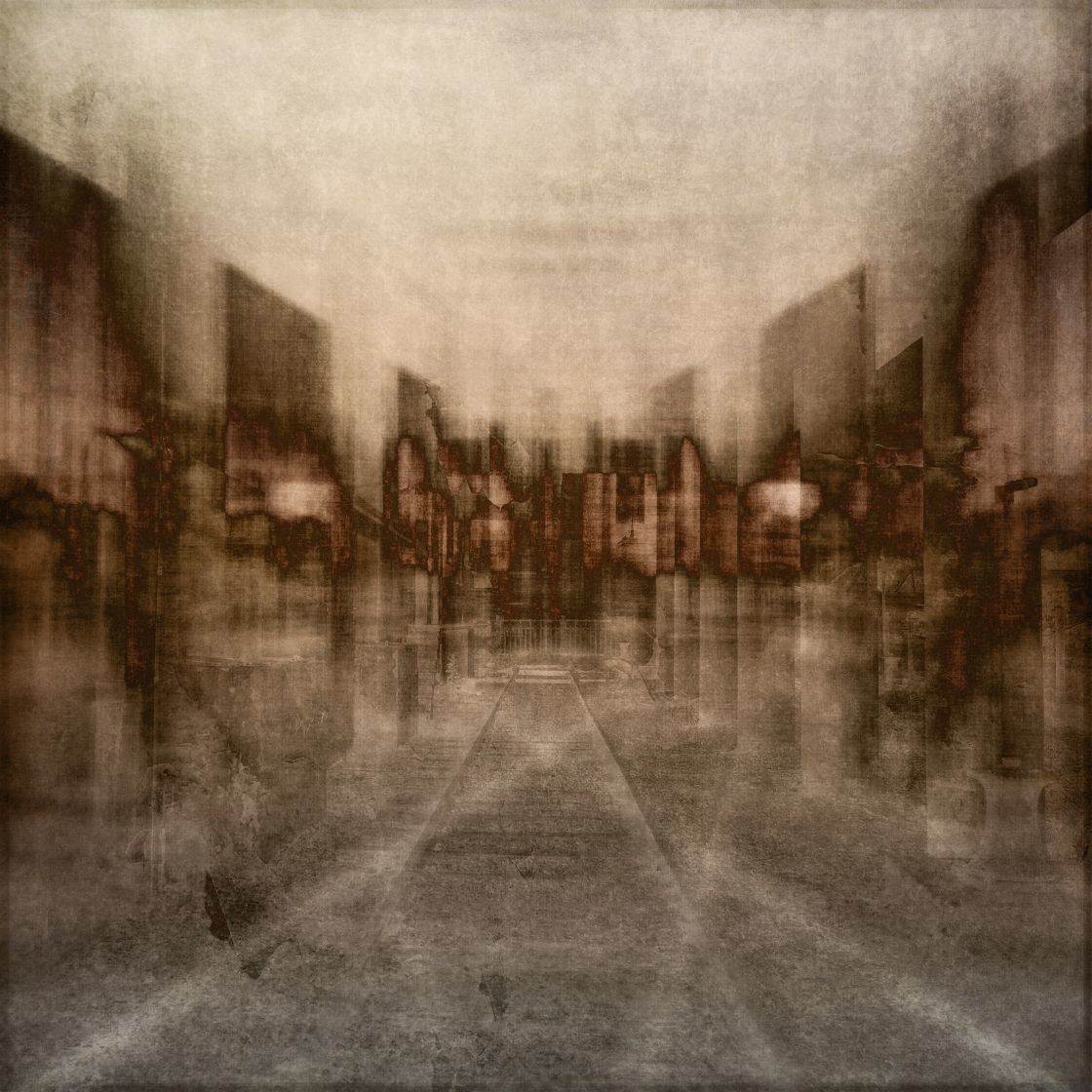
Converging lines create a sense of depth and distance in the same way as “tunnel vision”. Obvious examples are roads and railway lines that appear to vanish into infinity or overhanging trees along a path that appear to form a tunnel that draws you eye straight to the horizon line.
If that’s where you want to take your viewer, fine, but avoid distracting lines on the way that will stop the eye. Remember, the eye will follow a line. If you have a main subject, place it in such a way that the eye will not shoot past it.

Looking up from ground level at tall buildings or trees will have the same effect and can be very dramatic. Walk around your subject and try different angles. Tilt your iPhone slightly backwards or forwards, or hold it flat as close to the ground as possible and point skywards!

Dividing Lines
The most obvious of all dividing lines is the horizon. The horizon should not be in the middle of the frame, but preferably on or near the top or the bottom segment of the grid, and always perfectly straight. Lopsided horizons can have an unbalancing effect on the viewer. If it still leans a bit, use the ‘straighten’ tool in editing apps such as Snapseed.
You can use horizontal and vertical dividing lines to create contrast, different dimensions, or to separate different events happening inside and outside a building.

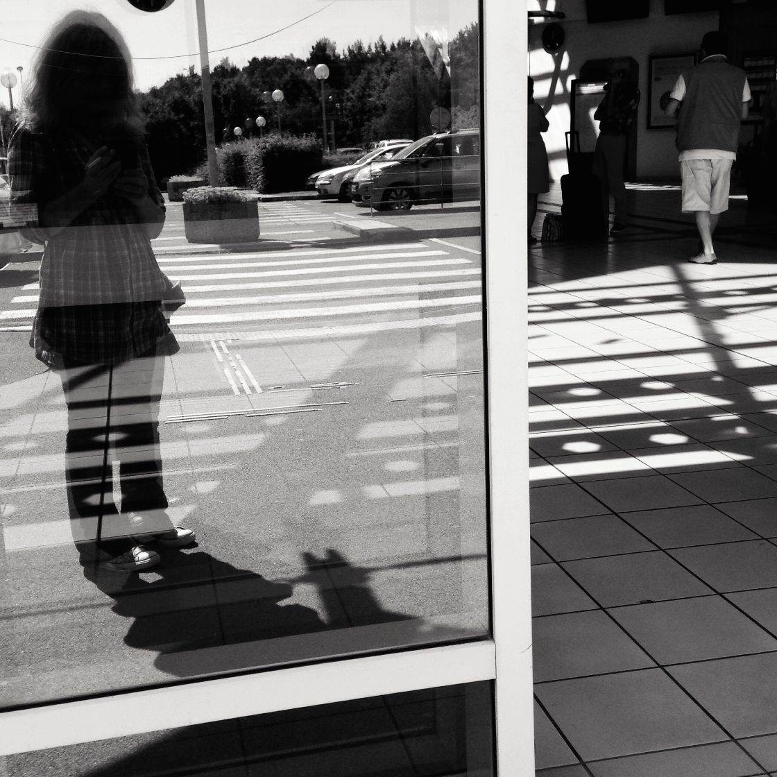
Look for the effects created by light and shadow lines, contrasts between warm and cold, soft and hard materials, different colors or very contrasting subjects. Use the grid segments to accentuate these contrasts.

Horizontal Lines
Horizontal lines are static and have a stabilizing effect. A series of horizontal lines should be straight across the frame, in the same way as the horizon. If not, they have destabilizing effect on the viewer. This is easily done by standing directly in front of your subject at a 90 degree angle.

Horizontal lines can also be quite boring. If so, try creating a visual break such as the triangle above. Here, the triangle is in the middle to create symmetry. You can also try placing the break on one of the intersecting lines of the grid for more impact.
Vertical Lines
Tall vertical lines are best taken from a distance or from higher ground if you want them to be straight. If you’re too close, you will get a distorted perspective such as buildings that appear to be toppling over. You can purposely use this effect to create drama, a sense of height, power or strength, or on the contrary, stable tranquility.

Confusing Lines
Too many lines in a photograph can be confusing, like on a busy street or a market place. It’s sometimes difficult to separate lines or avoid conflicting directions. Move around and try different viewpoints and angles. Keep things simple. Avoid lines that involuntarily lead away from your main subject, or lines that form a distracting background or cut through your main subject.
If you want to create a sense of confusion or oppression, you can of course deliberately use conflicting lines. The more you observe the lines around you, the more you will understand their effects and know how to use them intuitively.

Convey the Right Mood
Remember, a good photograph is more than just a set of correctly applied rules and formulas. It’s about how you see your world, how you feel about it, and how you convey those feelings. Your eyes control your camera. Think of it as your “eye” phone!

Look at the different ways you can use lines to convey mood or create an atmosphere. Ask people what they feel when they look at your photos, and also look at other iPhone photographers’ work.
The choices are endless; the choices are yours. iPhone apps give you endless scope for creativity but use your eyes first!
Conclusion
You may be starting out and still trying to apply all those rules. That’s fine, practice makes perfect. Be shutter-button happy and just keep experimenting. It sometimes takes a while to get everything right and develop your own style, but always remember: it’s not the iPhone that makes a good photograph but the photographer’s eye behind it. Use your eyes and your “eye” phone together!
Creativity is about self-expression. Remember, you can only express what you feel. To feel you must not only observe but feel. Then you can share your own personal view of the world and how you feel about it. Practice with the rules. Forget them sometimes, be spontaneous, be creative and just keep shooting!


Thank you Nikki for sharing these great tips with us!
Such a wonderful article–very well-written with helpful suggestions. I appreciate the advice.
So happy you enjoyed it atsash!
Really enjoyed this tutorial and the images are all wonderful, great eye candy! Thank you Nikki! 🙂
Hi