Have you wondered how to create captivating iPhone photos with a distressed and grungy appearance? It might seem counterintuitive to make your photos look dirty, but learning to work with distressed overlays and textures can really elevate your mobile artistry. In this tutorial, you’ll be introduced to four great apps for adding distressed and textured effects to your iPhone photos.
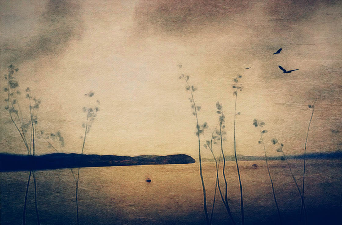
Texture overlays in iPhone photography typically refer to image layers that appear distressed, dirty, grainy or gritty. They can also include light leaks and gradients.
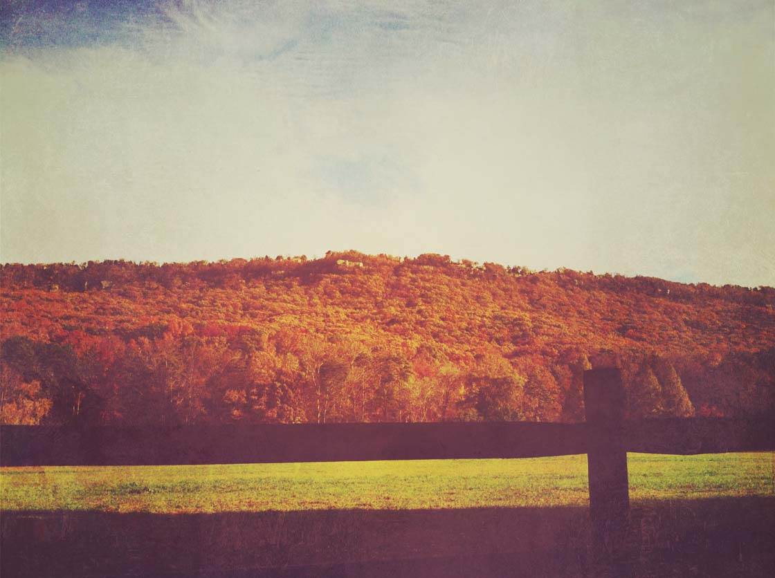
Textured and aged effects can add mystery and intrigue to your images. By using these distressed and painterly effects, you can convert a simple photo into a real work of art.
What Subjects Work Best?
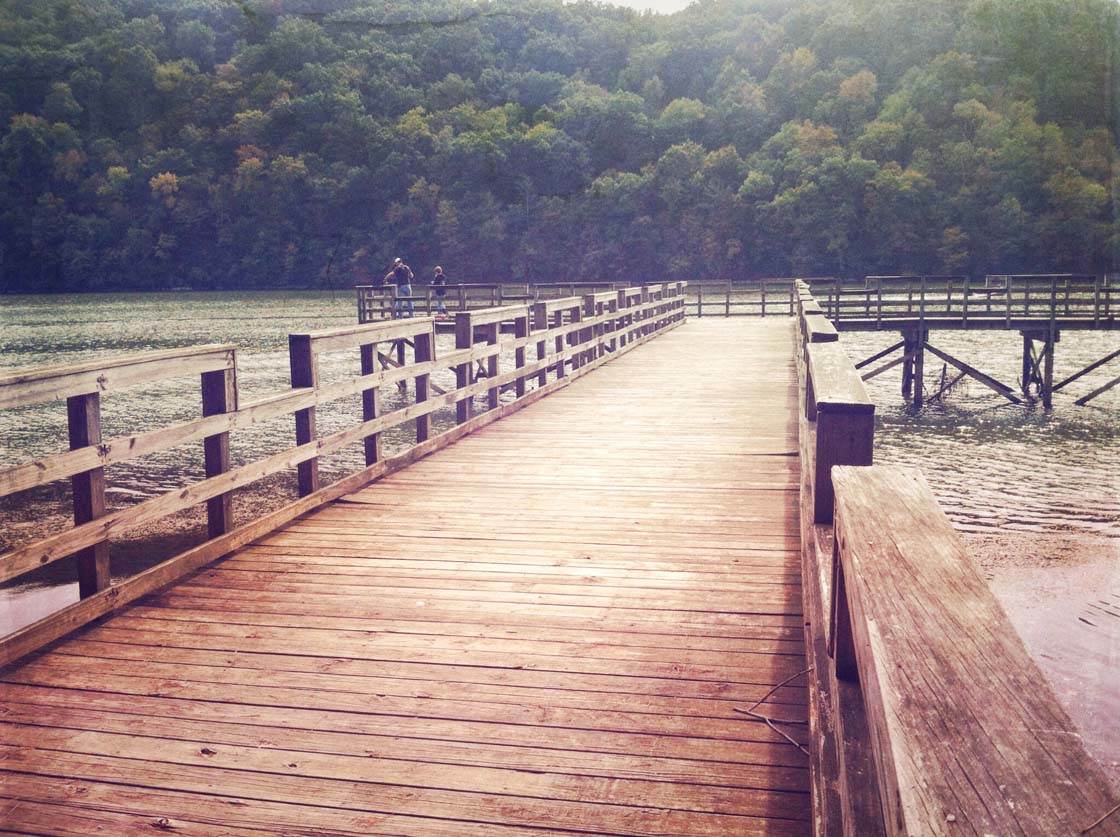
Can you add textures to any photo? You can, but some subjects and photos seem to really shine with grungy layers. In general, visually minimalistic subjects or photos with a lot of negative space are ideal. Also, still life and landscape photography look great when the right amount of texture is applied.
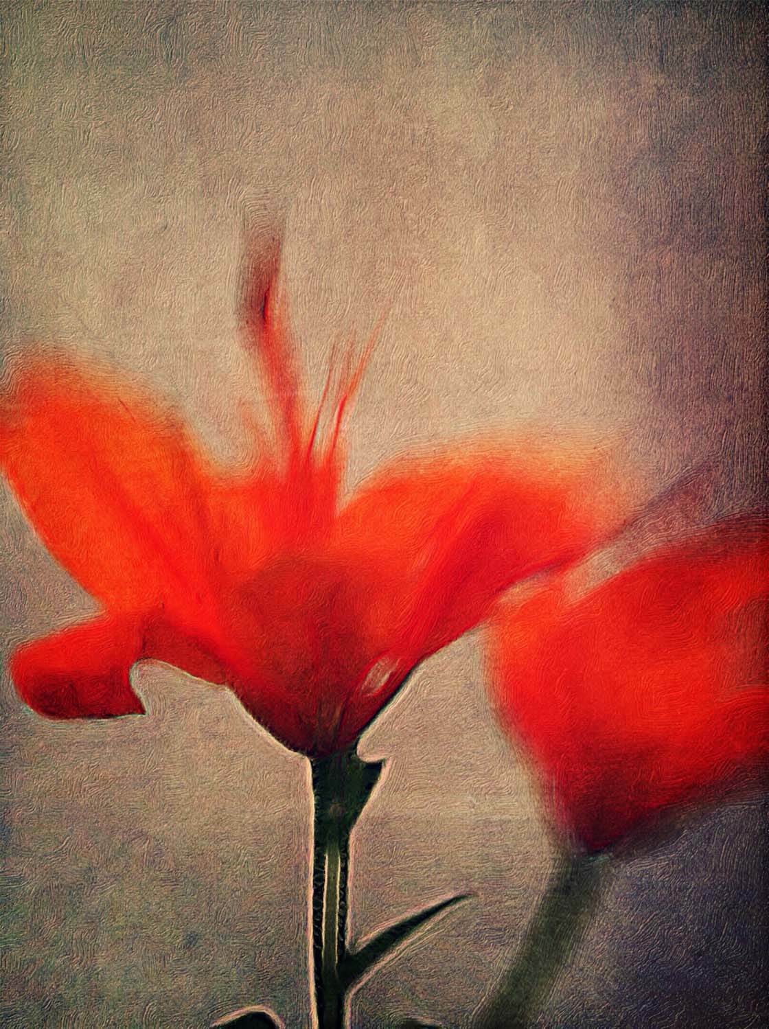
Many of the basic photo editing apps, such as Snapseed, include a feature allowing you to add texture to your photo (check out our complete guide to Snapseed photo editing).
However, there are a few apps that specialize in this effect. Worth mentioning are apps like ScratchCam, Vintage Scene and Pic Grunger. But the four apps listed below are my favorites.
1. Mextures
The Mextures app ($1.99) boasts 130 textures that include gritty and grainy film textures, dusty vintage film scans, and tasteful grunge. The majority of the original textures were created from 35mm film scans with various cameras giving them an authentic appearance.
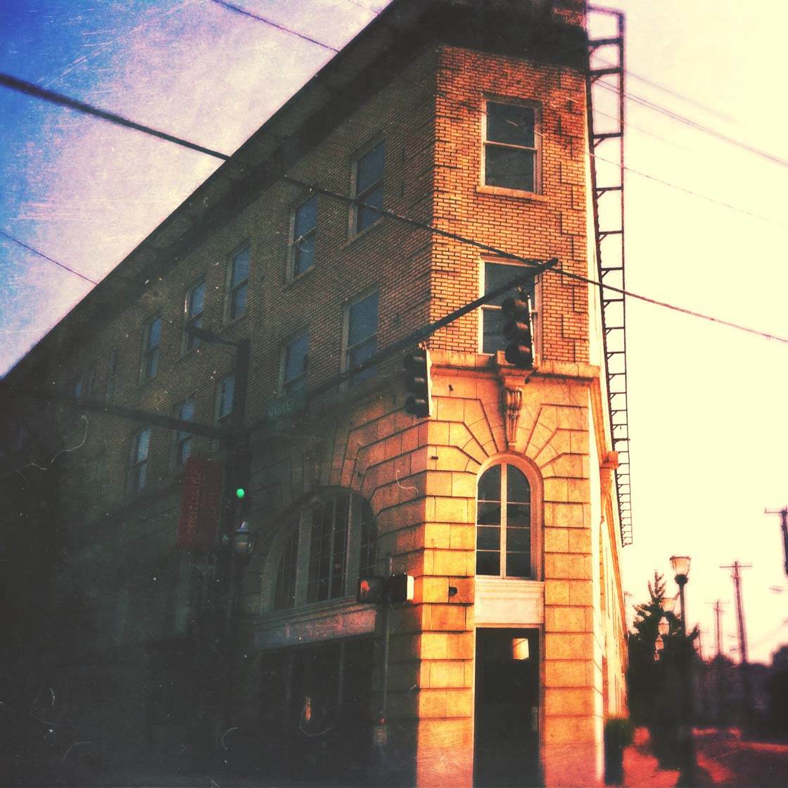
Textures are stacked on top of your image as layers to create a unique look. There is no undo button in Mextures but you can edit any layer you wish and add an infinite number of layers. You can also delete a layer or drag to reorder them. Stacking several layers creates a formula.
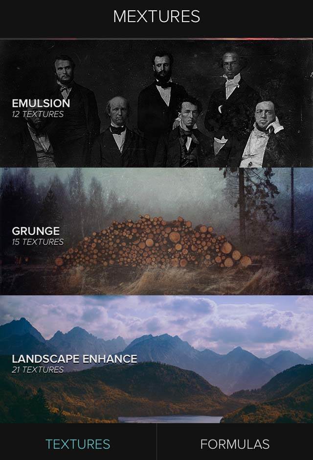
Once you’re in the app you have two options. The first option is to create your own formula and the second option is to begin with a custom formula. To create your own formula, choose from a list of textures in several categories including Emulsion, Grunge, Grit and Grain, and Light Leaks.
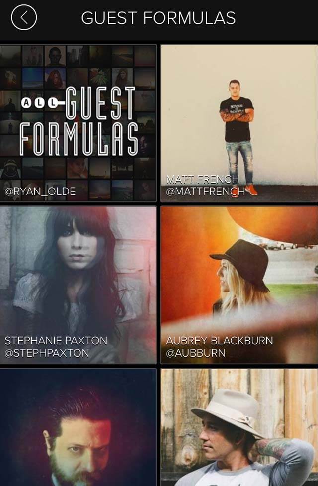
If you begin with the Formulas section, you can select from various formula categories such as Landscape, Destroyed Film, Black and White, and even guest formulas submitted by other iPhone photography artists.
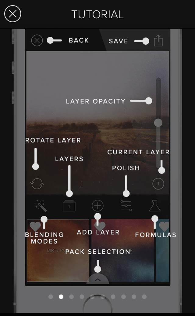
You can also use the 12 blending modes to alter the effect of the image. Tap the Polish icon for adjustment settings which allow you to change exposure, contrast, white balance, sharpen and more. You can then save your combination of effects to create your own custom formula which can be shared with others.
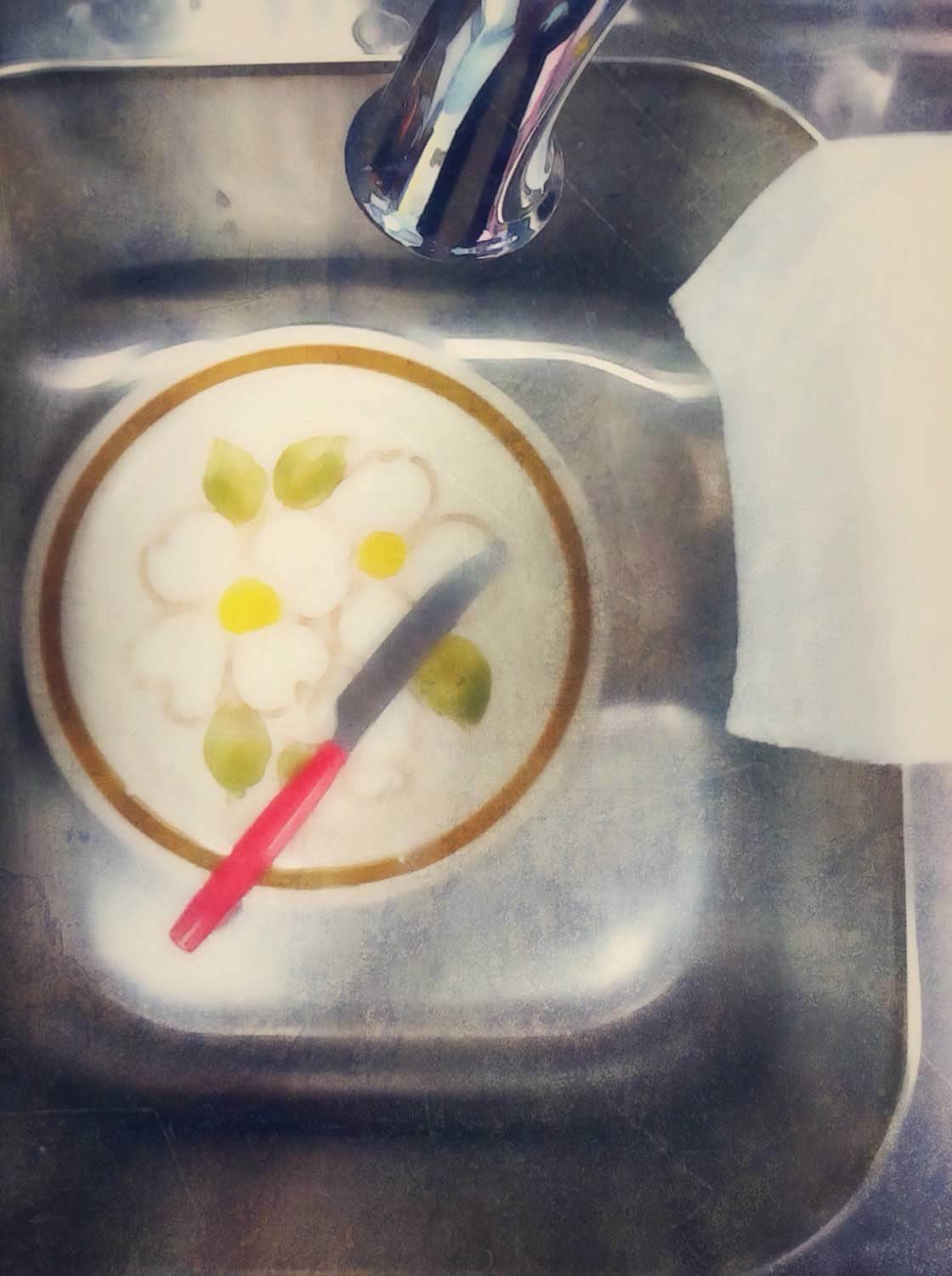
2. Distressed FX
Distressed FX ($0.99) is easy to use and allows hundreds of texture combinations. Many of the textures make your photo look like an oil painting, as if you’re working on a textured canvas instead of in an app. The textures come from texture artist, Cheryl Tarrant.
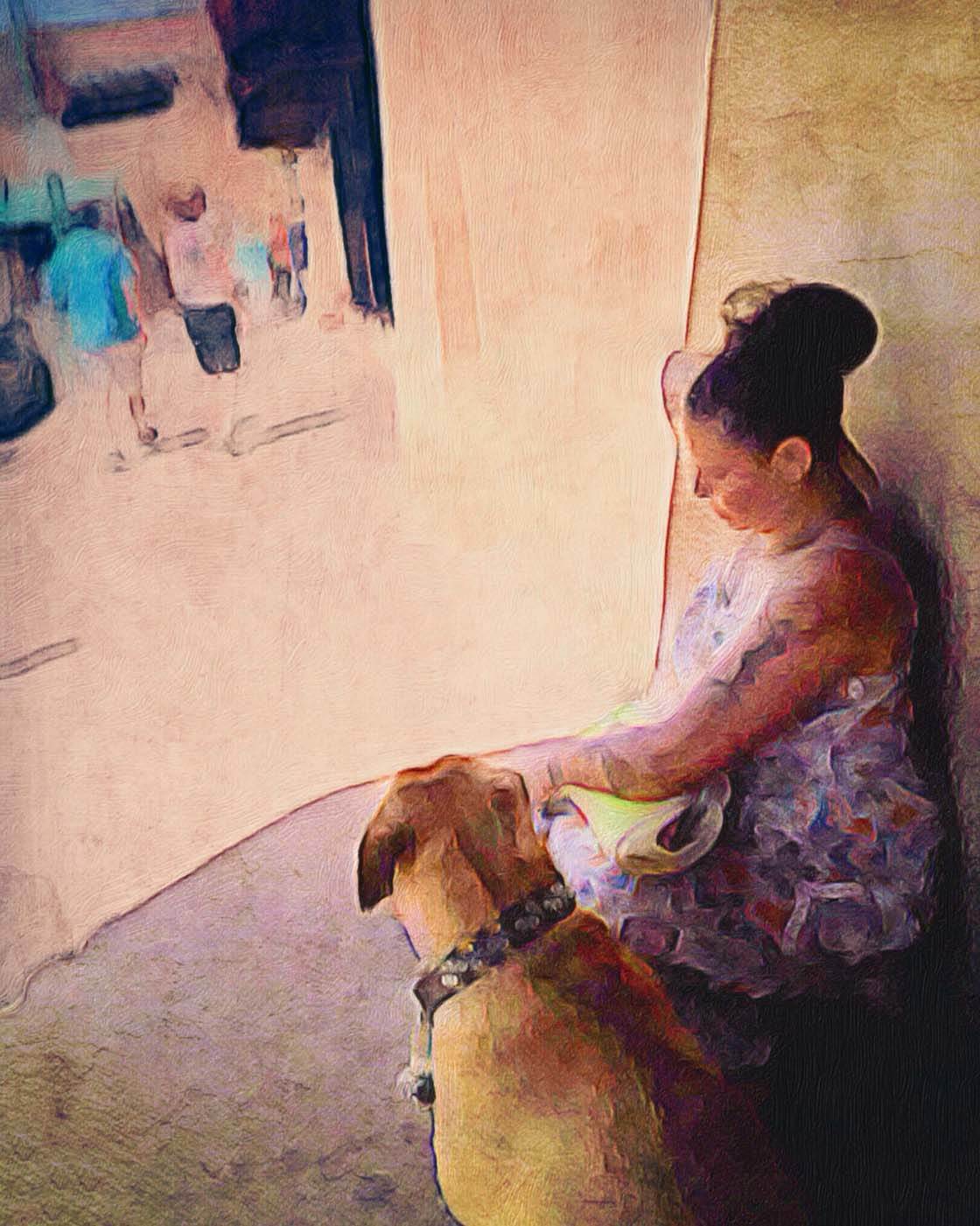
To use the app, tap the camera icon at the top left to open your photo. Select from 23 overlays and 19 texture presets. You can select both an overlay and texture preset for a more heavily textured photo.
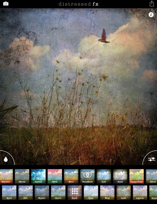
For example, I’ve applied the Storybook overlay and Dusty texture to the default image. You can also add your own texture to your photo – simply select Custom, then last Texture preset. Select the texture from your camera roll and it will be applied to the image.
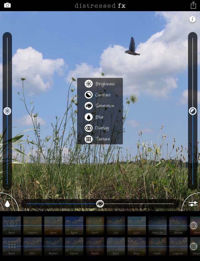
If you’d like to make adjustments, tap the sliders icon in the lower right corner of the image screen. Here, you can control the intensity of the overlays and textures using the sliders at the bottom.
You can also control the brightness, contrast and saturation of the image using the sliders around the image. When you’re ready to save, tap the Save icon in the top right corner.
3. Modern Grunge
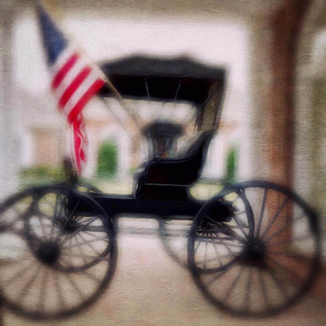
The Modern Grunge app ($2.99) offers over 40 presets featuring scratchy textures and tones to apply to your photos.
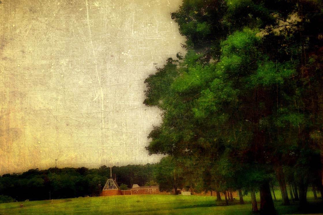
To use the app, open your image and tap Get Photo to pull a photo from your Camera Roll, or Take Photo to take a picture using the app.
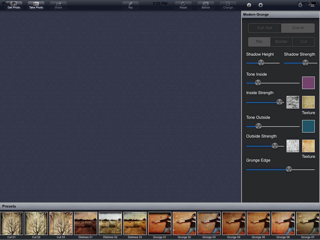
To edit your photo, you have three options: (1) select one of the presets located at the bottom of the screen, (2) tap the Change button to randomize the effect, or (3) customize your edit using the adjustment settings to the right of the screen.
The Tone Outside slider allows you to choose a tonal color for the entire image. If you want a sepia tone for example, simply choose the color and that tone will be applied. This is great for adding an aged look to the photo. The Grunge Edge slider adds a grungy vignette around the entire image.
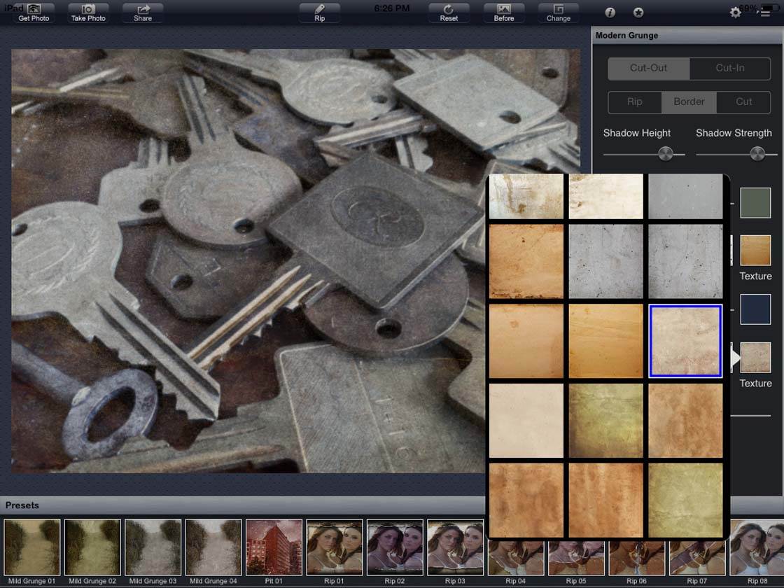
You can achieve hundreds of combinations by adjusting the type and intensity of the grunge effect and the type of paper texture and color.
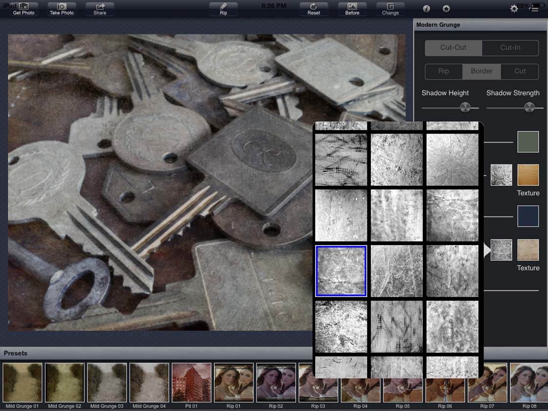
In the image above, the grunge effect can be chosen from more than 50 different options. In the photo below, you will see the box next to it allows you to change the paper type and color.
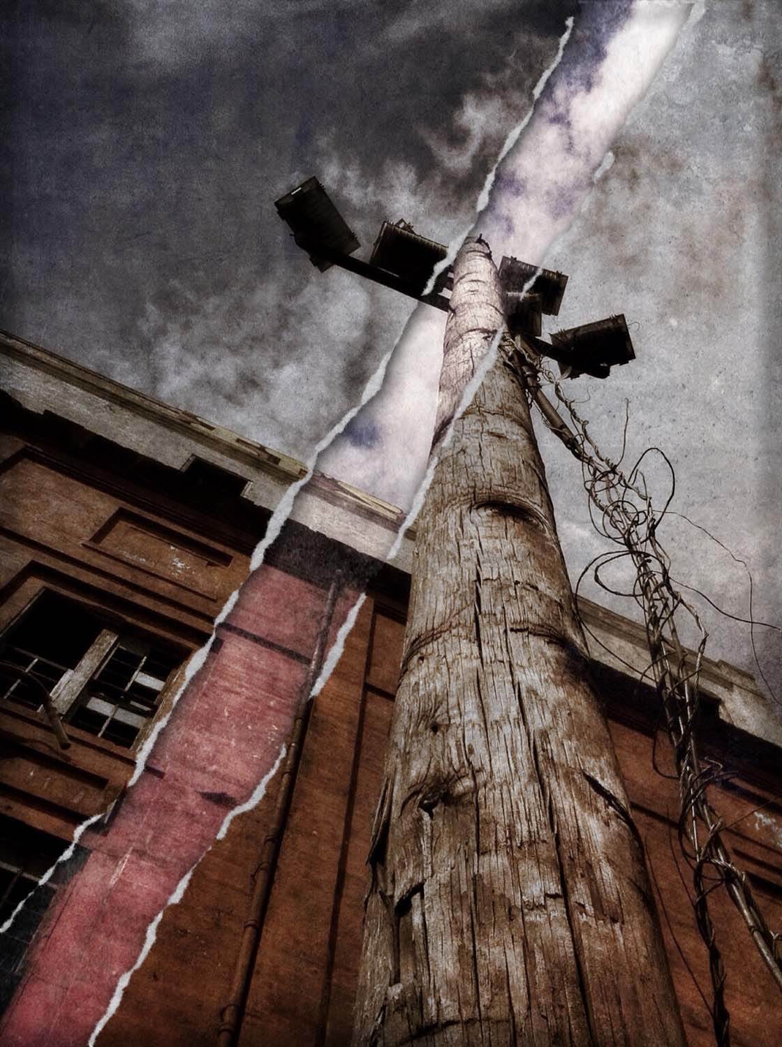
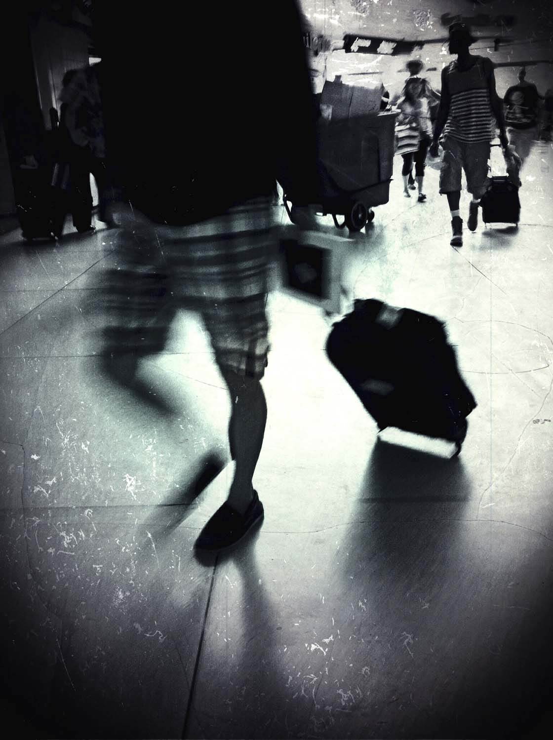
This app also delivers a unique photo effect – adding rips and cuts into your image. You can give the appearance of a photo with a hole cut through it or the appearance of a part of your image torn away from the photo.
4. Stackables
The Stackables app ($0.99) has over 200 effects that include textures in many forms such as grunge, abstract sky and cloud, emulsion, painterly and analog film. The app also includes other effects such as gradients, light leaks and geometric patterns that can be layered onto your image.
There are also 20 different adjustment tools (Vignette, Blur and Color Balance to name a few) to fine-tune your photo and give you complete control over your composition.
You can instantly transform your photos with 30 presets, or mix and match the effects to create your own customized formula. Like the Mextures app, Stackables works with unlimited layers that you can adjust, hide or delete.
When you open your image in the app, you’ll see 8 icons across the top. The first one is the home screen. The rest of the icons are for Textures, Filters, Gradients, Geometric Patterns, Adjustments, Formulas and Save.
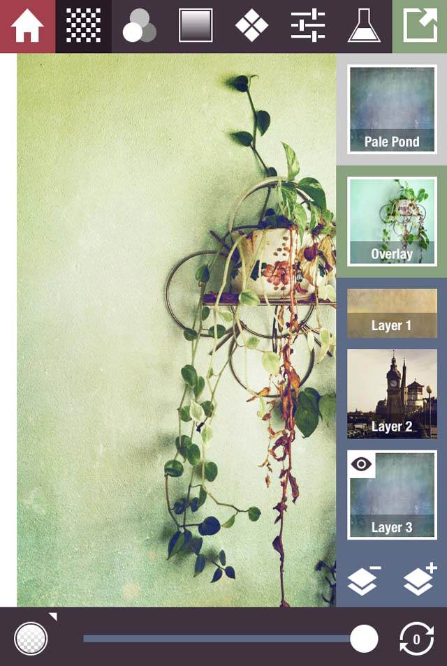
Now, you can start layering. To add a new effect, simply add a layer by tapping the layer + icon at the bottom of the right sidebar. Use the slider at the bottom of the screen to adjust the intensity of the effect.
In the photo above, I’ve added three layers. Layer 1 and Layer 3 are texture layers. Layer 2 is a filter. You can also share your custom formulas with friends via email or share them through devices.
How Much Texture Should You Use?
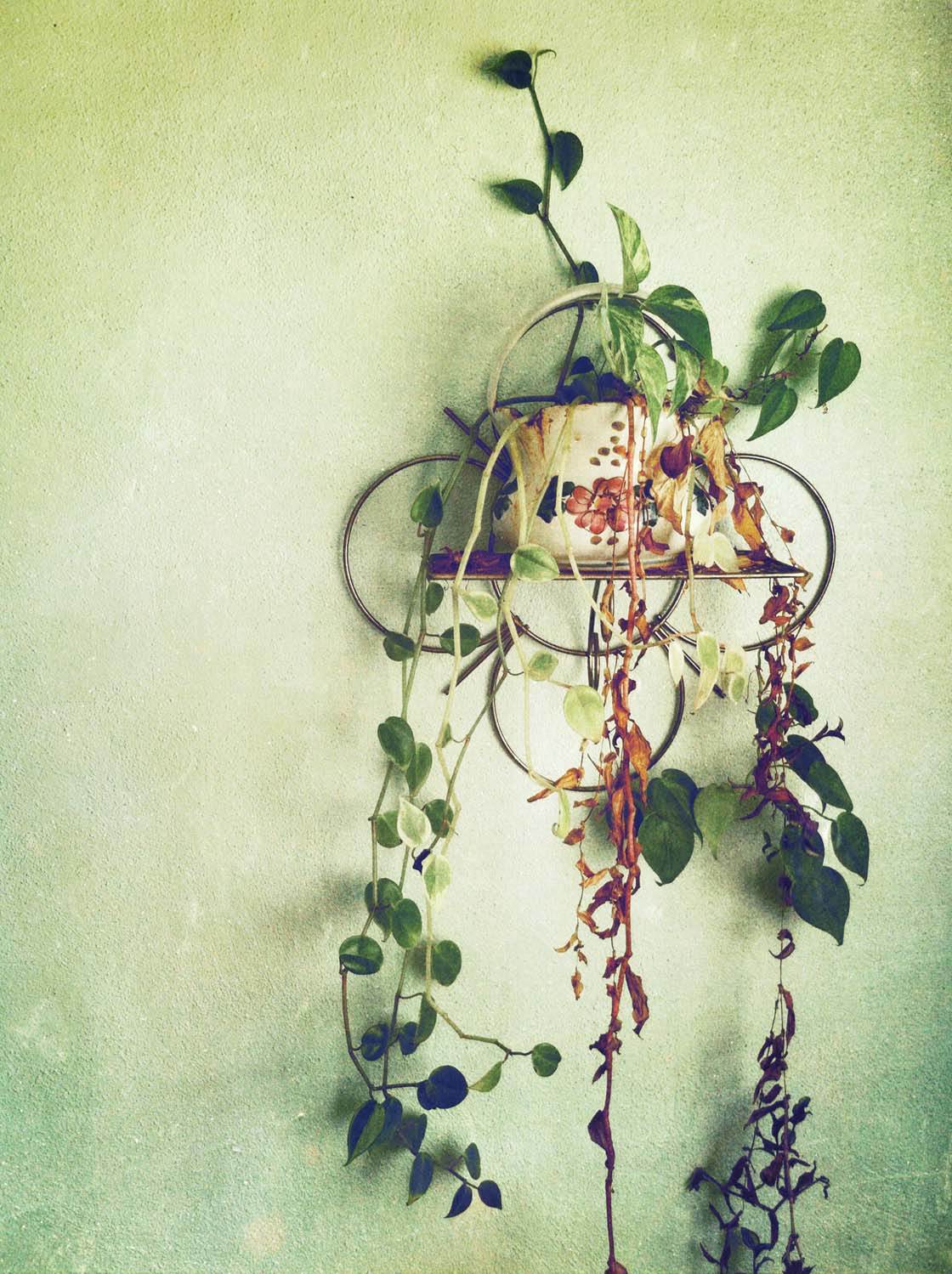
The general rule of thumb is that textures should be subtle – if you can clearly see the texture, you’ve added too much. However, as you can see from my photos, that’s not a rule I follow.
I believe this is a rule that can be broken based on the iPhone photographer’s style and what they want to convey through the photograph. You can choose to add a very subtle texture or grain that’s barely noticeable, just to give your image a slightly aged or retro look.
Or you can create more painterly images, using heavy textures and other distressed effects. The key is to experiment with different apps and layering to achieve your desired effect.
If you’d like to discover more iPhone photo apps, including camera apps and photo editing apps, check out our guide to the 10 best photo apps for iPhone photography. And check out our article on the best photoshop apps for iPhone!

fabulous post! I love grungy textures but was having a hard time using them…and great info on the apps themselves. I never realized that the bars at the bottom of the DistressedFX app were for adjusting the strength(I know…I am an idiot!!)
Thanks Marsha, and you’re not an idiot…it took me a while to figure those bars out too! LOL!
Thanks for this great tutorial Kristen. I really love these textured effects!
Thanks Kate!
Great tutorial! I teach iphoneography, and I’m going to recommend your post to my students. I have a different rule when using textures; the texture can show, but it shouldn’t be the first thing the viewer notices, or put another way, the texture shouldn’t be the subject of the photo. But I also find that once you start using textures, there’s no going back. They just seem to make every photo better!
Really glad you enjoyed this. And that’s wonderful that you’ll recommend it to your students… thank you 🙂 You’re right about textures – once you start using them, your photos often look like they’re lacking something if you don’t apply any texture!