The rule-of-thirds is a fundamental composition principle that most photographers are familiar with. But like many simple things, it is often overlooked or misinterpreted. In this article you’re going to learn how to correctly apply the rule of thirds to your iPhone photos, and how to create well-balanced compositions that just look and feel right to the human eye.

What is The Rule of Thirds
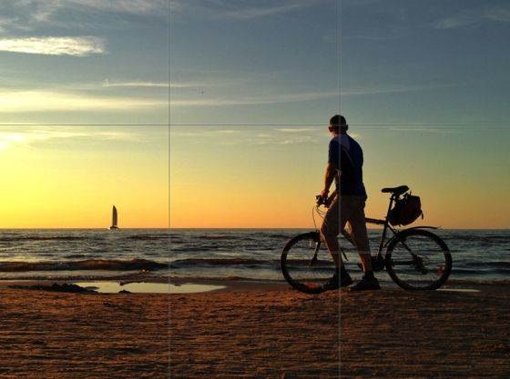
Every good photo has what is known as its main subject or subjects. Those are the parts of the image that the human eye is naturally attracted to, or the things that we notice before everything else when we’re looking at the picture. In a photo of a man walking on the beach with the bicycle, what do you think are the most important subjects?

That’s right, the man himself is the main subject of this photo. As we look at this photo, we immediately notice that the man is looking into the sea, and that he has a bicycle with him. We also quickly notice the yacht, which serves as a secondary subject.
Now, what does all of this have to do with the rule of thirds?
In its most basic form, the rule of thirds states that the most important subjects of the photo should be placed along the gridlines and at the intersections of these lines, which are known as junction points. In this photo you can see that I’ve placed the man along the right vertical gridline, and that the most important part of his body – his head – is placed at the junction point.
However, the example above does not perfectly follow the rule of thirds. Ideally, the yacht (which is another important subject) should be placed on one the bottom-left junction point, and the horizon should lie along the bottom gridline. But since the subject was moving quickly and the scene wasn’t staged, I only had one chance to take this photo.
Let’s look at another example.

Once again, I’m slightly off the gridlines because I was shooting this by instinct. Nevertheless, this composition looks good and the subjects are in harmony because the photo still roughly follows the rule of thirds. If I had placed the lady and her kid in the center of the image, or if the horizon was centered horizontally, the resulting composition would look much worse.
You should also be paying attention to the direction of movement inside the scene. The scene in the two photos above is very similar, but in the first photo I’ve left more space on the left side, while in the second photo I’ve left more space on the right side. That’s because the human eye naturally tends to follow the direction of movement as if it’s trying to see where the subjects are going.
For this reason you should always leave more space on the side towards which the subjects are moving. If you don’t believe me, just try doing the opposite. You’ll see how weird that looks.
Balance The Photo Diagonally
When applying the rule of thirds, it’s also essential to pay attention to the horizontal and vertical balance of the photo. In general, you want a composition that is not heavily biased towards one of the four sides of the image. Let’s consider this landscape photo.

The main subject of this scene is clearly the bright orange cliff on the right side of the river. But if that was the only subject in the photo, the visual weight of the image would be focused on the right side, and the eye would likely ignore the left side of the image altogether.
In order to balance out the scene, I deliberately included the big rock on the bottom left corner. This adds visual balance to the image, and now its left and right side, as well as the top and the bottom, are all equally powerful.
In order to achieve good visual balance, it’s best to place your important subjects diagonally, as I’ve done here with the cliff in top right and the big rock in the bottom left. I’ve used the same technique to create visual balance in the photo at the top of this post.
The Rule of Thirds And People
Whenever there are people in your photo, they are going to form an important part of your composition. But how do you know which parts of their body should you focus on in the composition?

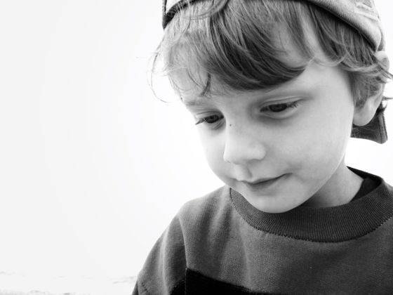
When looking at photos of humans and animals, our eyes will always follow the Eye-Face-Body rule. What it means that in a photo like the one above, the first thing you’ll always notice are they eyes of the little boy, followed by his face and the rest of the body. You can see the same thing in real life – whenever you see another person, they first thing you’ll look at are their eyes.
In terms of the rule of thirds, it means that you should position the eyes of the subject on one of the top junction points. If both eyes can be clearly seen, they should lie on the top gridline, as they do in this example. If the subject is seen in profile, the top grid line should naturally follow the path of the subject’s eyesight.
Notice how in the photo above the subject is looking to the left, and I have left a lot of free space on the left side of the image. Just like with shots of movement, the eye will always be drawn towards the direction to which the subject is looking. We are naturally curious to know what the other person is looking at, and our eyes are automatically drawn in the same direction.
Even thought there is nothing on the right side of this photo, the composition is still balanced as the eye automatically follows the gaze of the subject. Always leave some space in the direction towards which your subject is looking. A subject that’s staring out of the frame will never look natural to the human eye.
The Rule of Thirds on Your iPhone
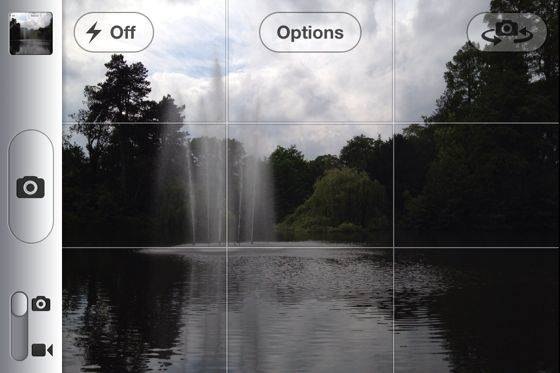
If you’re new to the rule of thirds or if you just forget to pay attention to composition, try enabling gridlines in your iPhone’s camera. The gridlines will remind you to pay attention to the rule of thirds and make it a lot easier to correctly align subjects inside the frame.

In order to activate gridlines, tap on the options button on the top part of the screen. That will give you the option to turn the grid on or off. You can also activate gridlines in almost every other camera app that you might be using.
I personally don’t always turn on the grid, which is why most of my examples in this article are slightly off the gridlines. However, at this point I automatically look at the scene in terms of the rule of thirds even without using the gridlines.
If you don’t get the composition right at the time of shooting, you can still crop the photo so that it follows the rule of thirds. Most photo editing apps, including the iPhone’s built-in cropping tool, will show you the gridlines to help you crop your photos correctly. Check out my article on cropping for Instagram to learn more about improving composition through cropping.
Rules Are Meant To Be Broken
Finally, I have to say that the rule of thirds is a misnomer. There are no hard rules in photography, and you should always feel free to experiment with whatever works best for you. For this reason I like to call the rule of thirds a guideline rather than a hard rule. Once you’ve mastered it, feel free to break it as often as you wish.
Just look at the photo below.

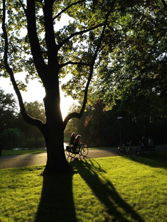
This photo is an old favorite of mine despite the fact that I’ve placed the two bicycles – which are the main subjects – in the center of the photo. In most cases this would not look great, but here the result is really good.
Here the subjects have a clear direction of movement, and only a part of the scene is visible due to the dark evening shadows. Placing the subjects any more to the right would no longer look good because there must be some space to see where they’re headed. So in this case, braking the rule of thirds was the best thing to do.
Let’s look at one more example.

Here both the top and the bottom of the forrest are significantly bellow the bottom gridline, which leaves very little of the field plenty of sky inside the scene. In this photo I wanted to put a lot of emphasis on the vastness of the enormous rain cloud. I also wanted to add something to the foreground that would put things in the right perspective.
The only way to show enough of the cloud in this Instagram photo was to leave in as little of the field as possible. Once again, blindly following the rule of thirds wasn’t the best thing to do in this particular scene.
The bottom line is that the rule of thirds is a very useful compositional guideline… that you don’t have to follow religiously. However, it is a good starting point and it works well in most cases. But feel free to experiment to find out what works best in your particular scene!


nice
Great tips! Thanks for making this easy to understand!!
Thanks a lot! one day in somewhere u will see the great picture.
The rule of thirds is a cookie cutter cut out concept of design that offers nothing in the way of variety, harmony or pleasing divisions in any photograph. It’s one of the worst composition concepts that has been flooded by the photography forums all over the web that teaches serious artists nothing on how to design. No professional or master photographer uses this concept and ever has.
It’s definitely not a hard-and-fast rule – I agree. But I think it’s a great place for beginner photographers to start as it gets them out of the habit of always placing the main subject in the center of the frame. I think a lot of landscape photography benefits from using the rule of thirds as a starting point, even if the final image doesn’t follow it exactly. For me, the rule of thirds is just one tool in my compositional toolbox, but you need to be aware of other design and composition techniques to make a decision about the best way to compose a particular image. That’s my approach anyway 🙂
As the article says, “There are no hard rules…” However, I challenge you to look at all photos and painting with this rule in mind. Even Rembrandt, who probably never learned of the composition rule, has many pieces that do have the subjects aligned with the grid lines and junction points.
I now have the grid on my iPhone 7+ turned on. I plan to work on this wonderful tip